I complained about this on the socials, but I didn’t get it all out of my system. So now I write a blog post.
I’ve never liked the philosophy of “put an icon in every menu item by default”.
Google Sheets, for example, does this. Go to “File” or “Edit” or “View” and you’ll see a menu with a list of options, every single one having an icon (same thing with the right-click context menu).
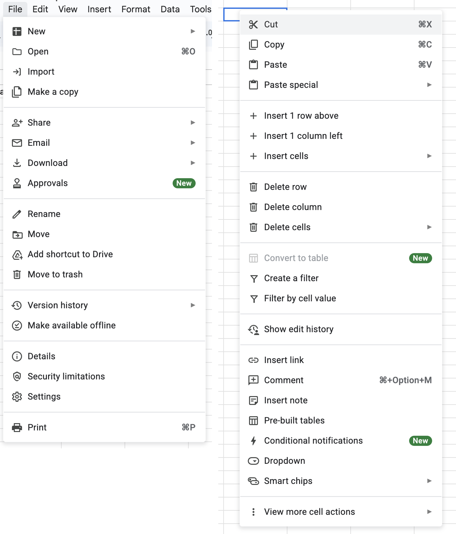
It’s extra noise to me. It’s not that I think menu items should never have icons. I think they can be incredibly useful (more on that below). It’s more that I don’t like the idea of “give each menu item an icon” being the default approach.
This posture lends itself to a practice where designers have an attitude of “I need an icon to fill up this space” instead of an attitude of “Does the addition of a icon here, and the cognitive load of parsing and understanding it, help or hurt how someone would use this menu system?”
The former doesn’t require thinking. It’s just templating — they all have icons, so we need to put something there. The latter requires care and thoughtfulness for each use case and its context.
To defend my point, one of the examples I always pointed to was macOS. For the longest time, Apple’s OS-level menus seemed to avoid this default approach of sticking icons in every menu item.
That is, until macOS Tahoe shipped.
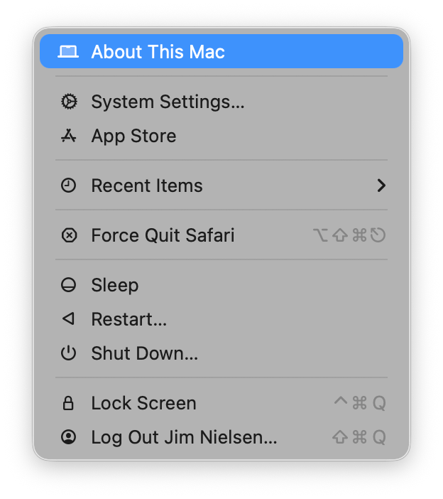
Tahoe now has icons in menus everywhere. For example, here’s the Apple menu:
Let’s look at others. As I’m writing this I have Safari open. Let’s look at the “Safari” menu:
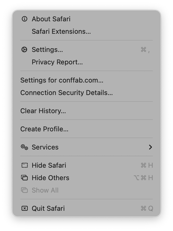
Hmm. Interesting. Ok so we’ve got an icon for like half the menu items. I wonder why some get icons and others don’t?
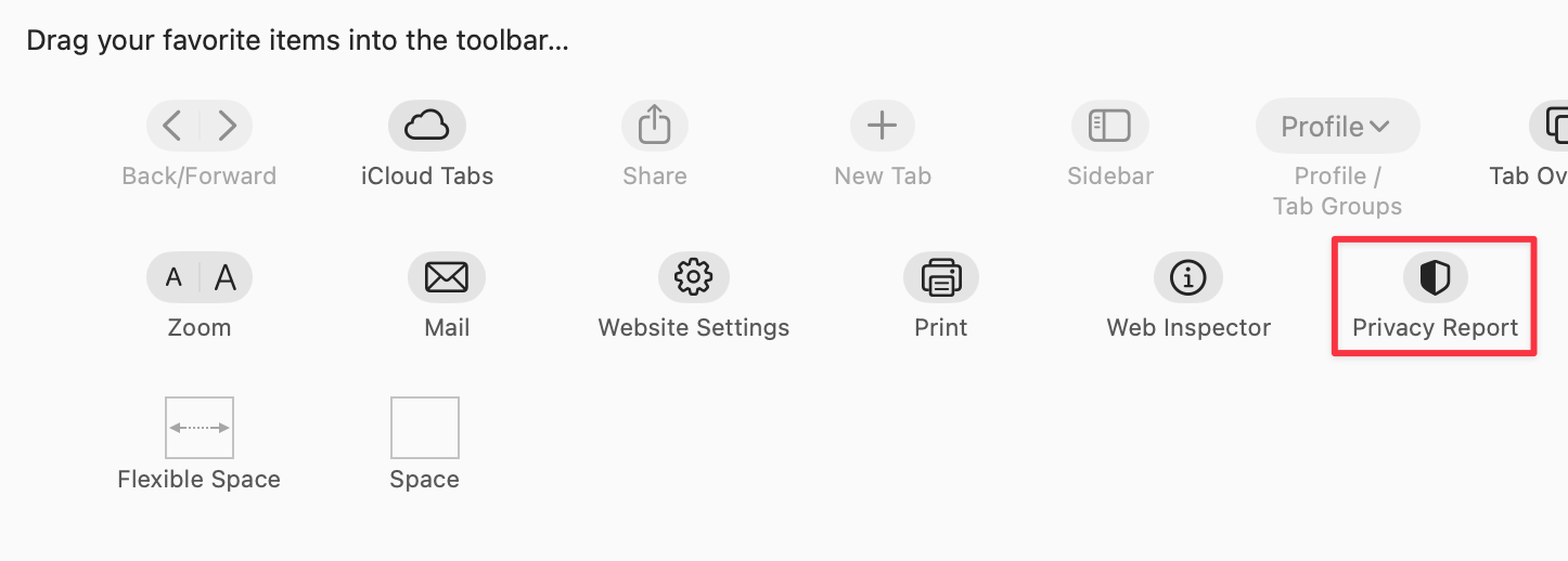
For example, the “Settings” menu item (third from the top) has an icon. But the other item in its grouping “Privacy Report” does not. I wonder why? Especially when Safari has an icon for Privacy report, like if you go to customize the toolbar you’ll see it:
Hmm. Who knows? Let’s keep going.
Let’s look at the "File" menu in Safari:
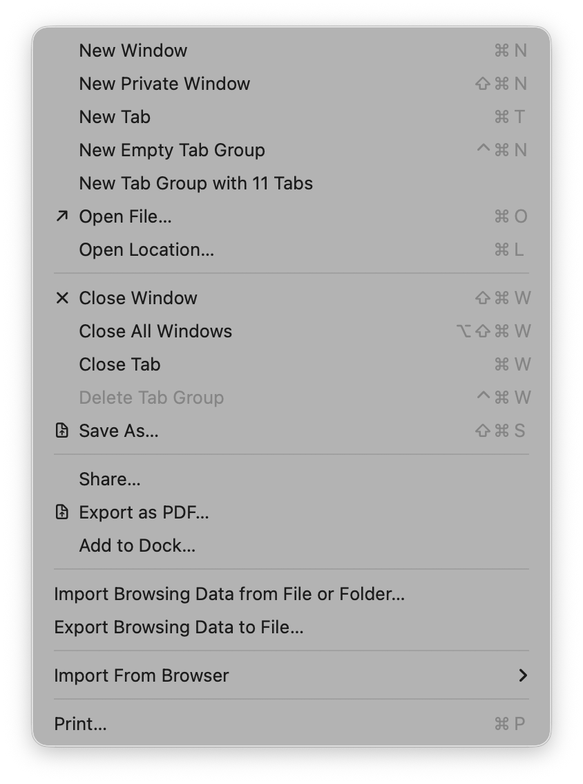
Some groupings have icons and get inset, while other groupings don’t have icons and don’t get inset. Interesting…again I wonder what the rationale is here? How do you choose? It’s not clear to me.
Let’s keep going. Let’s go to the "View" menu:
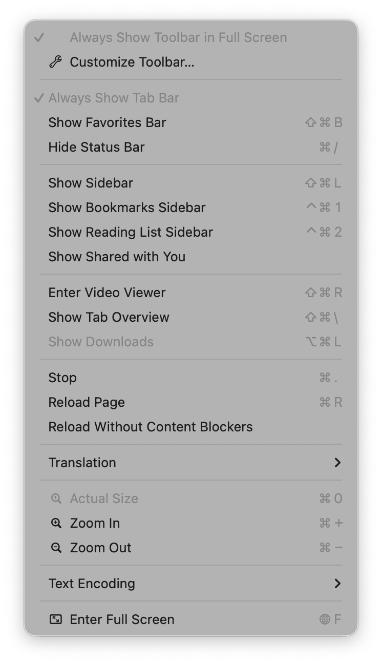
Oh boy, now we’re really in it. Some of these menu items have the notion of a toggle (indicated by the checkmark) so now you’ve got all kinds of alignment things to deal with. The visual symbols are doubling-up when there’s a toggle and an icon.
The “View” menu in Mail is a similar mix of:
- Text
- Text + toggles
- Text + icons
- Text + icons + toggles
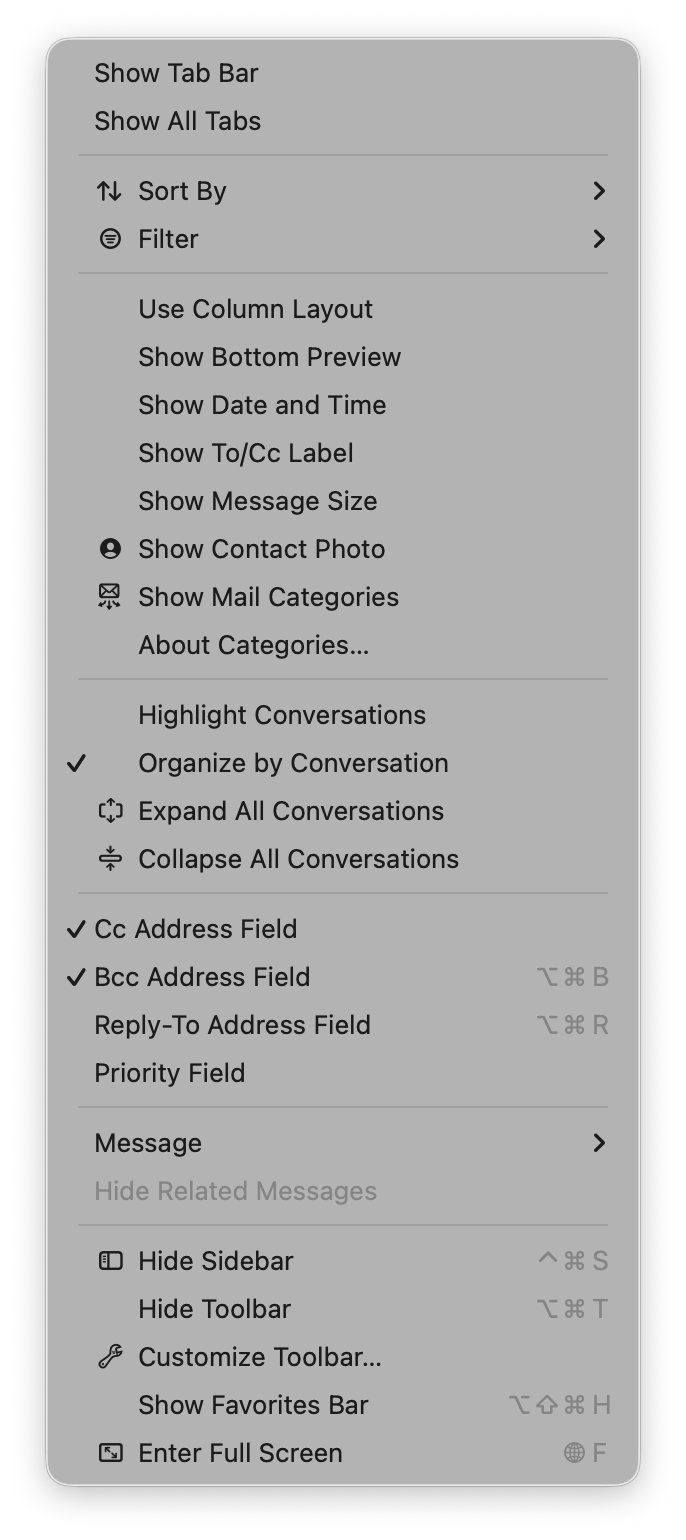
You know what would be a fun game? Get a bunch of people in a room, show them menus where the textual labels are gone, and see who can get the most right.
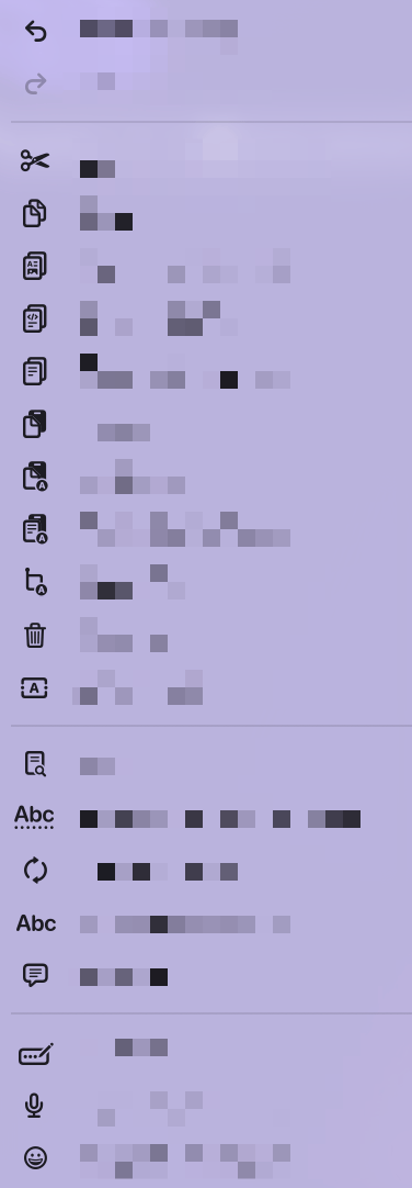
But I digress.
In so many of these cases, I honestly can’t intuit why some menus have icons and others do not. What are so many of these icons affording me at the cost of extra visual and cognitive parsing? I don’t know.
To be fair, there are some menus where these visual symbols are incredibly useful. Take this menu from Finder:
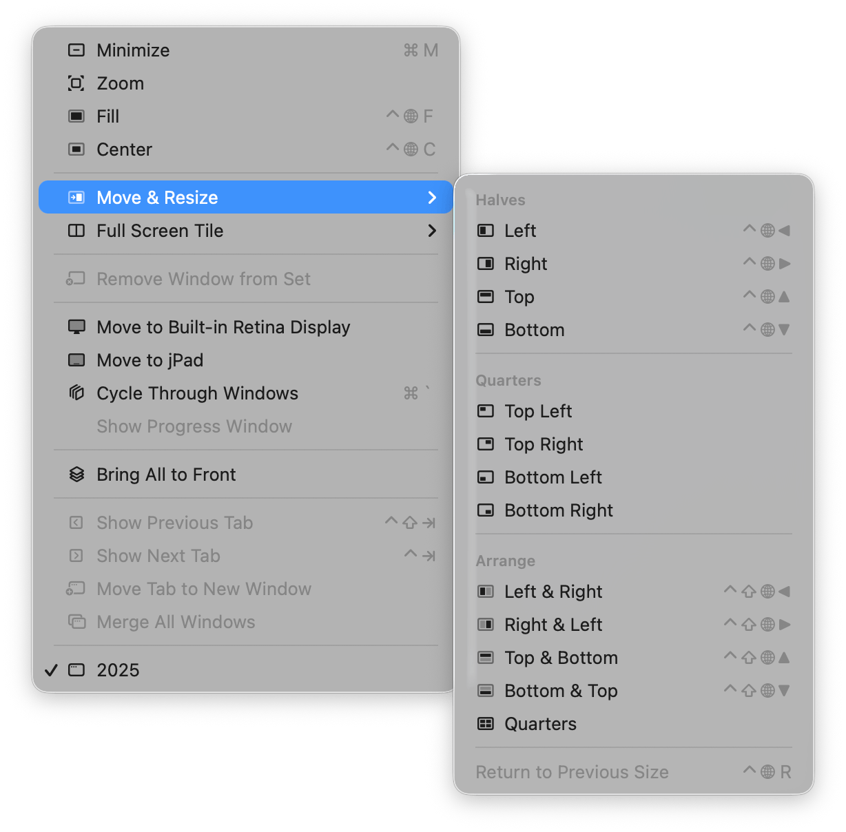
The visual depiction of how those are going to align is actually incredibly useful because it’s way easier for my brain to parse the symbol and understand where the window is going to go than it is to read the text and imagine in my head what “Top Left” or “Bottom & Top” or “Quarters” will mean. But a visual symbol? I instantly get it!
Those are good icons in menus. I like those.
Apple Abandons Its Own Guidance
What I find really interesting about this change on Apple’s part is how it seemingly goes against their own previous human interface guidelines (as pointed out to me by Peter Gassner).
They have an entire section in their 2005 guidelines titled “Using Symbols in Menus”:
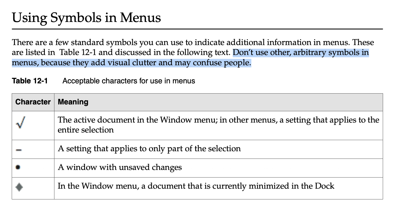
See what it says?
There are a few standard symbols you can use to indicate additional information in menus…Don’t use other, arbitrary symbols in menus, because they add visual clutter and may confuse people.
Confused people. That’s me.
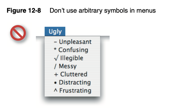
They even have an example of what not to do and guess what it looks like? A menu in macOS Tahoe.
Conclusion
It’s pretty obvious how I feel. I’m tired of all this visual noise in my menus.
And now that Apple has seemingly thrown in with the “stick an icon in every menu by default” crowd, it’s harder than ever for me to convince people otherwise. To persuade, “Hey, unless you can articulate a really good reason to add this, maybe our default posture should be no icons in menus?”
So I guess this is the world I live in now. Icons in menus. Icons in menus everywhere.
Send help.