In a WWDC 2011 session, Dan Schimpf explained some of the goals of the refreshed design for Aqua in Mac OS X Lion were “meant to focus the user attention on the active window content”. This sentiment was echoed by John Siracusa in his review of Lion for Ars Technica:
Apple says that its goal with the Lion user interface was to highlight content by de-emphasizing the surrounding user interface elements.
When Apple redesigned Mac OS X again in 2014 with Yosemite, it promised…
[…] a fresh modern look where controls are clearer, smarter and easier to understand, and streamlined toolbars put the focus on your content without compromising functionality.
Then, when it revealed the Big Sur redesign in 2020, it explained:
The entire experience feels more focused, fresh, and familiar, reducing visual complexity and bringing users’ content front and centre.
And you will never guess what it promised in 2025 with the announcement of MacOS Tahoe and Liquid Glass, as introduced by Alan Dye:
Our goal is a beautiful new design that brings joy and delight to every user experience. One that’s more personal, and puts greater focus on your content — all while still feeling instantly familiar.
It is not just Apple, either. Here is Microsoft’s Jensen Harris at Build 2011 describing a key goal for the company’s then-new Metro design language:
Metro-style apps have room to breathe. They’re not about the chrome, they’re about the content. […] For years, Windows was always about adding stuff. We added bars, and panes, and doodads, and widgets, and gadgets, and bars — and stuff everywhere. And that’s how we defined our U.I., based on what new widgets we added. Now, we’ve receded into the background, and the app is sitting out there on the stage.
And later, as Microsoft rolled out app updates with its Fluent Design language, it described them in familiar terms:
With the updated OneDrive, your content takes center stage. The improved visual design reduces clutter and distractions, allowing you to focus on what’s important – your content.
This is a laudable goal if the opposite is, I assume, increasing the amount of clutter in user interfaces and making them more distracting. Nobody wants that. Then again, while the objective may be quite reasonable, there are surely different ways of achieving it — but Apple has embraced a single strategy: make the interface blend into the document. (I will be focusing on MacOS here as it is the platform I am most familiar with.)
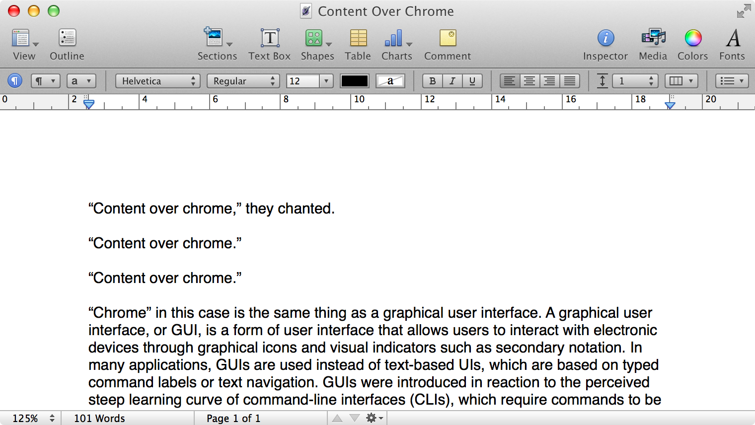
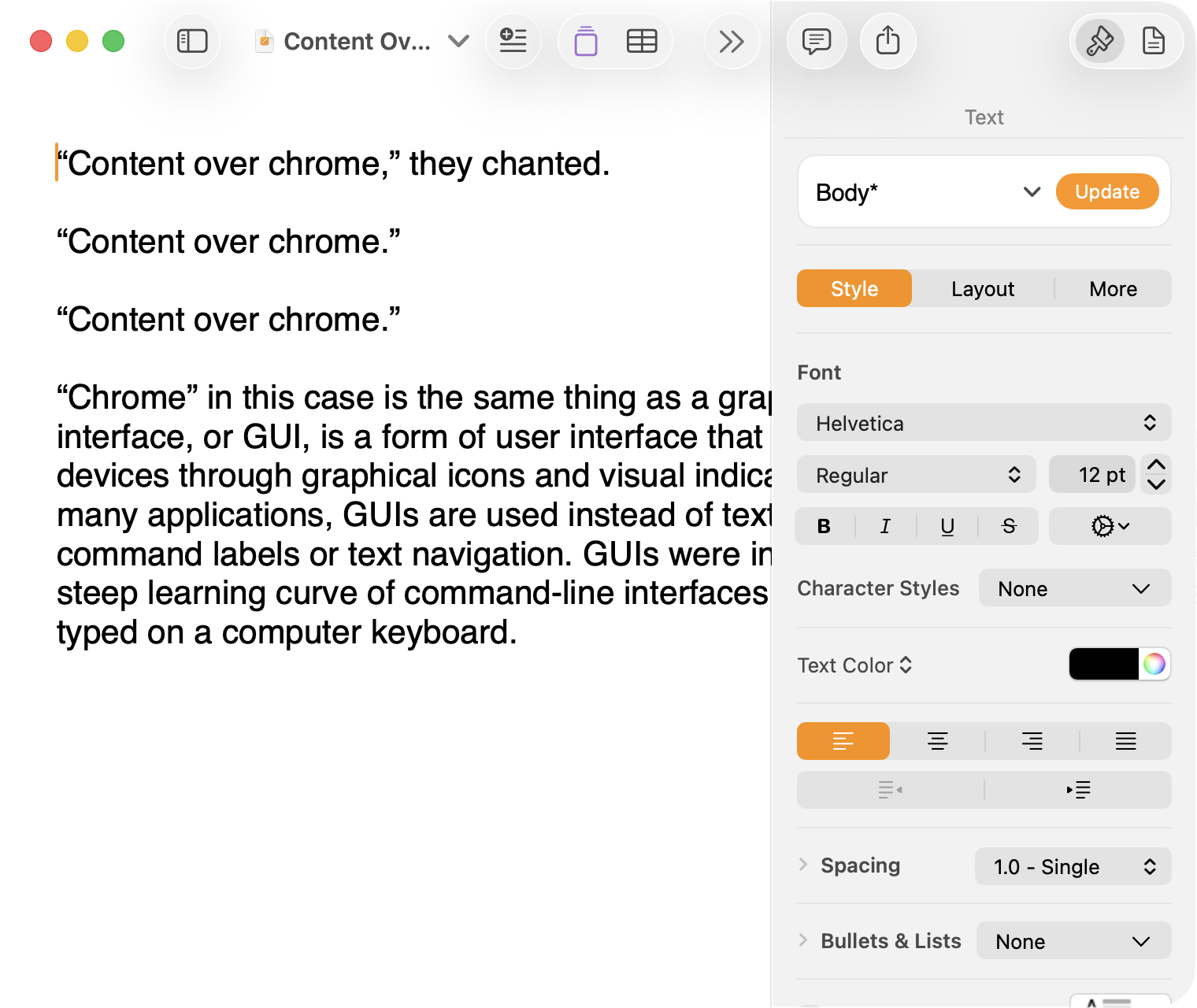
Here is what a Pages document looks like running under Mac OS X Lion:
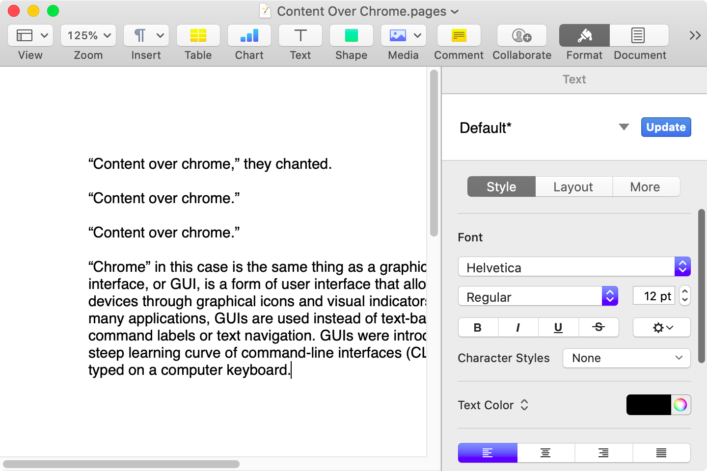
Here is that same document in a newer version of Pages running on MacOS Catalina, with the Yosemite-era design language that replaced the one that came before:
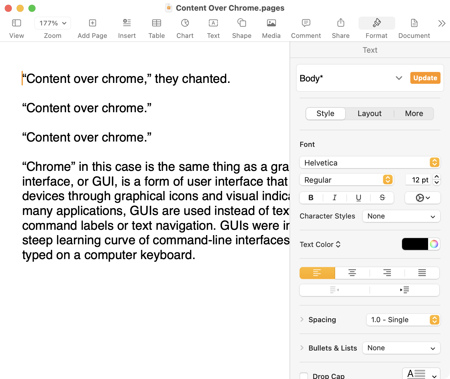
Here it is in the last version of Pages on MacOS Tahoe, using the design language introduced with Big Sur:
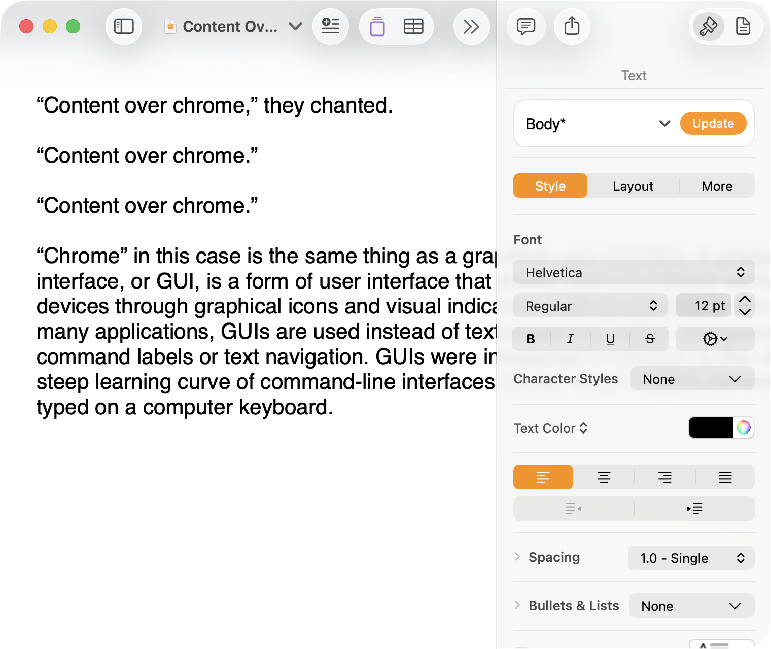
And, finally, the newest version of Pages on MacOS Tahoe using the current Liquid Glass visual design language:
There are welcome improvements in newer versions of this comparison, like the introduction of the “Format” panel on the right-hand side, which makes better use of widescreen landscape-oriented displays, and allows for larger controls. While I admire the density of the Lion-era screenshot, the mini-sized controls in that formatting menu are harder to click.1
Overall, however, what Apple has done to Pages over this period of time is representative of a broader trend of minimizing the delineation of user interface elements from each other and the document itself. This is the only tool in the toolbox, and I am skeptical it achieves what Apple intends.
Compare again the two more recent screenshots against the ones that came before, and focus on the toolbar at the top of each. In the older two, there is a well-defined separation between the toolbar — the window itself — and the document. In the Big Sur visual language, however, the toolbar is the same bright white as the document. By Tahoe and the Liquid Glass language, there is barely a distinction; the buttons simply float over the document. And, bizarrely, that degrades further with the “Reduce Transparency” accessibility preference enabled:
(Also, no, your eyes do not deceive you: the icons in the drop cap menu, barely visible in the lower-right, are indeed pixellated.)
For me, this means a constant distraction from my document because the whole window has a similar visual language. As the toolbar and its buttons become one with the document, they lose their ability to fade into the background. In the two older examples, the contrast of the well-defined toolbar allows me to treat them as an entirely separate thing I do not need to pay attention to.
This is further justified by the lower contrast within those two older toolbars. In Lion, the grey background and moderately saturated colours are a quiet reminder of tools that are available without them being intrusive. The mix of shapes is a sufficient differentiator, something Apple threw away in the following screenshot. By making all the buttons literal and with the same bright background, the toolbar becomes a little more distracting — but at least it does not blend into the document. Without the context of the previous screenshot, the colours of each icon seem almost random, and I find the yellow-on-white “Table” button difficult to distinguish at a glance from the black-on-yellow-on-white “Comment” button.
The Big Sur-era design language is, frankly, an atrocious regression. The heterogeneous shapes may have returned, but in the form of monochromatic medium-grey icons set against a uniform white background. The icons are not bad, per se — though putting “Add Page” and “Insert” next to each other in this default toolbar layout, both represented by a plus sign, is a little confusing. But I will bet you would not guess that some of these are buttons, while others are pop-up buttons with a submenu.
Finally, there is Liquid Glass which, in its default form, has more contrast than the previous example; with “Reduce Transparency” enabled, which is how I use MacOS, it has even less. The buttons themselves have a greater amount of internal contrast with bigger, darker grey icons on a white background. This is preferential within the context of the toolbar compared to the thin, small, and low-contrast buttons in the past example, but it also means this toolbar has similar contrast to the document itself.
I would not go so far as to argue that Pages ’09 has a perfect user interface and that everything since has been a regression. The average colours used for the icon fill in both older toolbars generally fails accessibility contrast checks which, remarkably, the Big Sur design will pass. The icons in Pages ’09 rely on dark outlines and unique shapes to have sufficient contrast with the toolbar background. However, Apple has since discarded most variables it could change to design these interfaces. Every button contains an icon of a single uniform colour, within barely defined holding containers of the same shape, and without text labels by default.
This monochromatic look means any splash of colour is distracting. The yellow accent used in Pages is garish — though, thankfully, something that can mostly be mitigated by changing the Theme Colour in System Settings, under Appearance. (Unfortunately, the yellow background remains on the “Update” button in the most recent version of Pages regardless of the system accent colour.) But perhaps you also noticed the purple icon in the Liquid Glass screenshot above. Here is the full toolbar:

Those purple icons signify features that are part of Apple Creator Studio, a paid subscription to Pages and other applications that allows you to — in the order they are presented above — generate an image, artificially boost the resolution of an image, and access a stock image library. If you would like to insert one of your own images into your Pages document, that feature has been moved to the paperclip icon. Yes, it is a menu and not a button, despite lacking the disclosure triangle of the zoom menu right beside it, and it also reminds you about the “Content Hub” and “Generate Image” features. In Pages under Lion, colour was used in the icons to help guide the user as they complete a task — click the green thing to add a shape; click the darker yellow thing to add a table. Colour is not being used in the newer version to signify these are A.I. features, as the “Writing Tools” icon remains dark grey. In this version, the coloured icons are there to guide the user to premium add-ons regardless of whether they are currently paying for them.
I decided to focus on Pages for this comparison because it has lived so many different lives in MacOS. However, it is perhaps an imperfect representation for the rest of the system. Across Mac OS X Lion, for example, the toolbars of first-party applications like Finder and Preview almost exclusively use monochromatic icons. This has been true since Mac OS X Leopard, which also introduced barely differentiated folder icons. Some toolbars in Tiger, introduced two years prior, featured icons inside uniform capsule shapes. These were questionable ideas at the time, but they still retained defining characteristics. The capsules, for example, may have had a uniform shape, but contained within were full-colour icons. Most importantly, they were all clearly controls that were differentiated from the document.
Perhaps Apple has some user studies that suggest otherwise, but I cannot see how dialling back the lines between interface and document is supposed to be beneficial for the user. It does not, in my use, result in less distraction while I am working in these apps. In fact, it often does the opposite. I do not think the prescription is rolling back to a decade-old design language. However, I think Apple should consider exploring the wealth of variables it can change to differentiate tools within toolbars, and to more clearly delineate window chrome from document.