Today we had the first of the material programming project student workshops. We got some UAL Teaching and Learning funding to run a series of workshops on the Kniterate, with the eventual aim of getting students to experiment with the knit programming tools we’re developing. For now, the focus is just getting everyone trained on the machine, which was also a really useful refresher for me.
B demonstrating how to thread the kniterate
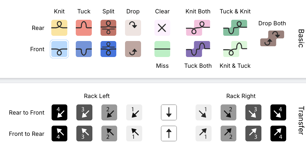
 knitout stitch types
B led the workshop, first giving an overview of the kniterate editor (free to use!), and then using the machine to knit out one of the files. It’s interesting, now having worked with the CMU knit tools, comparing the construction of the kniterate files both to their interface, and the eventual knitted design.
 the 100-stitch template cast on
setting up the file
The first thing we did was to set up a 100-stitch cast-on file to use as a template. All the different operations are managed in ‘layers’. While the name invokes something like Photoshop layers, these reminded me more of the process tracker bar in Fusion 360: though it seems that, unlike in Fusion, if you go back and change something earlier in the design the changes don’t cascade. (this makes me wonder what a parametric design tool for knit would look like).
It was also interesting to compare the kniterate interface both to the knitout visualiser, and to the eventual results of the knitting. The cast on section, for example (in the kniterate software) has a complex sequence of bringing in the different feeders, which means the yarns end up in the correct position.
In the photos below you can see how the two rows of yarn 1, the drawthread, (orange in the kniterate interface and bright pink in the sample), are integrated into the design. Yarn 6, the waste yarn (green in the interface and orange in the sample), alternates between the back and front beds initially, before a row of the main yarn (yarn 4, double stranded blue/yellow in the sample) is brought in.
the cast-on section in the kniterate file (left) vs the actual cast-on (right). The machine freaked out after the first couple of rows of the main yarn, so the orange waste yarn starts again after a couple of rows.
The other thing that this made me realise was that an obvious first step for improving the behaviour of knitout on the kniterate would be to simply attempt to duplicate the exact cast-on pattern used by the kniterate software itself.
At present, the waste section appended by knitout-backend-kniterate has a number of similar aspects – the row where the rear stitches are dropped, followed by the drawthread row (the last row of purple waste yarn, then red drawthread) seems to be the same as in the kniterate file. Similarly (but harder to see), the section of waste yarn where the front and back-bed stitches are alternated is followed by a few rows of them being knitted separately (you can see this in the knitout visualiser when the threads cross back and forth) is the same in both files. However, the knitout equivalent is missing the rows where the main yarn and drawthread are being brought into work, which might be partly why the machine struggles to knit these files.
comparing to the equivalent section in the knitout visualiser
rib and knit structure
 a plated cable sample by Helen Sharp, where the alternating colours are caught by front (pale) and rear (dark) beds.
 the configuration of yarn in the kniterate feeder required for plating
Once we’d made the template file, we used the rest of the workshop to explore knit structures using ribs. The Kniterate machine supports plating, a knit technique where two yarns are placed into the same feeder, layered so that one yarn will tend to be in front when knit by the front bed, and at the back when knit by the rear bed.
 some of B's samples that use plating. Note that sometimes the front/back bed catching isn't perfect -- you can see the rear yarn coming through at the edges of the wavy orange sample, creating a slight marl. In the top sample, the brighter green yarn also has higher elasticity, creating a difference in texture.
Plating can be used to create colour variation without using fairisle or jacquard, and instead by alternating stitches between front and back beds. One of the students was even wearing a plated jumper, with the shape of a horse outlined as a flat area surrounded by alternating ribs. It was cool to learn how a fabric I’d seen around was constructed!
 layers in the rib file (I learned later that each set of transfers didn’t need to be done separately…)
The other nice thing about plating is that it doesn’t require anything complicated in the pattern – the colour variation will be provided by the existing structure, so the only thing we needed to do was learn how to make a rib.
To start editing the file, we added a ‘free edit’ layer – these allow you to change the type of stitches being used. I used the paint tools to add sections of rib, alternating columns (wales) of front and back bed knitting. In order for this to be safely knit by the machine, transfers also need to be added. For this, a layer called ‘Front <> Rear Transfers’ is used, which will automatically plan transfers in a selection.
 the bindoff section
You can see in this sample that adjacent transfers take place over multiple rows – this is to decrease the likelihood of the thread breaking. For complex transfers, this can extend to several rows.
The last part of making a pattern is adding a bind off, and going through the checks process. The checks will highlight things like, for example, the bindoff starting on the wrong side (it will throw this error by saying the ‘float’ is too long – as the carriage has to jump from one side to another). The bindoff itself looks like a huge triangle, but it’s similar to the transfers in that it’s just moving and binding off one stitch per row – the end result is just a neatly knit straight line.
knitting out
The file we ended up knitting was one made by Rosie, who is the other e-textiles technician at CCI. She’d gone with a pattern that spelled her name, using a similar technique of the horse jumper of a flat area surrounded by ribs. After a couple of false starts (with feeders ending up where they shouldn’t be), the machine knit it out!
 Rosie's plating rib sample
final thoughts
In some ways, I’m struck by how much less informative the knitout stitch visualiser is than the kniterate one. It feels like the difference between a tinkercad drawing and a circuit diagram – with the former being more useful for people with no electronics experience in representing how a circuit will look, but being ultimately very limited in terms of participation in the wider symbolic language of the field. Even spending a morning with the kniterate visualiser, the symbolic language is so much clearer.
Perhaps this makes sense – the knitout visualiser was designed by non-knitters / the text parallel (which is super useful) provides a specific understanding of the pattern. But I do think making a visualisation interface readable by knitters seems pretty important, and is maybe another step that’s needed in developing the tool.
A tinkercad pictoral representation of a circuit (left) vs a circuit diagram, or schematic representation (right). Although the picture can be easier to make sense of for a beginner, it's much harder to clearly read and analyse the circuit, making it much less usable for someone who needs to understand the circuit (and in a sense, much less malleable)