Friday, 29 May 2026
Please enjoy this article on its own webpage. Trust me.
dickover n. : a modal panel, popover, or curtain presented by a website or app, deliberately obscuring its own content to frustrate the user with an unwanted, unnecessary, mandatory interaction; e.g. asking the user to accept “cookies”, subscribe to a newsletter, install the website’s mobile app, agree to terms of service, or anything else that the user couldn’t give two shits about.
You know what a dickover is, even if you didn’t know what to call it (until now). If you use the Internet, you encounter them every day. They’re popovers, but dickheaded. The web is absolutely lousy with them, and mobile apps present them too, with increasing frequency.
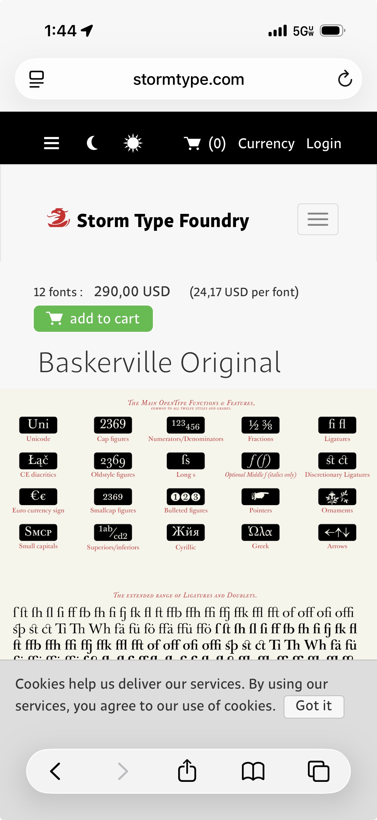
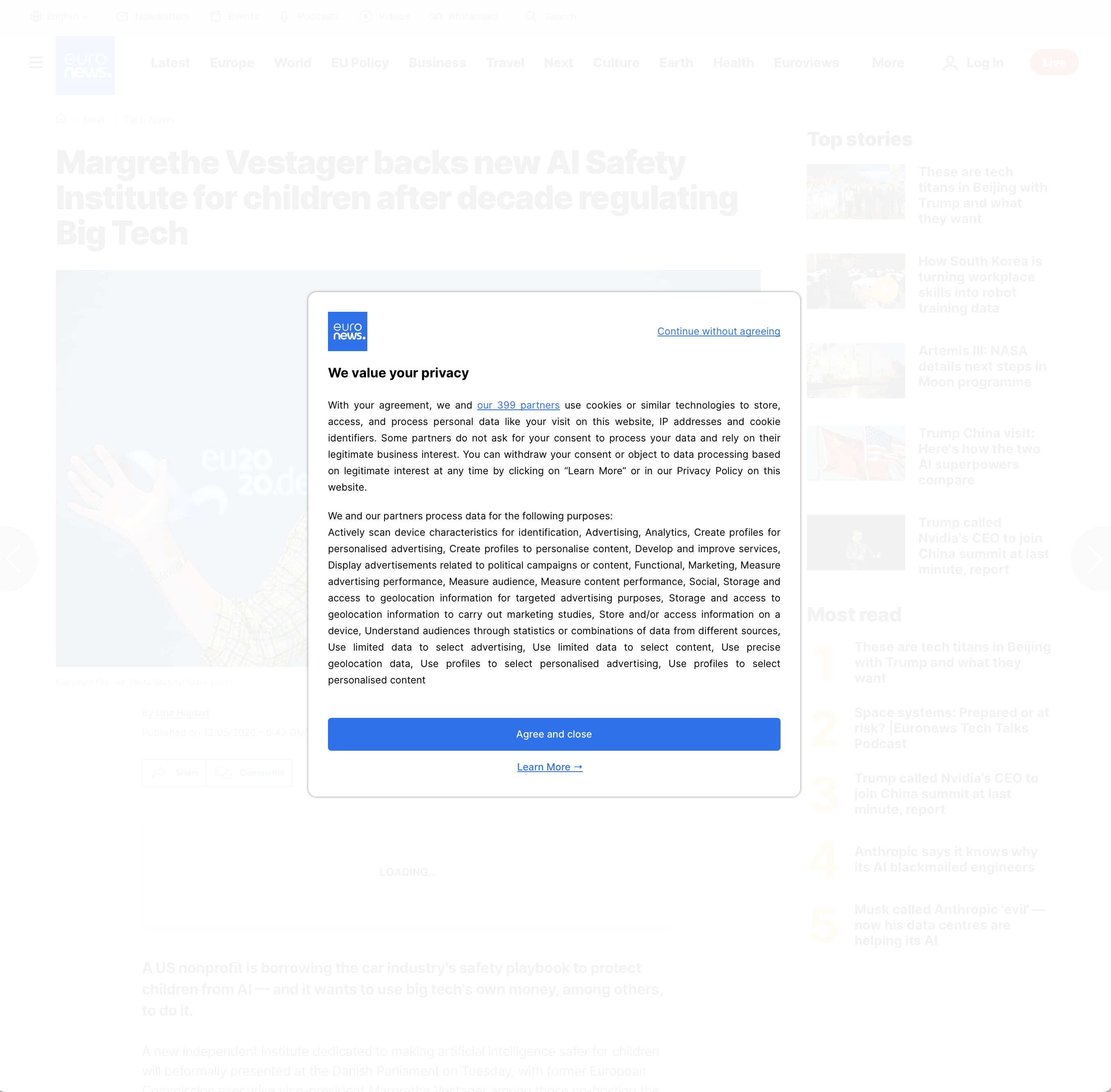
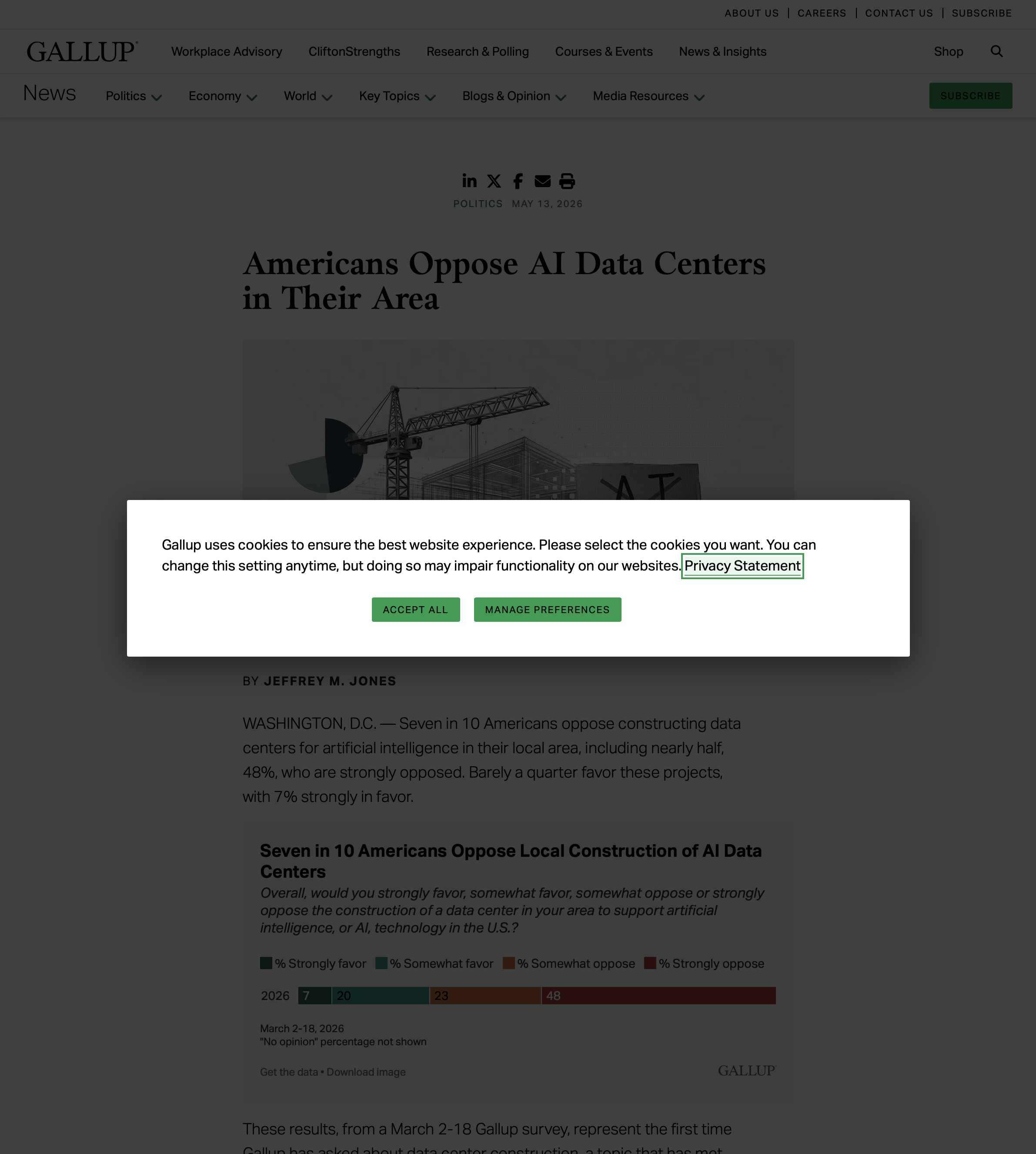
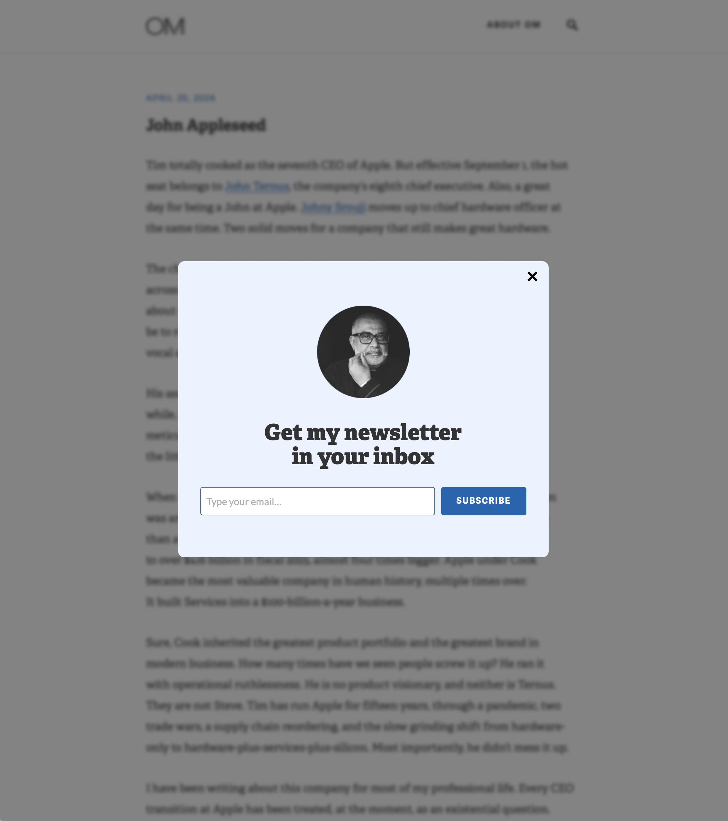
Dickovers are a veritable scourge. They’re so common they’re effectively part of the firmament. I started calling these things dickpanels in 2022, but when dickover popped into my head last week,1 I couldn’t shake the feeling that it’s a better term for these ubiquitous odious irritations. You can hardly go anywhere on the web without getting dicked over by a dickover. They often pester you about permitting cookies, like this one from Euronews or this one from Gallup. This malicious design pattern is so ubiquitous that it has spread even to personal blogs, like this one from my friend Om Malik, and to great brands like Field Notes, both asking you to sign up for their newsletters.

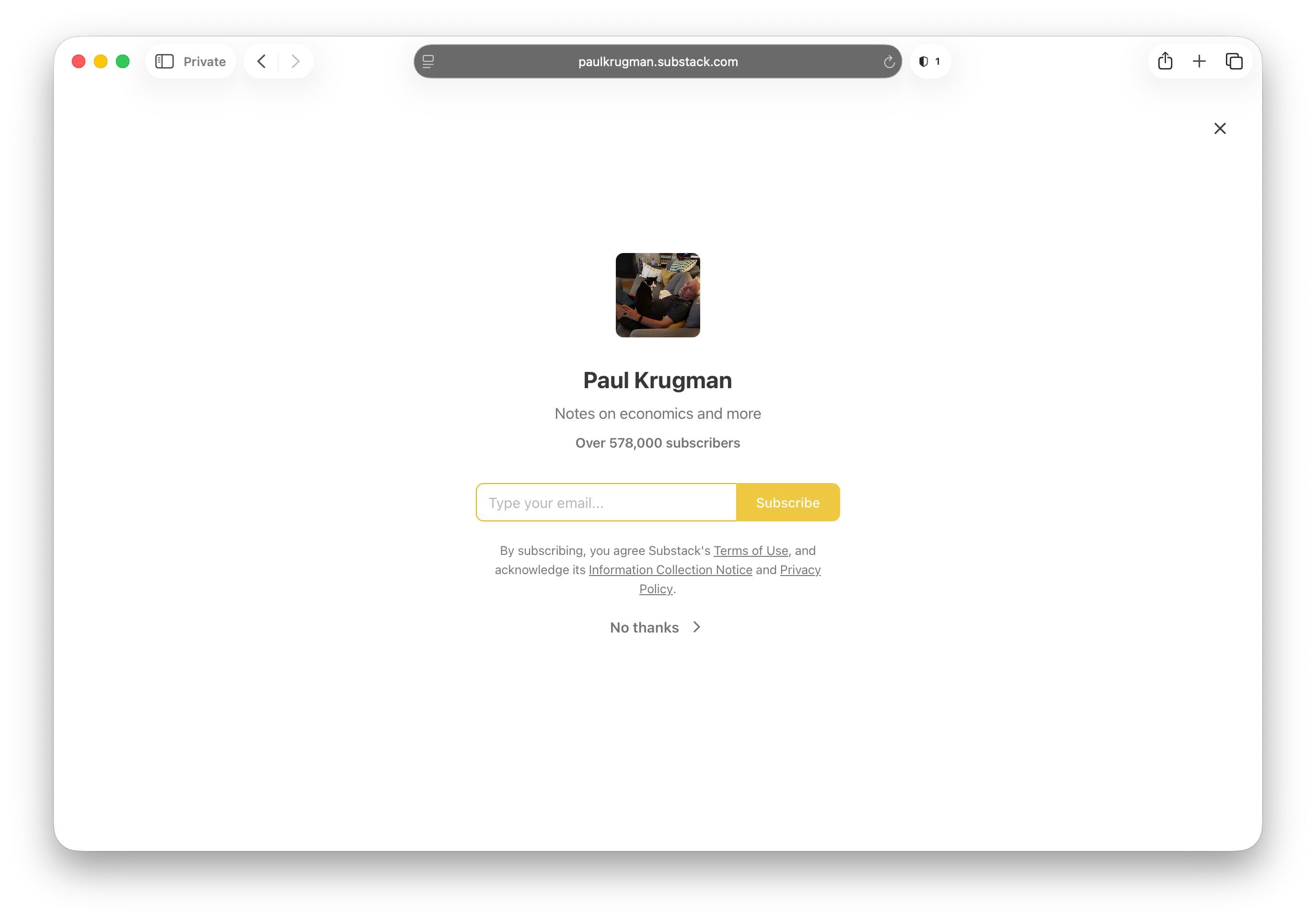
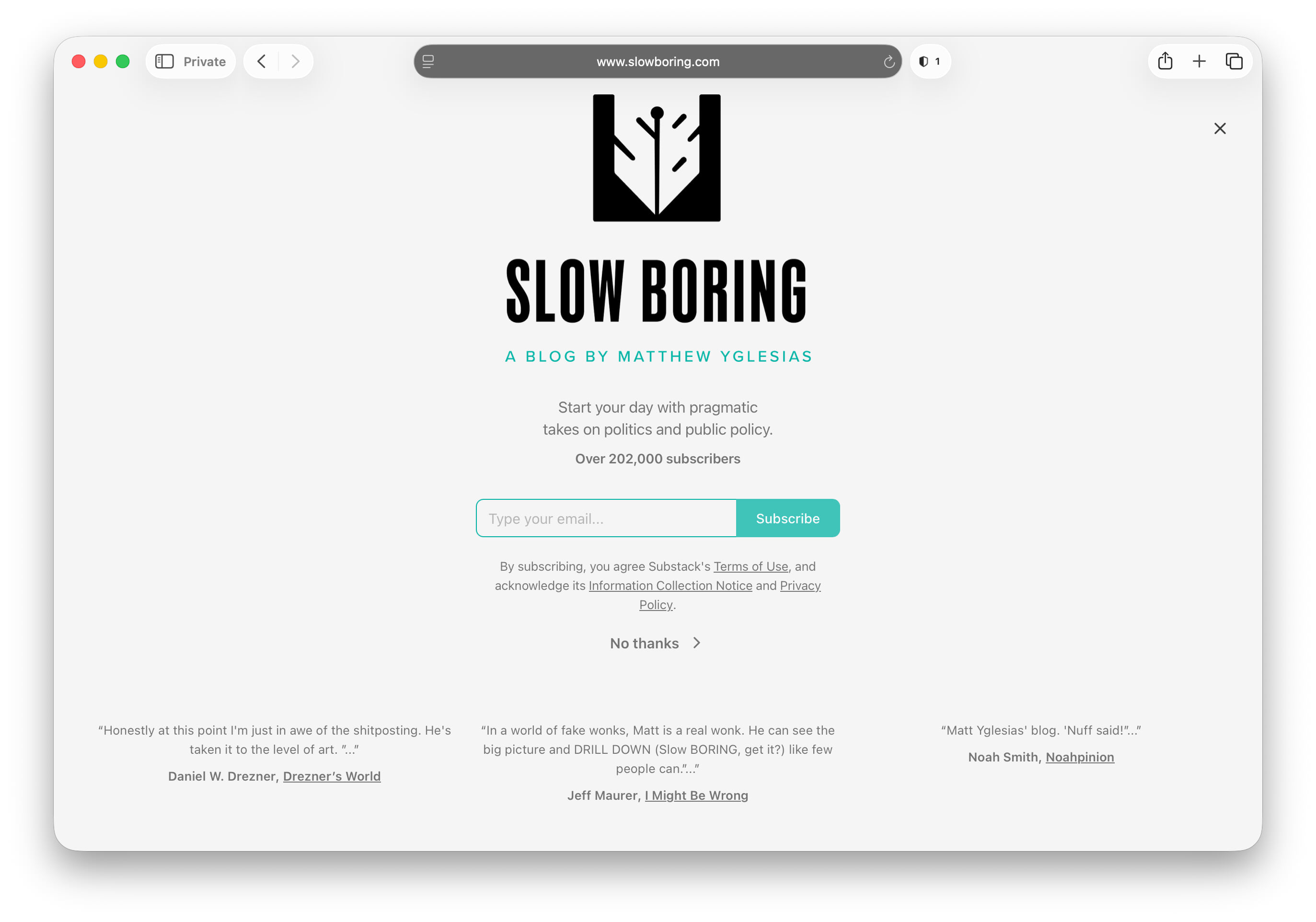
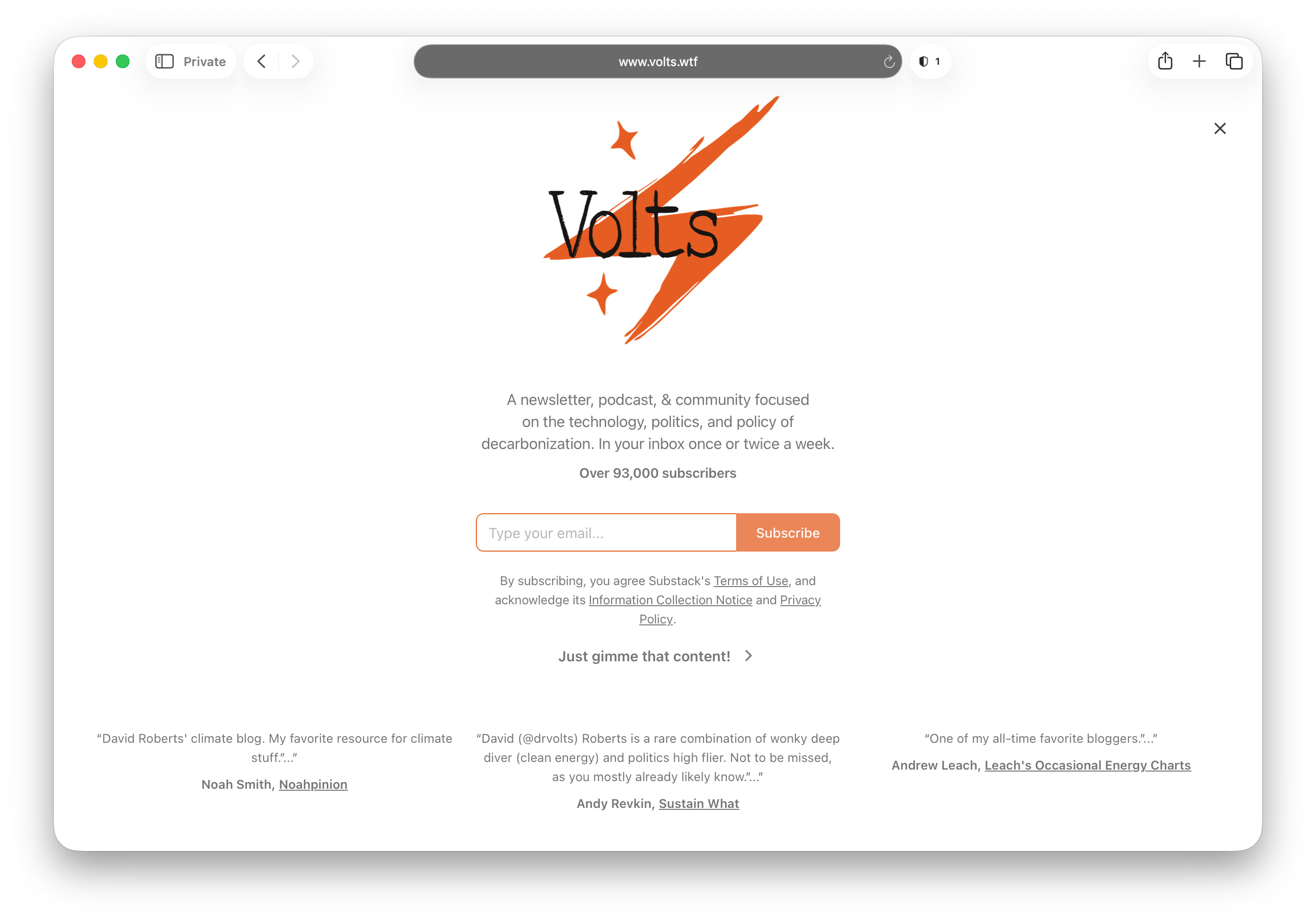
The homepage for every single blog hosted by Substack shows a particularly pernicious dickover on its homepage. The Substack dickover doesn’t even look like a panel. It’s a full-screen curtain designed and worded to suggest, strongly, that you need to sign up for the blog’s email newsletter just to read anything. The dismissal button for the Substack dickover is a small text link — that doesn’t look anything like a button — that says something like “No thanks” (e.g. Paul Krugman, Matt Yglesias) or something that adds insult to injury with a cloyingly saccharine label like “Just gimme that content!” (e.g. Volts).
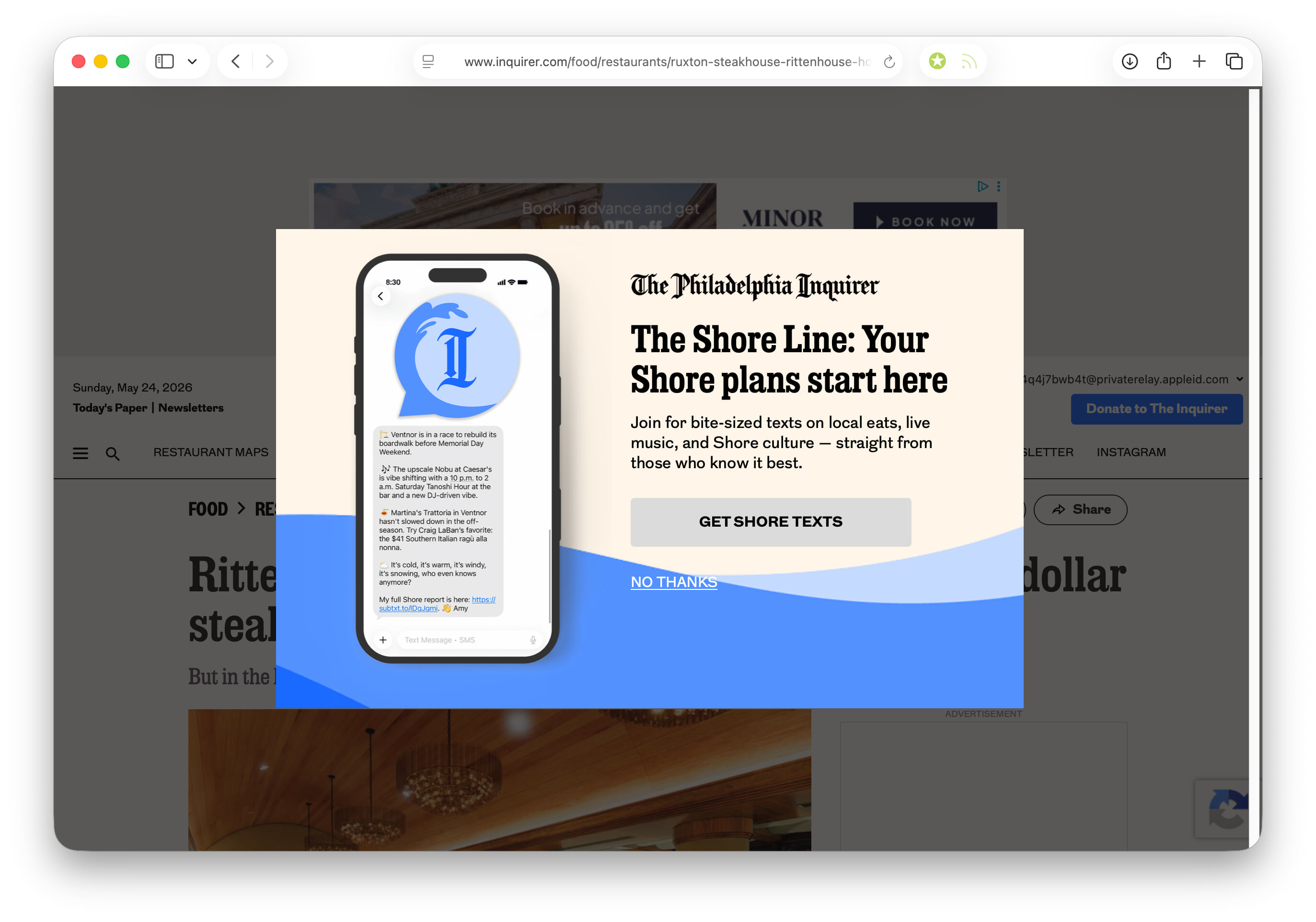
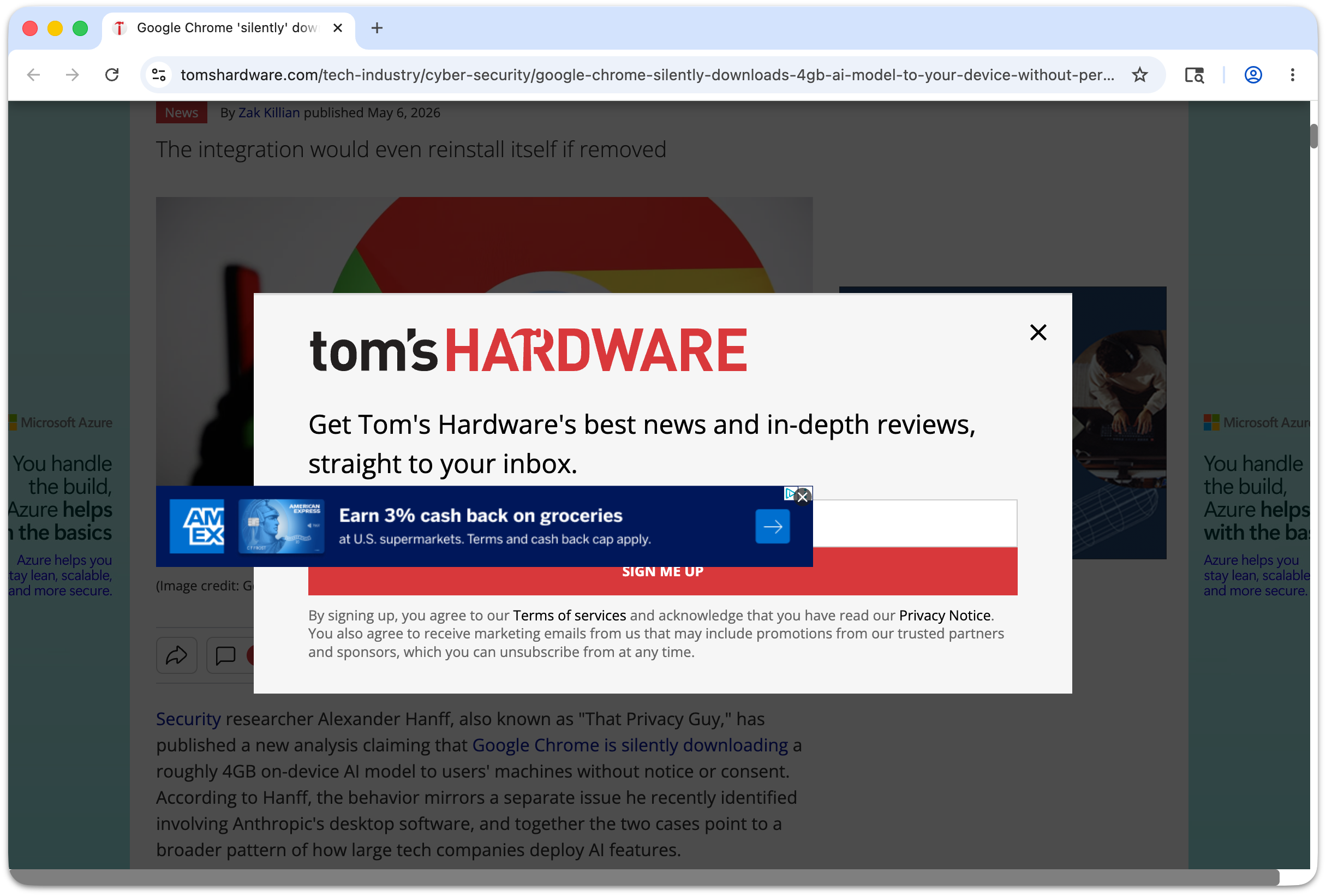
Here’s one from The Philadelphia Inquirer, for which I pay $20/month to subscribe, asking me to sign up for SMS text messages about the Jersey shore, while I’m logged into their cursed website, before they’ll let me see the article I came to read. Every time I see one of these I think about unsubscribing. I’m paying them to abuse my time and attention. I started capturing screenshots of every dickover I saw when I started working on this article, and I soon had to give up because I was collecting too many of them. But this one from Tom’s Hardware I actually enjoyed, because their own dickover got dicked over by one of their own fucking ads in a JavaScript Z-axis slapfight.
If you visit a website you should ... see the website. See its content. Be able to read the article whose page you are attempting to visit. Showing a “subscribe to our newsletter” or “accept our fucking cookies” dickover to someone trying to read an article on the web makes no more sense than sending out an email newsletter that only contains a link to read the newsletter on a webpage. A webpage should show the webpage. An email should show the email. I should not have to explain this.
Some sites hit you with their dickovers on page load, when you might be braced for it. We’re all braced for obstacles and annoyances these days when we load web pages. But some sneaky, cowardly bastards sucker-punch you with their dickbars only after you have started reading, and begin to scroll down the page. Then, wham, they hit with their dickover. It’s a goddamn privilege for anyone to bestow your article, story, or product page with their attention. The gall, to deliberately interrupt them while they are in the middle of actively reading, to present them with a dickover. It is no different from snatching a physical copy of a book or magazine out of a reader’s hands in order to badger them for something other than the attention they were already granting your work, except that the physical act of snatching a publication from a reader’s hands would subject you to being punched in the face.
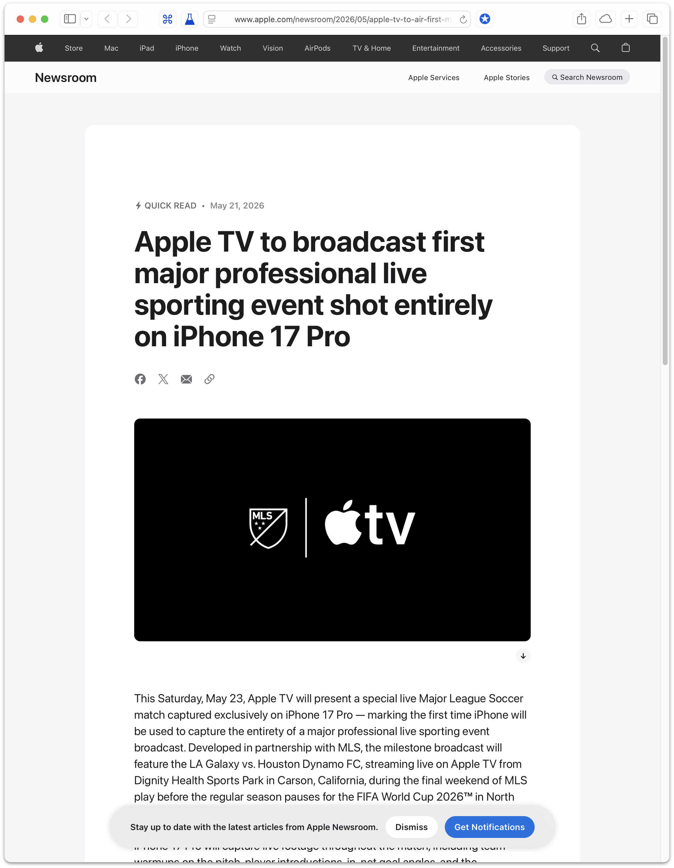
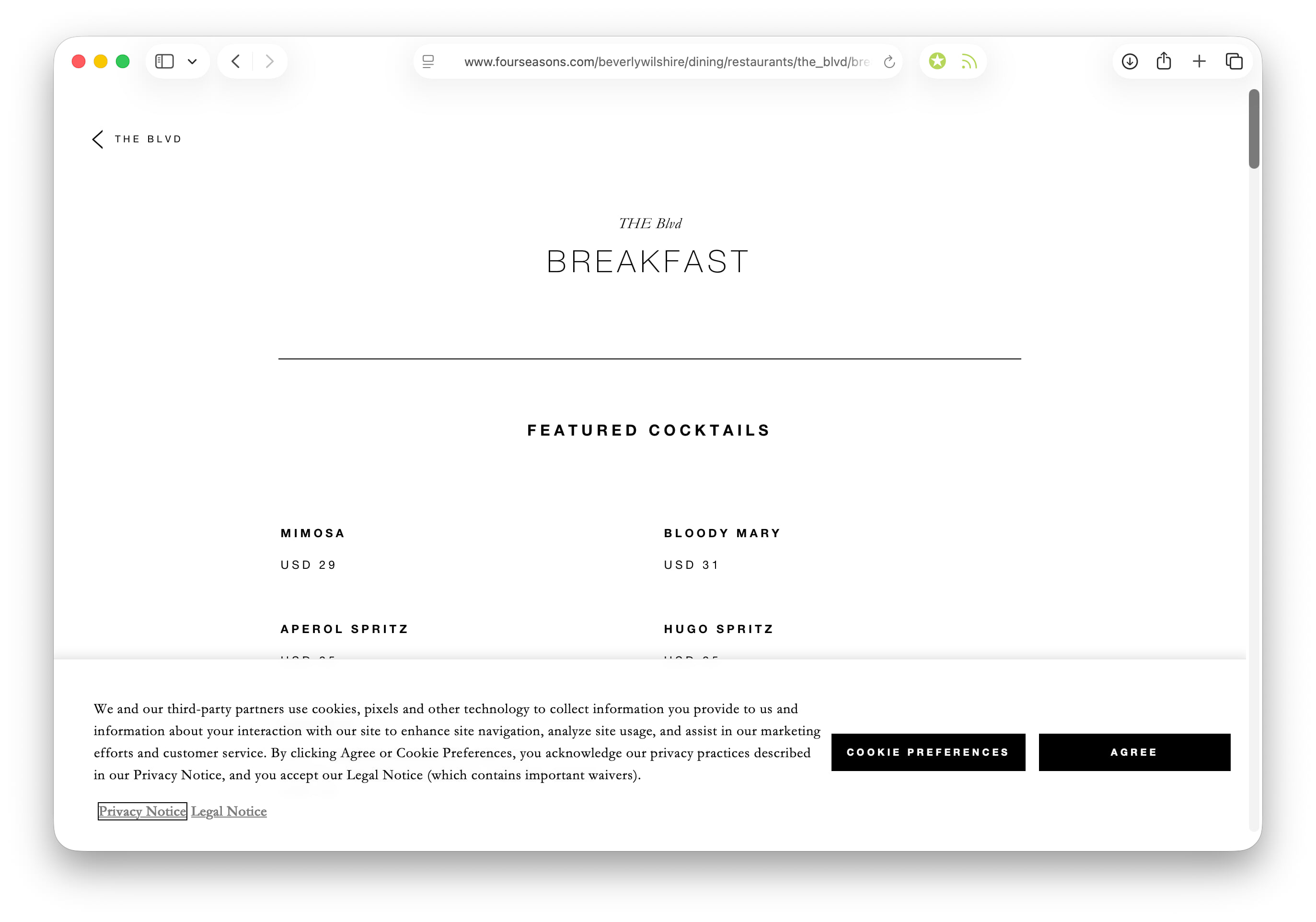
Dickbars are related to dickovers, but are far lesser crimes against design and user experience. A dickbar is a non-modal popover that obstructs only a portion of the underlying content, often just a short horizontal strip. If dickovers are design felonies, dickbars are misdemeanors. Here are typical dickbar examples on desktop and mobile layouts. Here’s a relatively attractive one from Apple on its Newsroom blog, and one from the excellent Acquired podcast that is gracious enough to tuck itself into a corner. Here’s an obnoxious one from the Four Seasons that is large enough to edge toward dickover consideration. What makes dickbars lesser offenses is that they do not obscure the entirety of the underlying content, and thus do not demand mandatory action to dismiss them. You can view and scroll the page below them. What makes dickbars crimes is that they still obstruct and distract. (Horizontal dickbars, the most common form, interfere with paging via the space bar one screenful at a time. The content scrolls by the height of the webpage, not the height of the webpage minus the height of the dickbar. Thus the dickbar covers unread text each time you page down.)
All dickovers are modal blockers, but not all modal blockers are dickovers. A paywall sign-up / sign-in panel, for example, is not a dickover. Paywalls are, at times, annoying, but one of the defining aspects of a dickover is that they are unnecessary. Cookie permissions are unnecessary. Signing up for an email newsletter is unnecessary. But for paywalled content, asking for sign-up / sign-in is necessary.