When preparing images for publication, it is good practice to check how accessible they are for colour blind people. Using a simple bit of code, it is possible to check an image – or a whole figure – in ImageJ for accessibility.
For example, Figure 1 from our recent paper. Originally looked like this:
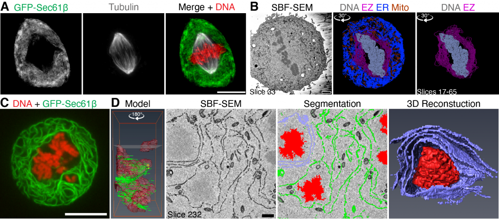
Using the script we can see how it appears to people with different types of colour blindness.
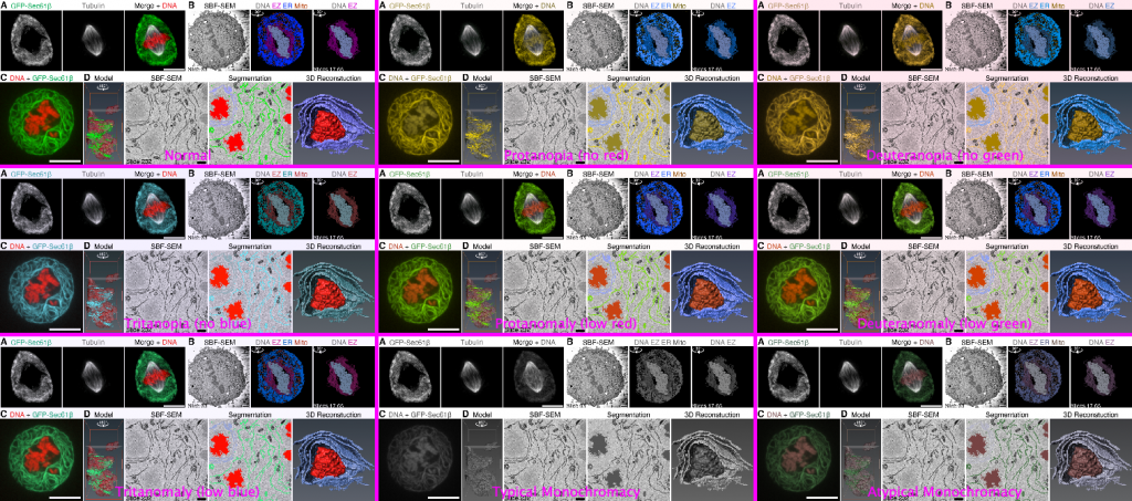
From this, we could see that panels A and C were problematic for folks with Protanopia and Deuteranopia. Panel D was also an issue but this was a still from a video that was difficult to edit.
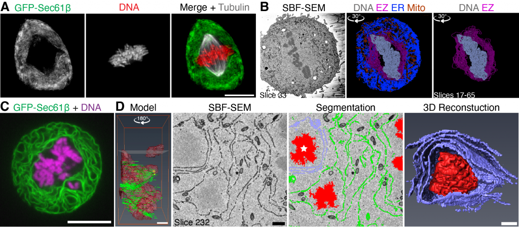
Some explanation and personal opinion here. The solution is not as simple as banning red/green overlays. Red/green overlays are very effective for most people to look at colocalisation and, with multiple channels, there are not many options. Our strategy is to show the separated channels in grayscale so that everyone can see the individual channels, even if they cannot distinguish the overlay. However, for C we had not done this at all and for A, it was limited. We also did not want to change the layout of the figure extensively.
Here is our solution:
And now checking it again with the script:
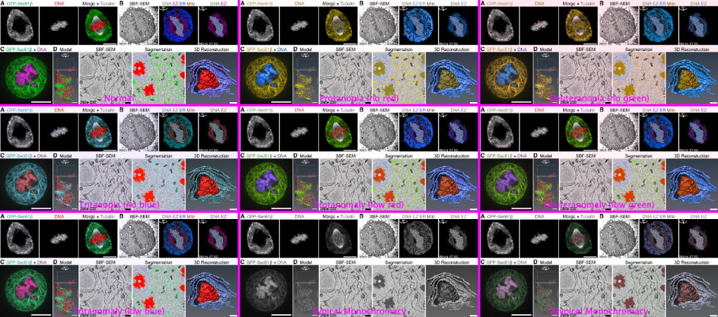
Panel D is now clearer for all kinds of colour blindness. Panel A is also OK (in my opinion), the DNA is not clear in the overlay for some colour blindness types, but now the separate channel is provided. The tubulin is well contrasted in the overlay so the merge did not need to change.
Feel free to try it out. I will probably add it to the quantixed update site in Fiji soon.
- In putting together this post I realised there was a typo in this figure. Luckily the wonderful folks at JCB corrected it before publication.
- The bulk of the code came from Henrik Persson, whose macro I found online
- I’d welcome any feedback from people with colour blindness
—
The post title comes from “Colorblind” by Super Furry Animals, a B-side to their Do Or Die single.