Recently, I bought my first-ever MacBook. I’ve spent some time with it, and I gotta say - despite all that hot garbage that is thrown at GNOME for being an OSX clone, GNOME does the job better than I’ve expected, and certainly better than Apple. In some areas, that is.
Good old days of Linux
A bit of a backstory.
I’ve been using GNUplusSlashLinux for more than fifteen years. Most of the time, I used GNOME, starting from GNOME2, moving to Unity maybe for two years, then GNOME Shell, then KDE Plasma 5 for another two years, and switched back to GNOME Shell again. I’m not mentioning some of my at most month-long endeavors to other DEs, like XFCE, or tiling WMs, because they never stuck with me. So I’ve been there for most releases of GNOME Shell, followed them closely, even used to run Ubuntu GNOME when GNOME Shell became a thing, until it became the default in Ubuntu once again. Though by that time, I had already moved from Ubuntu to a different distribution for a variety of reasons.
I wasn’t always satisfied by GNOME, and was a fair bit vocal about it in the past - even got myself banned from r/gnome subreddit, for shitting on it too much. That’s why I experimented with other desktop environments, particularly Unity and KDE.
Unity felt like a breath of fresh air after GNOME2, mostly because Canonical took years of people trying to make GNOME2 more OSX-like, and made decent steps in that direction. A global menu, HUD, blur, buttons on the left - you name it, it was there. Granted, it wasn’t an OSX clone - rather, it was its own thing, and I still remember Unity days fondly.
I switched to GNOME Shell almost instantly as it was released as Ubuntu GNOME spin, and while it was a bit janky, Unity started to lose steam, and GNOME looked like a hot new thing.
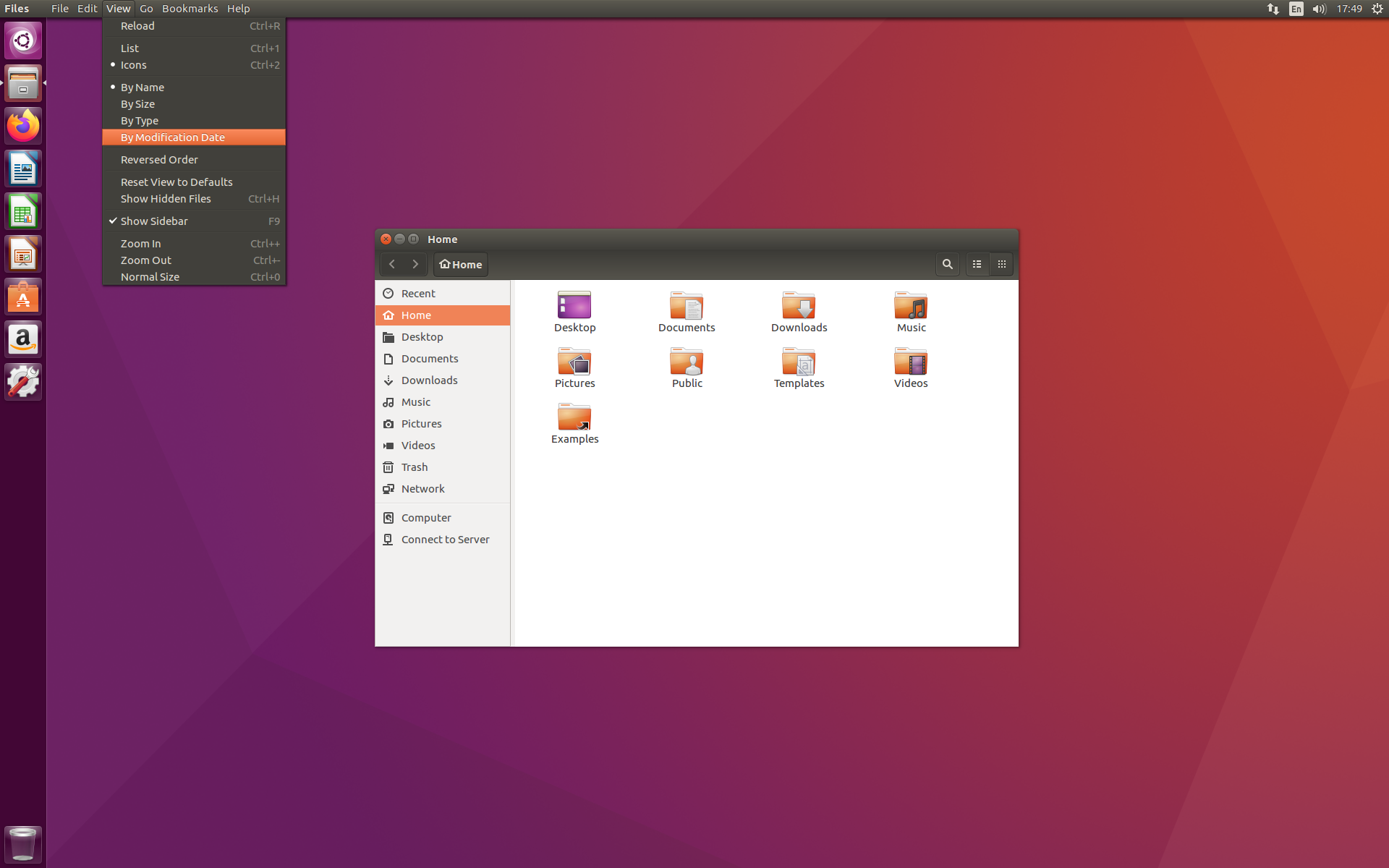
Figure 1: Anyone else remember that wallpaper? GNOME sure has come a long way
I did, however, run Unity on my older PCs, as it was far less taxing on resources than early versions of GNOME3, but then it was discontinued, and long-awaited Unity 8 with Mir never became a thing. So, when I was fed up with GNOME being a resource hog, often crashing, and moving towards Wayland, which didn’t work as good as it was advertised, I decided to try KDE somewhere around 2018.
And boy, how wrong was I, thinking that KDE is a buggy mess that would drain my resources even worse than GNOME. KDE Plasma 5 was nothing like I imagined - it was fast, lightweight, and slick. As a fan of old Unity design and OSX looks, I’ve configured my plasma, but it wasn’t a full clone, as other people often did. Instead, I tried to keep Plasma look like Plasma, but feel like a mix between Unity and OSX:
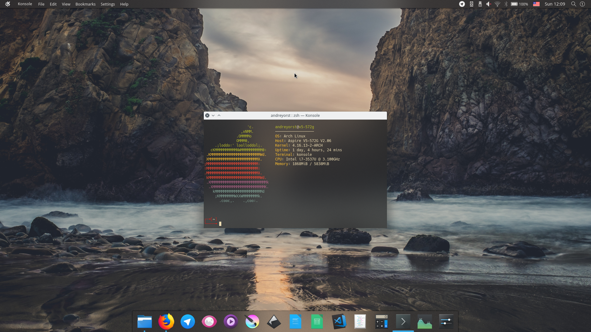
Figure 2: To this day, I still think this was beautiful. I’ve spent a lot of time fiddling with icon spacings in the top panel, combining widgets, writing my own in QML, just to throw it all away, a few years later
I’ve run Plasma 5 for about two years, and while I was enjoying it, there still were a lot of jank, bugs, occasional crashes (although Plasma recovered from them beautifully), but GNOME also became a lot better. So I switched back to GNOME, and I’m still running it on my old laptop, where I’m writing this part of the text right now:
Figure 3: GNOME 42 (Note, I have a 2K display and use GNOME without scaling with enlarged fonts. Helps a lot with too big GNOME UI elements taking up space)
As you can see, there are no fancy extensions - everything is the same as in a stock Fedora Workstation, because it is a stock Fedora Workstation. And I love it.
Over the years, I had a love-hate relationship with GNOME, but after a while, I came to accept it as it is, and now it feels like a perfect desktop environment for me personally. That, of course, is thanks to GNOME developers actually trying to make GNOME better, and me buying into their vision of what an OS should look and feel like. There is still some jankiness to it, but I’m willing to overlook it at this point, because after years of searching, I couldn’t find anything that suits my workflow better. And I’m fine with that.
A disclaimer
Before I go crazy on bashing macOS, I need to make a disclosure - I AM BIASED. I’ve been using GNOME for a lot of time, and a lot of things that feel logical to me may not feel logical at all to others. Especially for macOS users.
I’m fully aware of that.
Now, with that outta the way, let’s begin.
A new laptop
As I mentioned, I’ve just got myself a MacBook. I did it because today’s laptop market is a bit odd. It’s hard to find a decent non-gaming laptop with good specs. I mean, there are Lenovo ThinkPads, ThinkBooks, and even IdeaPads that are decent, but I already owned an IdeaPad, and while it served me for six years and I liked it, I don’t know if I want another one. Other brands may offer similar hardware, but I didn’t investigate much.
One of the reasons is OS choices. You see, I have run Linux as my main OS since around 2008. But I still have to use Windows from time to time. During university years, most of the non-programming software was Windows-only. After university, I had to use Windows to do media stuff, like music recording and video production, or design.
Design is probably the only task Linux can handle without much of a hassle, given that there are decent programs for that. For instance, I don’t mind GIMP, Krita, or Inkscape for most of my image-related tasks. I can even do video editing in Blender (and I do), but for some reason, it just works better under Windows. Audio production - not a chance. You’ll find me dead in the ground before I figure out how to set up a realtime kernel and configure Jack. Not to mention, VSTs just don’t work because many are relying on Windows APIs, and patching them through Wine is not a path I would like to walk.
So I had to use Windows, constantly rebooting from Linux to it every time I wanted to record myself, or work on some video for my channel. And I also had to use the one that came with my laptop - 6 years ago, it was Windows 10.
My parents recently got a new laptop with Windows 11 on it, and my god, it is horrible. After using Linux for more than fifteen years, I can’t even imagine how Microsoft is still able to get away with it. Ads are everywhere - on the lockscreen, in the start menu, in notifications, etc. You can’t even activate it without connecting to the network and signing into a Microsoft account.
Oh, and updates. Fucking updates are being forced, while I’m waiting for the next 5 hours until my video finishes rendering, because my laptop is too old to render in 4K.
Yes, it’s possible to “debloat” Windows, remove most of the jank they added, disable automatic updates, and have a decent, clean experience. I just don’t want to do that. The whole point of an operating system, to me, is to stay out of the way while managing resources, processes, and making sure my shit is done without major hiccups.
Now, when Windows 10 support is ending, all we’re left with is Windows 11, and god knows what bullshit awaits us in Windows 12.
So I thought to myself: “Ok, I like Linux, but I want to be able to do my media-related stuff, and I don’t want to invest in making Linux be able to do so. What options do I have other than that?” I just applied to a new job, and almost everyone there uses a Mac, and many of them are musicians, either hobbyists like myself or even professionals. After asking around, it appeared to me that switching to macOS could be the solution I’m looking for. It’s a Unix, so I guess my Linux habits won’t have to go through WSL hoops, and it has world-class support for media tasks. I think macOS can even be considered media-first when it comes to production, unlike Linux or Windows.
So I saved some money and got myself a new MacBook Pro, with M4, and decent specs. While the laptop itself is nice - I like the aluminium body, keyboard is nice (although I had an opportunity of using their butterfly one, and liked it better), the screen is gorgeous, and even the laptop speakers are great, but…
…but the OS…
macOS
This is the most counter-intuitive, user-unfriendly, confusing piece of software that I’ve used in my life. And I worked as a consultant in a cellphone store and used software for cashiers, yet it still was not as horrid.
I’m sure nothing I will write here will be new, and I’m committing an “internet crime” of “beating a dead horse” here, while it’s probably already reduced to vapors, but I still want to get it out of my system.
The Desktop
My laptop came with macOS 15 Sequoia preinstalled, so I haven’t used previous versions much, although I had used a Mac a bunch of times in the past when I was at the university ten plus years ago. However, I decided to immediately upgrade to the 26.1 Tahoe, so I wouldn’t get too used to the good-looking interface, and instead learn to get comfortable with this liquid glass crap. So I didn’t touch macOS for some years, and some things have changed, but the majority of annoyances I remember are still here.
Virtual desktops
As an ex-GNOME user, I like my virtual desktops. MacOS has had virtual desktops for a long time, but I think GNOME handled those better.
First of all, switching with the touchpad gesture feels a lot slower. In GNOME, it wasn’t an animation - the speed was tied directly to how fast you move your fingers, with easing after you release them. I got used to switching between desktops with a lot of speed, and on macOS, it’s not like that.
It seems it is also tied to the speed of the gesture, but it feels like there’s a cap on the maximum possible speed:
An additional feature of GNOME is that it will automatically create additional virtual desktops once you’ve filled all of them, and there’s no limit to how many you can have. I usually have 4-5 desktops, but when I’m not working on something, it’s nice that I can only have one or two.
In macOS, you can have as many desktops as you want, however, they’re not added automatically. Or at least I couldn’t find a setting for that. Because of that, even if I’m not using all of them, sometimes a stray window is sitting on the last desktop, and I have to go through all of them to get to it.
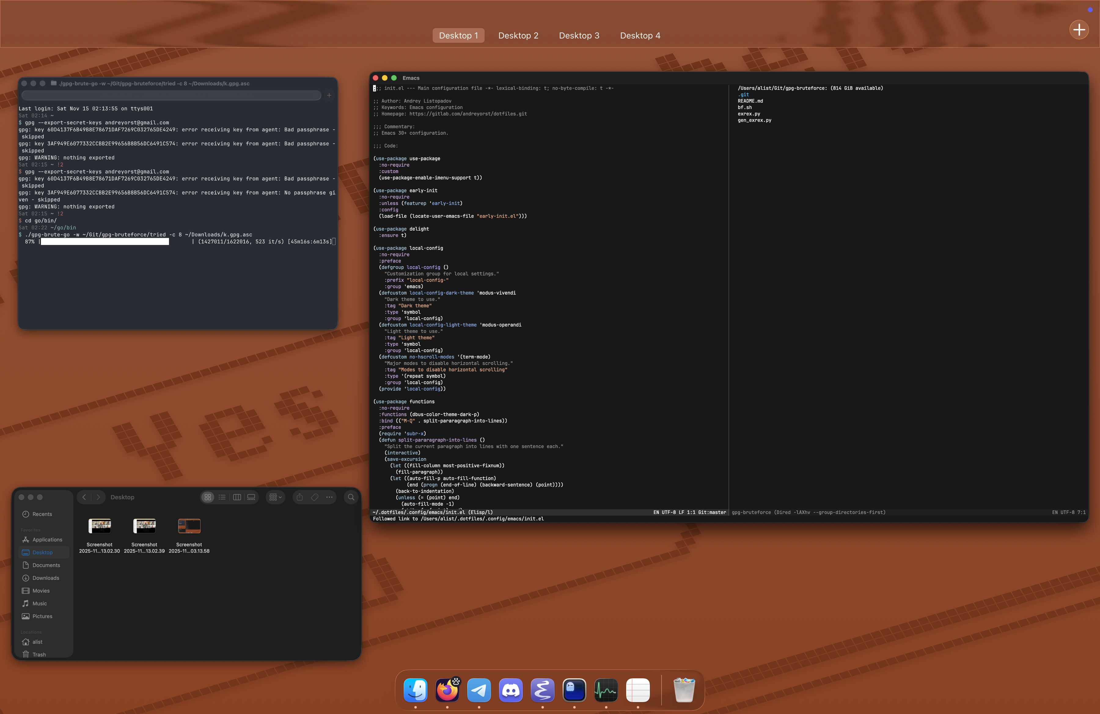
Fullscreen and maximize button
For some reason, the developers decided that the maximize button should instead act like a fullscreen button in macOS. When you maximize a window, it is moved to its own, dedicated virtual desktop - and I like it. I have used this pattern in GNOME for a long time by installing an extension that brings this feature into GNOME.
However, and it is a big however, in GNOME, when I maximize a window, it creates a virtual desktop next to the one I’m on. In macOS, it also creates a virtual desktop, but it moves it to the far right.
So, imagine I’m browsing the web, seeing something interesting, and I want to open Emacs to take a note. I open Emacs, maximize it, and on the desktop to the left of Emacs, I still have my browser, and I can switch between these back and forth. In macOS, if I do this, the window is moved to a desktop at the far end of the list of desktops. You can rearrange those manually, but it’s clumsy. I would much prefer if the desktop were created to the right of the current one.
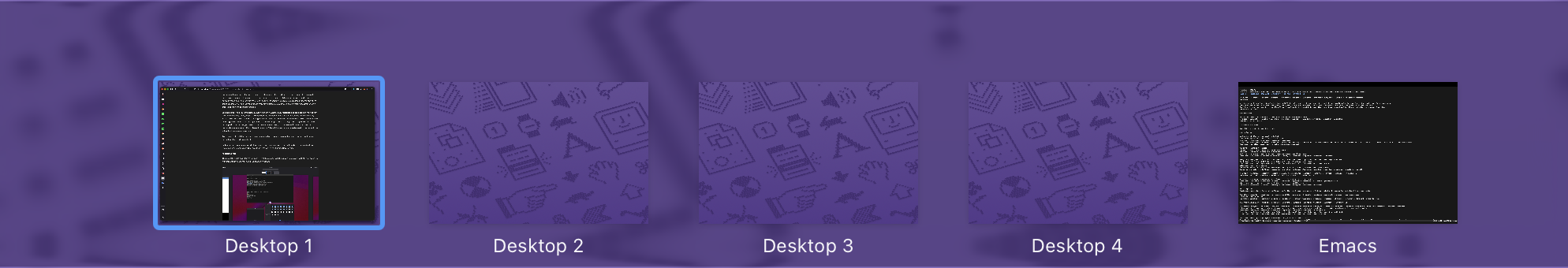
Figure 4: Emacs was opend on Desktop 1, but after maximizing it is now essentially at Desktop 5
You can prevent this, in some form, by turning on the “Automatically rearrange Spaces based on most recent use” in the settings. Then, a new fullscreen desktop is created to the right of the one you’re currently on, which is nice, however, then the spaces get rearranged all the time. Like, when you’re opening a link from the messenger, you switch to a desktop that has the browser open. The spaces get rearranged, such that the desktop with the messenger is next to the one with the browser, so you have to find the other one that previously was inbetween. It’s so bizarre that we can’t have fullscreen spaces created next to the current one without automatic rearrangement.
And, because it is a fullscreen mode, it also makes things go a bit haywire for some applications. Emacs doesn’t like this mode in particular.
Right now, I’m using four virtual desktops and manually organizing those, but maybe I need to adjust my usage pattern. Speaking of virtual desktops, let’s look at the Mission Control thing.
Mission Control
That’s another pain point for me. You see, GNOME also has something akin to Mission Control - you swipe up with three fingers, and you see all your open windows:

You can then move your windows between desktops or switch between them.
MacOS also has this, with the exact same gesture:
However, it is far less useful.
In GNOME, I can close windows in the Overview:

Figure 5: This close button is part of the Overview, not the window manager
I can tweak the dock:
Figure 6: Actually, the dock is only visible in Overview
I can start typing, and the search appears:

I can even swipe up again and bring up the applications menu:
Figure 7: Not that I use it that much though
There’s a lot of control! Wanna know how much you can control in the Mission Control?
You can move windows and desktops around.
…
That’s it!
What mission? What control? You can’t do anything.
Sure, one advantage macOS’ mission control has is that you can move entire desktops around - in GNOME, you can’t rearrange desktops themselves, only windows. And it plays nicely, with all this full-screen nonsense, but I still much prefer the GNOME approach here.
The Dock
Dock is a weird concept. It’s cool to have it, and I remember in my early Linux days I wanted a macOS-like dock so badly that I tried to make it out of existing panels and custom widgets. I installed various dock plugins in my desktop environments just to have it zoom in on icons when I hover over them. These days are long past.

Figure 8: remember Cairo dock?
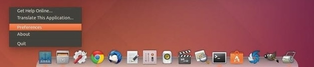
Figure 9: remember Plank?
GNOME made a smart decision to only show the dock when you’re in Overview - their “Mission Control” variant. You don’t need the dock constantly taking vertical space from your windows, and you don’t have to deal with it showing up accidentally when you simply hover the mouse pointer at the bottom of the screen. Or at the side of the screen if it is your thing.
When it is only inside the Overview/Mission control, it makes sense as a favorites bar and a way of switching between applications. I haven’t used Alt+Tab (or ⌘ command+⭾ Tab) in years because of that. I would much prefer for the dock to be only visible in Mission Control, but sadly, there’s no way of doing it in macOS, as far as I can see. Moreover, Dock becomes useless in Mission Control specifically, so it won’t work that well in macOS.
What baffles me is that when you close an app, it stays in the dock, taking up space. Again, there seems to be no way of disabling it. Disabling the “Show suggested and recent apps in Dock” in system settings doesn’t affect this behavior.
You have to either use ⌘ Q, or right-click on the dock item and choose “close”. What’s the red button in the window for then? Usually, the app simply continues working in the background, as if minimized.
Speaking of which, so far only the minimize button seems to work in a sane manner.
Sure, there’s little point in actually closing applications, given that this laptop has a lot of RAM and CPU power, but it always felt weird to me that apps want to stay open all the time. I’m done with you - why do you think that you’re so important that you shouldn’t be closed? Do what you’ve been told.
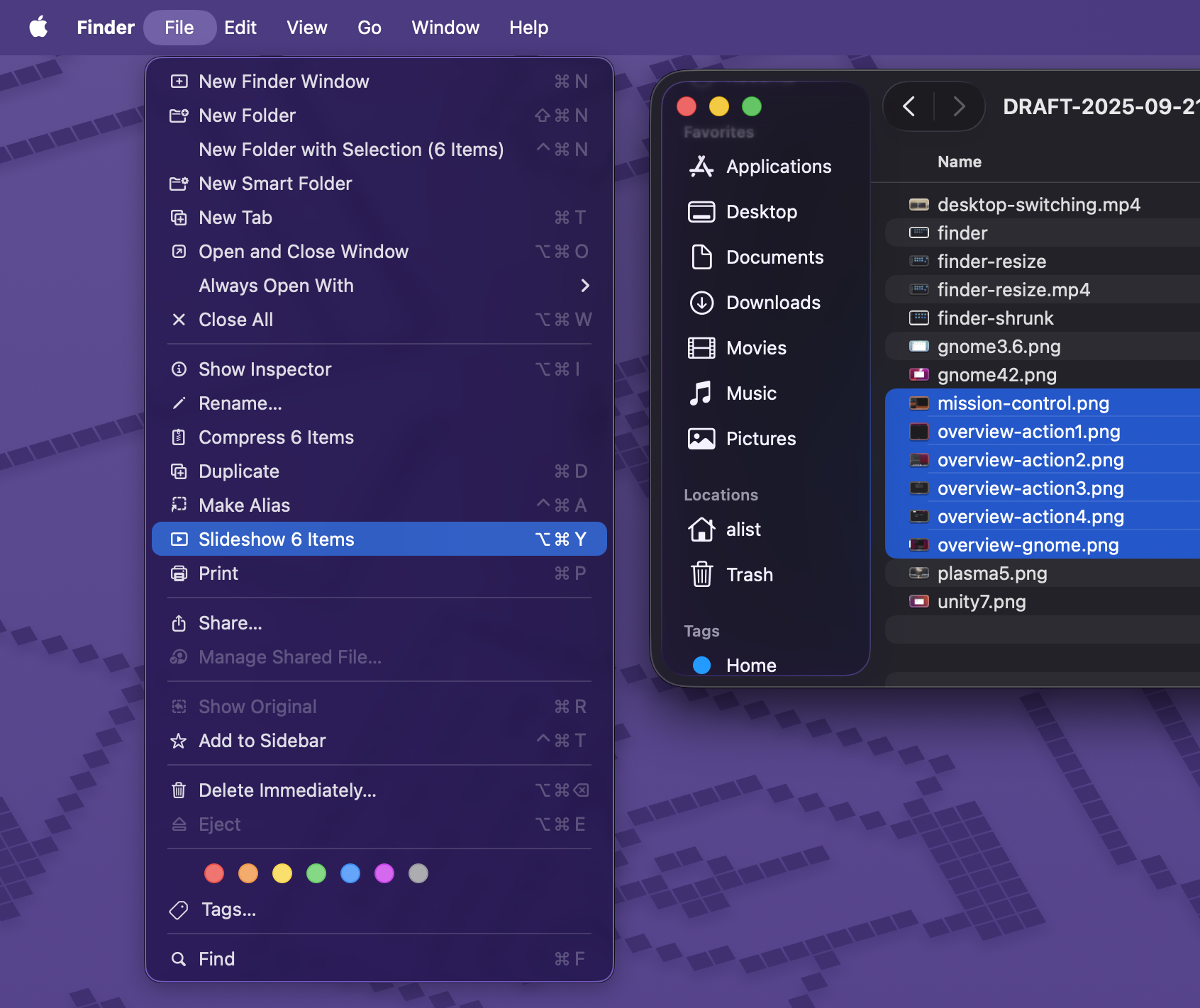
The Finder
Linux has always had weird file managers. To me, nothing beats Microsoft’s Windows 7 file explorer - it was the least BS one in my opinion. GNOME’s Nautilus, or Files, as it is called nowadays, had a few long-standing problems, some of which date back ten plus years. KDE’s Dolphin was nice, but too had some weird quirks. However, it’s nothing in comparison to macOS Finder.
See the screenshot?
A normal file view, right? Now, what should happen if I shrink the window?
The what? Who thought that this was a good idea? For those who didn’t get it, the grid of items remains the same despite the size of the window! Like, seriously?
The oddities don’t end there. Where’s the current path? For some reason, you can only see it when holding the ⌥ option, it appears at the bottom of the window. You can, in fact, toggle it in the settings so it is always shown, and while you can click on it to navigate, you can’t edit it, as it seems.
Another oddity is that when moving directories around, there’s no option to merge directories with the same name by default. I mean, when I move a directory to a different place, where another directory exists with the same name, I expect them to be merged, but the pop-up only says this:
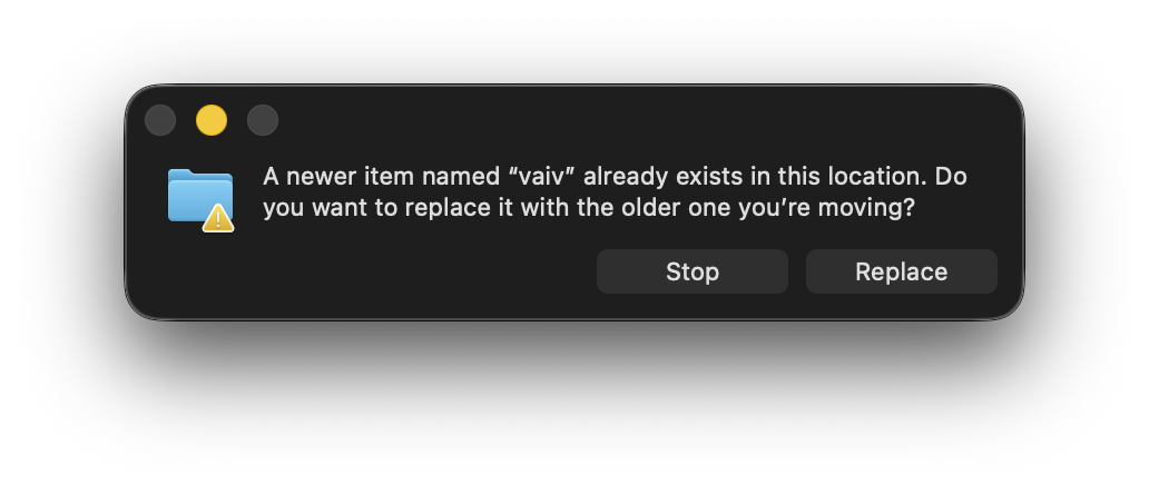
When the ⌥ option key is pressed preemptively and held during the drag, the option to merge directories appears:
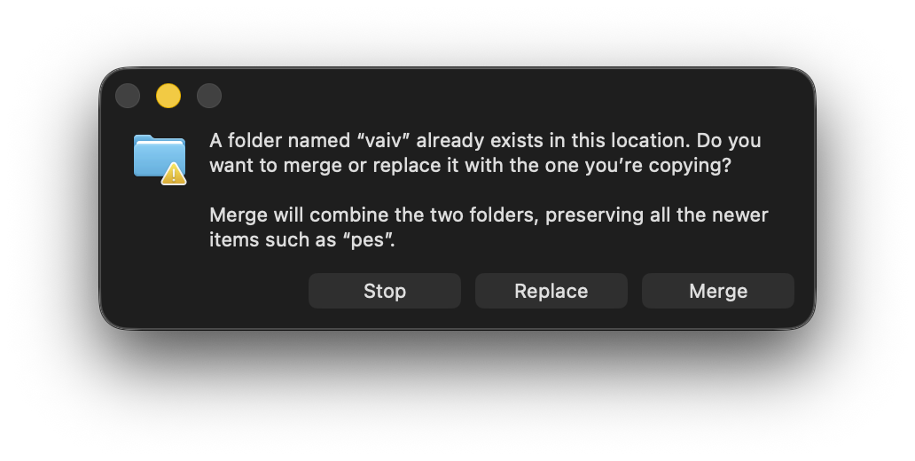
Like, you need to know, before the hand, that the target location you’ve chosen contains a folder with the same name you’re moving right now. And if you didn’t, you need to repeat the drag. Why not show it by default?
For the record, when the same thing is done in the GNOME file manager, it asks you if you want to merge directories, but you can’t replace them, so you can’t ever lose data. And if it contains files with the same names, it asks for each file if you want to replace it, or keep both. Of course, you can choose to replace all files, so it wouldn’t drag.
Cutting files is also super weird. You first copy the file as normal, then proceed to the directory you want to move the file, and press ⌘ command+⌥ option+v. Not only does the shortcut itself make your hand curl up as if you were a lobster, but also the semantics of this operation feel extremely weird - you copied the file, after all, why would it move afterwards? I guess, it’ handy in cases when you thought you wanted to copy the file, but you actually decided to move it, so you don’t need to input a whole new shortcut again, but it’s a minor win in my book.
Thankfully, I use graphical file managers rarely, so I can continue living in my comfort zone of Emacs’ DIRED.
Files and folders
But, while we’re at it, let’s talk about files in general.
I have some local music stored in the Music folder.
Some videos and films are stored in the Videos folder.
I also have pictures stored in the Pictures folder.
Crazy, right? Imagine using the file system to store files systematically?
I also try to keep things organized, so I manage all these with some directories, like band-name/album-name/track-name in case of music files, or year/place-name/photo in case of photos.
I like it because if I want to listen to something, I can just drop the folder into the player, or open the image folder and relive those moments.
Organizing these with folders is also handy for backing these things up - just drop the folder to the external drive and you’re good to go.
In macOS, as it seems, tags are the way the system wants to work with files. It’s a different approach, and I’m not entirely opposed to that, since filesystems are an illusion, after all.
But every once in a while, I open the Music folder, and I see a second Music folder inside it.
Apparently, it is created when opening the Music app.
I can’t use the Music app because it can’t play FLAC, which is what the majority of my local library is encoded in.
When I open the Videos folder, I often find a TV folder inside.
I’m not sure what app creates it, but it wasn’t done by me, as I never launched the TV app.
And it appears there far more regularly than the Music/Music one.
Other apps often create their own folders anywhere they want.
The OrbStack app creates an OrbStack folder in $HOME.
Some other app I installed created a folder in the Music folder for some reason, even though it didn’t store music in it, just some audio files.
It feels like that this is not my computer, but one I share with everyone else, and watch they do as they please with my filesystem. Never once was this a problem in Linux.
Why can’t apps keep their files to themselves?
I’m tempted to create things like Music/My Music, or Pictures/My Pictures, and use them specifically, forgetting about the default Music, Pictures, Videos thing, but it is such a cumbersome solution.
It feels like, when you invite friends to a party, and they go to your bookshelf, and decide that they’ll put some of their own stuff on it for the time being.
And when they leave, they forget to take their stuff, but you don’t want to touch it, as it is not exactly yours.
And you can’t throw it out, as your friends will be mad.
I don’t know.
The media viewer
Oh, the image viewer.
Let me ask you a question:
You have a directory with some photos. You want to go through these photos in the order taken and view them. What do you do?
In Linux, or Windows for that matter, the answer is simple: you double-click on the image you want to start with, the image viewer is opened, and you can use the arrow keys to go back and forth. Simple and effective!
What happens when you do it in macOS Finder?
Well, the image viewer still opens, but the arrow keys do nothing!
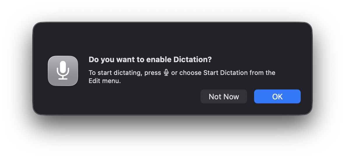
No, in order to go through images, you need to select the items you want to view, hover over the File menu in the top bar, press the ⌥ option key, and select “Start slideshow N items”:
HUH? Slideshow is cumbersome, as it is a slideshow - it’s not meant for going through images manually.
Alternatively, you can use a different viewer, called “Quick Look”, which supports arrow keys. Horray! But what is it? If you’re in grid view, why are the arrow keys following the grid too?
HUUUUUH?
Who thought that this was a good idea? Hopefully, I won’t repeat this question all too many times.
The only reasonable way of using it is by switching to the list view and using the up and down arrow keys. Which is still not great, because Quick View is meant to be viewed temporarily. Any accidental click outside of it will close it, and you’ll have to find where you were and start from there.
You can put it into fullscreen mode, but then the arrow keys stop working. This seems like such a basic feature for an image viewer, but somehow they’ve managed to make it unusable. Not only that, but if this folder has any non-image files, like text files or PDFs, they’ll be included in the quick view too.
I understand that the purpose of Quick View is to view files quickly, and often it is a great thing to have, but at the same time, it’s super weird in behavior.
Hardware accessibility
OK, I can go on and on about the software part of the os, but to be honest, all of this is covered by other people rather well. And, in truth, I couldn’t be bothered to try all other preinstalled software, because it’ll take a lot of time to put it into this already long article, but also because I don’t want to. For instance, the Music app is also weird, and I already have an extensive post about how Linux music players are weird, so it goes without saying that I’ll need to replace it with something else. Like, the Quick View can play FLAC without any issues, but the Music app (formerly iTunes, I believe) can’t. Even GNOME’s player could do that, and it kinda copies Apple’s Music app in some aspects. Reencoding all my library into ALAC - Apple’s equivalent of FLAC for lossless audio is not an option for me. I did it once before when I was a happy owner of an old 4th-gen iPod touch, but never again - it is pointless, there are better music players out there.
So to me, the silver lining is that GNOME’s inbuilt software is in a lot of ways better than one in macOS. And KDE has even better software than GNOME in a lot of cases. So instead, let’s talk about hardware oddities and their operating system counterparts.
The Microphone
So, while I do care about my privacy, I can’t call myself a privacy maniac. However, one thing I like to have in my devices is the ability to mute the microphone. It’s best when there’s a hardware switch for that, but it’s so rare that I’ve only seen it once in my life on some Lenovo laptop.
I mean, it’s simply more convenient to do that than switch to a specific application that currently uses the microphone and toggle it there.
So, on Linux, I used the microphone key found on my laptop’s keyboard. It muted the microphone in the system settings.
When I got my Mac, I examined the keyboard, and found almost all usual shortcuts - you can change screen brightness on F1 and F2, you can change volume on F11 and F12, and there’s the microphone icon on F5. So I naturally assumed that this was a button to mute the microphone, after all, my old laptop had it too.
I assumed wrong.
There’s no way to disable the microphone in macOS via inbuilt means. The only thing you can do is to manually set the volume input gain level to 0, effectively making the microphone deaf.
Wanna know what the microphone button does then? I’ll show you:
Yup, it asks you if you want to use the speech-to-text feature. Cool, right?
And you can’t change what this button does.
You can set a different shortcut for dictation in the settings, but look what happens when you press the microphone key:
It changes itself back to this button if you click “don’t ask again”! And then it asks you again once you press it! So what was the point of providing “don’t ask again” then?
Though I’ve managed to defeat this beast of a problem by writing some AppleScript. This script can be executed in the Shortcuts app, and by analyzing its output, we can rename the shortcut accordingly:
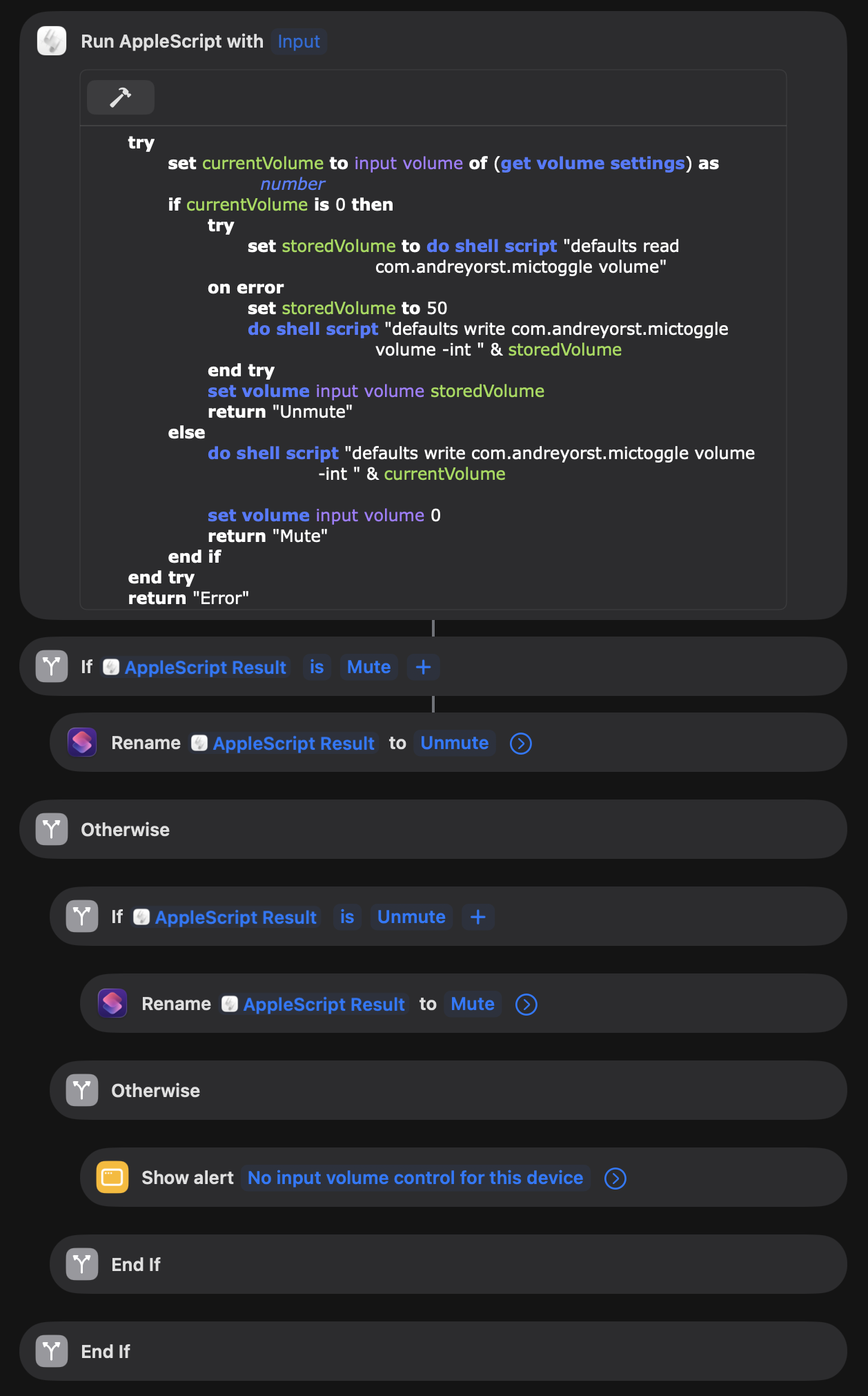
After adding this shortcut to the “Controls” menu, it acts as a mute button:
Works well so far, and even remembers the current input level value, so I can still adjust it if needed. Even more, it works better than it did on Linux, because it constantly forgot what level the mic was set to and chose a default value of 20%, which was too low.
Here’s a text version of the script, if anyone needs it:
on run {input, parameters}
	try
		set currentVolume to input volume of (get volume settings) as number
		if currentVolume is 0 then
			try
				set storedVolume to do shell script "defaults read com.andreyorst.mictoggle volume"
			on error
				set storedVolume to 50
				do shell script "defaults write com.andreyorst.mictoggle volume -int " & storedVolume
			end try
			set volume input volume storedVolume
			return "Unmute"
		else
			do shell script "defaults write com.andreyorst.mictoggle volume -int " & currentVolume
			set volume input volume 0
			return "Mute"
		end if
	end try
	return "Error"
end run
I can’t share the whole script because no way I’m making an iCloud account for that.
The keyboard layout
Not strictly about the hardware part, since the keyboard itself is pretty good. It’s a bit of a shame that Apple stopped using their Butterfly switches, as I did like them more than the current scissor ones, but the keyboard is still better than the one on my old laptop.
One thing that bothers me, and which I got very accustomed to, is the fact that GNOME can remember keyboard layout per window. MacOS can’t do that - and I don’t know what is the reason for that.
The settings page for layouts has a setting called “Automatically switch to a document’s input source”:
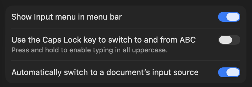
However, I’m not sure what it does. It seems to work sometimes, but other times it does the opposite of what I want to. I only have two layouts. Is it that hard to keep track of that amount of data per window?
The keyboard layout (physical)
Though let’s touch the keyboard one more time. I know that Apple has at least two keyboard layouts for different markets - one for the US and one for Europe.
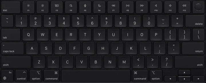
Figure 10: US layout
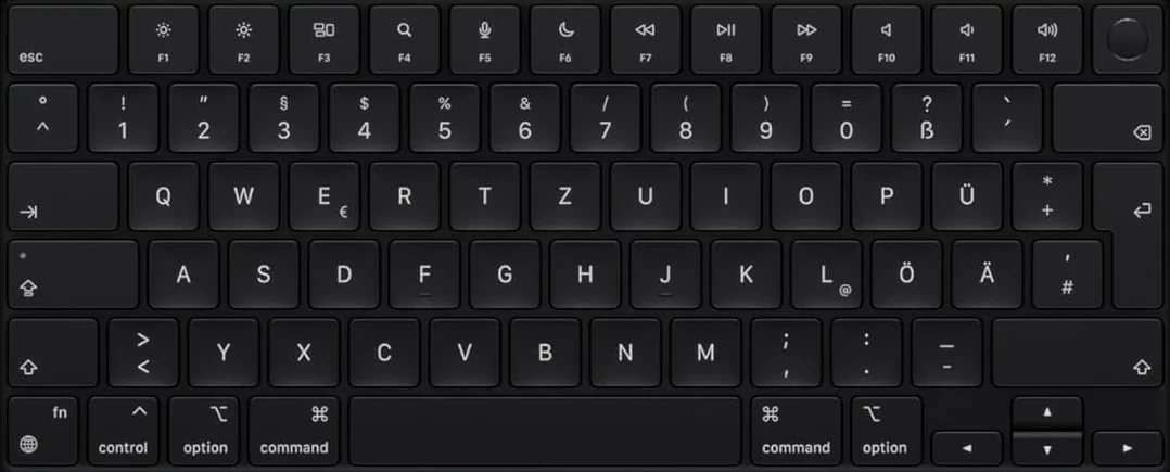
Figure 11: European layout
I specifically wanted the US layout, because all other laptops and standalone keyboards I had in my entire life had this kind of layout. Never once in my life have I seen the European layout on any device.
But, for some unknown reason, Apple sells its laptops with a European layout in my area, and when my wife had a Mac, it had that. Every time I used it, I was fighting my muscle memory.
Sure, it has more keys, and these contain some characters otherwise inaccessible without switching the layout, so it can look like Apple does a good thing.
However, literally no one except Apple users had seen this layout, and it makes no sense to them.
In my particular case, some already existing keys in the European layout are placed differently, like . and ?.
So, since I didn’t want to deal with that, I got myself a version with a US layout. Thankfully, there’s a “PC” layout in the system settings, so I don’t have to relearn anything. Using the “PC” layout on a European keyboard, however, is even more cumbersome.
No middle click on the touchpad
For some reason, there’s no such thing as a middle-click on a touchpad. In Linux, it is usually mapped to clicking with three fingers at the same time. I’ve been using it in Firefox a lot, and to paste stuff into the terminal once in a while.
However, in macOS, my muscle memory is now against me. I click with three fingers in Firefox, and usually it brings up the right-click menu, which is fine at least. But sometimes it is registered as a left-click instead, and it is super annoying. Re-learning to use @@html:<kbd>⌘ command</kbd> click will take some time, I guess
The camera cutout
Same as with the microphone, I’d like to have a physical way of blocking the camera, but because Apple moved towards a custom-shaped display matrix, it can’t be done as easily as before. It has a lot of sensors there, and blocking them with a huge plastic cover will make it impossible to close the laptop lid.
Again, not strictly about the hardware side of things, but the display in general feels weird because of this notch - it’s right in the middle of the screen, and I’m used to having the clock there, after years of using GNOME. Some say it’s more logical to have them at the far right side, as it is commonly done on phones, but phones have a much smaller and narrower screen. The same goes for notifications - having them in the middle feels more natural to me, because most of the content I’m working with is somewhere in the middle. But your opinion may vary (as if anything else I said here can be universally agreed on).
The good parts
OK, enough bitching around, let’s discuss some good parts.
The screen itself is gorgeous, colors are vivid yet natural, and the 14-inch model is actually both a bit bigger and a bit taller than my old 13-inch laptop. I like the screen a lot. I didn’t go for the nano-texture display, as I don’t work in environments where reflections are problematic, so I can’t say how it affects image quality. Maybe if I did, it’d be in the bad section.
The speakers are pretty good. And for a laptop, they’re actually amazing. They have depth, the upmp, and are loud enough to watch films with comfort - can’t say this about any other laptop I’ve had before.
Touchpad - oh, the touchpad. Simply put, the fact that it is a lot bigger (in fact, they had even bigger ones before), and I can press on it absolutely everywhere, is amazing. I was also surprised to learn that they aren’t actually pressed in physically. Instead, it is a glass surface, which has haptic feedback that simulates the click. Purely amazing. I’ve spent a long time trying to find anything remotely close to these touchpads on other laptops, but I never could find one.
M4 Pro CPU is a beast. Recently, I forgot a passphrase to one of my GPG keys and tried to brute-force it. My old laptop had AMD Ryzen™ 7 3750H, which isn’t fast by today’s standards, but it wasn’t a slow CPU either - it handled all of my tasks without major hiccups. I tried it first on the old laptop, and it could try about ~45 passphrases per second. The M4 could try ~750 passphrases per second. Everything is so fast I can’t believe it.
The macOS itself isn’t all that bad.
As a matter of fact, writing this post helped me find how to fix a lot of problems I initially had - this post was a lot longer before that, but I had to cut stuff from it, as it was no longer applicable.
There are still some oddities - it constantly bothers me with asking permission to run apps for the first time, because I install them through brew, or downloaded from the official website (again, I’m not making an Apple account, no, no).
But I finally have a machine on which I can do both my programming tasks and media tasks without needing to keep two different operating systems to handle each task specifically.
Finally, I can record my music with my right hand while writing code with the left - a dream.
Even the liquid glass thing is not as bad as I thought it would be. Thankfully, Apple added a tinted style to it, so it is less transparent, which helps readability.
And overall, I really like the device - it feels solid, and that it will last me another five years at minimum. Hopefully I didn’t jinx myself here, though.
Anyhow, thanks for reading, and please do share your experience with me, or if you know ways of solving the problems I’ve listed, I would be glad to know about them!