Custom elements are one of those web platform features that sound complicated but turn out to be surprisingly simple. If you have used Hotwire in Rails, you have already used them. Both <turbo-frame> and <turbo-stream> are custom elements. They are just HTML tags with JavaScript behavior attached.
This article walks through what custom elements are, how they compare to Stimulus controllers and how to build them yourself! Starting with a simple counter and ending with an optimistic form that updates instantly without waiting for the server. 🤯
The code is available on GitHub.
What are custom elements?
Custom elements let you define your own HTML tags with custom behavior. They fall under the Web Components umbrella, alongside Shadow DOM (encapsulated styling and markup) and templates (reusable HTML fragments), though each can be used independently. To use custom elements, just define a class, register it with the browser, and use your new tag anywhere (Shadow DOM or templates not required).
Here is the simplest possible custom element:
class HelloWorld extends HTMLElement {
  connectedCallback() {
    this.textContent = "Hello from a custom element 👋"
  }
}

customElements.define("hello-world", HelloWorld)
Now you can use <hello-world></hello-world> in your HTML and it will display the message. The connectedCallback runs when the element is added to the page. This is similar to Stimulus’s connect() method. There is also, just like with Stimulus, a disconnectedCallback. This can be used similar to Stimulus’: removing event listeners and so on.
Custom element names must contain a hyphen. This prevents conflicts with future HTML elements. So <hello-world> works, but <helloworld> does not.
Attributes and properties
Custom elements can read attributes just like regular HTML elements:
class GreetUser extends HTMLElement {
  connectedCallback() {
    const name = this.getAttribute("name") || "stranger"

    this.textContent = `Hello, ${name}!`
  }
}

customElements.define("greet-user", GreetUser)
Use it like this:
<greet-user name="Cam"></greet-user>
To react to attribute changes, use attributeChangedCallback:
class GreetUser extends HTMLElement {
  static observedAttributes = ["name"]

  connectedCallback() {
    this.#render()
  }

  attributeChangedCallback(name, oldValue, newValue) {
    this.#render()
  }

  // private

  #render() {
    const name = this.getAttribute("name") || "stranger"

    this.textContent = `Hello, ${name}!`
  }
}
The observedAttributes array tells the browser which attributes to watch. Without it, attributeChangedCallback never fires.
The is attribute
You can extend built-in HTML elements using the is attribute. For example, extending a button:
class FancyButton extends HTMLButtonElement {
  connectedCallback() {
    this.classList.add("fancy")
  }
}

customElements.define("fancy-button", FancyButton, { extends: "button" })
Then use it like:
<button is="fancy-button">Click me</button>
This keeps all the built-in button behavior while adding your custom features (simply adding the fancy class in above example). However, Safari does not support this feature. So I stick to autonomous custom elements (the hyphenated tags) for better compatibility.
Custom elements vs Stimulus
If you have used Stimulus, custom elements will feel familiar. Here is how they compare:
| Feature | Stimulus | Custom Element |
|---|---|---|
| Lifecycle | connect() / disconnect() |
connectedCallback() / disconnectedCallback() |
| Finding elements | targets |
querySelector() / direct children |
| State | values |
attributes + properties |
| Events | action attributes |
addEventListener() |
| Framework | Requires Stimulus | Browser-native |
Stimulus is great for connecting behavior to existing HTML. Custom elements are better when you want a reusable component that works anywhere. They are also simpler when you do not need Stimulus’s conventions.
The main difference is how you find elements. Stimulus uses targets:
<div data-controller="counter">
  <span data-counter-target="count">0</span>

  <button data-action="click->counter#increment">+</button>
</div>
Custom elements use standard DOM/query methods (see example below):
<click-counter>
  <span class="count">0</span>

  <button>+</button>
</click-counter>
Custom elements feel more like writing vanilla JavaScript. Stimulus is more convention-based (which is often confusing to many).
In the end it is all a regular JavaScript class. I’ve explored these extensively in the book JavaScript for Rails Developers. 💡
Building a simple counter
Time to build something. Start with a counter that increments when clicked:
// app/javascript/components/click_counter.js
class ClickCounter extends HTMLElement {
  connectedCallback() {
    this.count = 0

    this.addEventListener("click", () => this.#increment())
  }

  #increment() {
    this.count++

    this.querySelector("span").textContent = this.count
  }
}

customElements.define("click-counter", ClickCounter)
Import it in your application JavaScript:
// app/javascript/application.js
import "@hotwired/turbo-rails"
import "controllers"

import "components/click_counter"
Configure importmap to find the new directory:
# config/importmap.rb
pin_all_from "app/javascript/controllers", under: "controllers"

pin_all_from "app/javascript/components", under: "components"
Now use it in your views:
<click-counter>
  <button>Clicked <span>0</span> times</button>
</click-counter>
Click the button and watch the counter increment. Simple! 😊
Building an optimistic form
Now for something a bit more useful. Build a form that updates instantly without waiting for the server. If the save fails, show an error. If it succeeds, keep the optimistic UI.
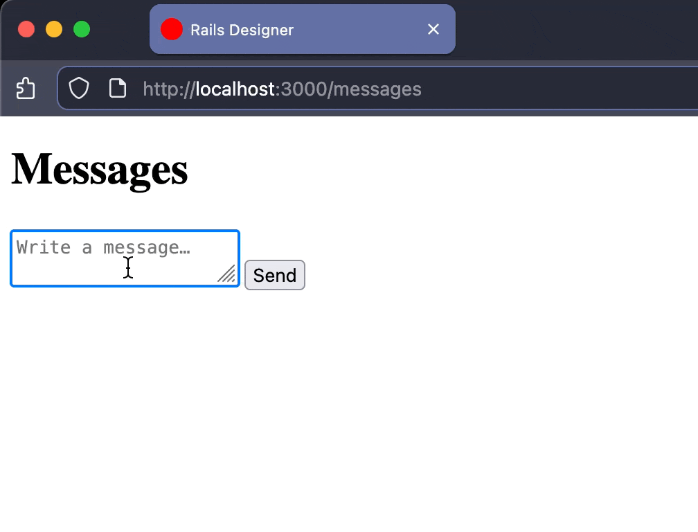
It will look like this:

See how the message gets appended immediately and then (notice the blue Turbo progress bar) gets replaced with the server rendered version.
The HTML looks like this:
<optimistic-form>
  <form action="<%= messages_path %>" method="post">
    <%= hidden_field_tag :authenticity_token, form_authenticity_token %>

    <%= text_area_tag "message[content]", "", placeholder: "Write a message…", required: true %>

    <%= submit_tag "Send" %>
  </form>

  <template response>
    <%= render Message.new(content: "", created_at: Time.current) %>
  </template>
</optimistic-form>
The <template response> tag (indeed also part of the Web Components standard) holds the display HTML for new messages. When the form submits, the custom element renders this template with the form values and appends it to the list. The form still submits normally to Rails.
Start with the basic structure:
// app/javascript/components/optimistic_form.js
class OptimisticForm extends HTMLElement {
  connectedCallback() {
    this.form = this.querySelector("form")
    this.template = this.querySelector("template[response]")
    this.target = document.querySelector("#messages")

    this.form.addEventListener("submit", () => this.#submit())
  }

  #submit() {
    if (!this.form.checkValidity()) return

    const formData = new FormData(this.form)
    const optimisticElement = this.#render(formData)

    this.target.append(optimisticElement)
  }
}

customElements.define("optimistic-form", OptimisticForm)
The submit method checks form validity first using the browser’s built-in validation. If the form is invalid, let the browser show its validation messages. Otherwise render the optimistic UI and let the form submit normally.
Getting optimistic
Extract the form data and populate the template:
#render(formData) {
  const element = this.template.content.cloneNode(true).firstElementChild

  element.id = "optimistic-message"

  for (const [name, value] of formData.entries()) {
    const field = element.querySelector(`[data-field="${name}"]`)

    if (field) field.textContent = value
  }

  return element
}
The cloneNode(true) creates a copy of the template content. Loop through the form data and update any element with a matching data-field attribute. This is why the partial has a data-field="message[content]" on the message display.
The optimistic element appears in the list immediately, then the form submits to Rails.
The Turbo Stream does not append the message, but replaces the “optimistic message” with the real one from the database:
<%# app/views/messages/create.turbo_stream.erb %>
<%= turbo_stream.replace "optimistic-message", @message %>
Since both the optimistic template and the message partial render the same HTML, the replacement is seamless. The user sees the message appear instantly, then it gets replaced with the real version (with the correct ID, timestamp, etc.) a moment later.
Here is the full implementation:
// app/javascript/components/optimistic_form.js
class OptimisticForm extends HTMLElement {
  connectedCallback() {
    this.form = this.querySelector("form")
    this.template = this.querySelector("template[response]")
    this.target = document.querySelector("#messages")

    this.form.addEventListener("submit", () => this.#submit())
    this.form.addEventListener("turbo:submit-end", () => this.#reset())
  }

  // private

  #submit() {
    if (!this.form.checkValidity()) return

    const formData = new FormData(this.form)
    const optimisticElement = this.#render(formData)

    this.target.append(optimisticElement)
  }

  #render(formData) {
    const element = this.template.content.cloneNode(true).firstElementChild

    element.id = "optimistic-message"

    for (const [name, value] of formData.entries()) {
      const field = element.querySelector(`[data-field="${name}"]`)

      if (field) field.textContent = value
    }

    return element
  }

  #reset() {
    this.form.reset()
  }
}

customElements.define("optimistic-form", OptimisticForm)
Do not forget to import it:
// app/javascript/application.js
import "components/optimistic_form"
Now when you submit the form, the message appears instantly in the list. The form submits to Rails, which responds with a Turbo Stream (I added sleep to mimic a slow response) that replaces the optimistic message with the real one. If the save fails, Rails can show an error message normally.
Cool, right? I’ve used this technique before with a client successfully. Many months later and it holds up nicely.
This pattern can work great for any form where you want instant feedback. Like chat messages, comments or todos. The new item appears immediately. No loading spinners, no waiting.
The key is that the partial lives right within the template element. You are not duplicating it in JavaScript. Change the partial and the optimistic UI updates automatically.
Custom elements make this pattern reusable. Drop <optimistic-form> anywhere in your app. It works with any form and any partial (with client’s project mentioned above I stubbed the partial with more advanved “stand-in” model instance).
Yet another tool in your Rails toolkit. Did this inspire you to use custom elements more too? Let me know below! ❤️