A less romantic truth is that aesthetic standards rarely travel alone; power tends to follow in their wake. An episode at the U.S. State Department this month makes exactly this point.
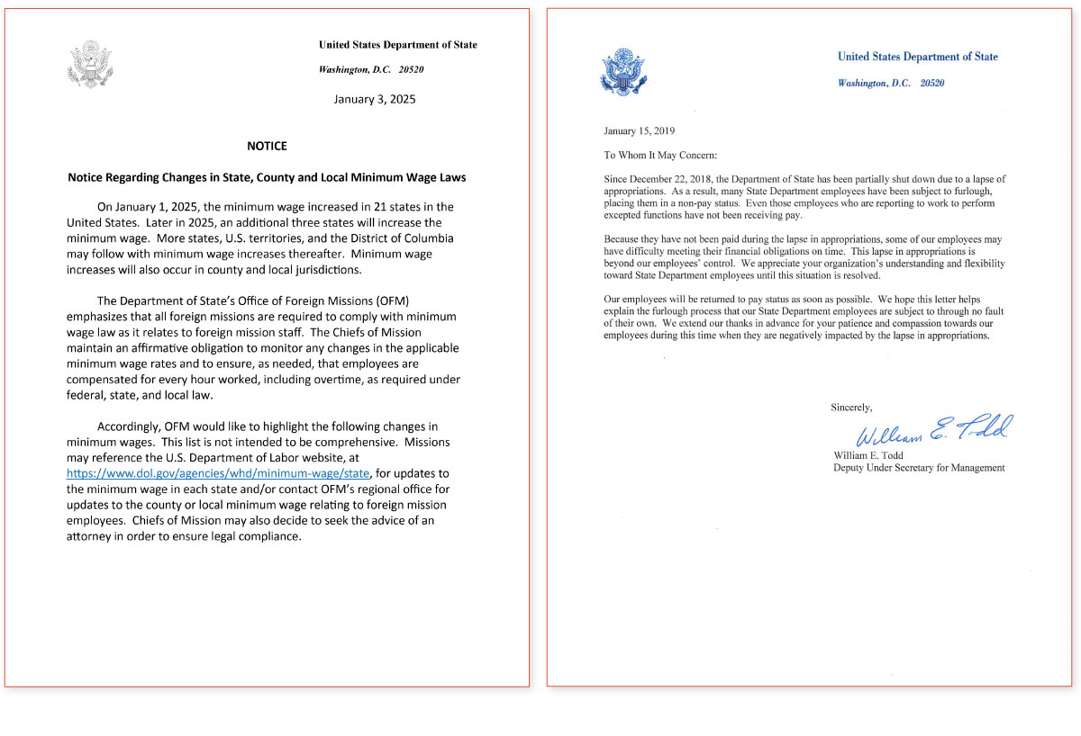
On December 9, Secretary of State Marco Rubio issued a memo titled “Return to Tradition” that required all State Department documents to switch back to 14-point Times New Roman, overturning a Biden-era directive from 2023 that had turned to 15-point Calibri.
Frankly, most people likely view both of these simply as “standard typefaces” without distinguishing much difference between them. So why would an institution of the State Department’s scale bother, twice in three years, to take a stance on something as seemingly trivial as a default typeface?
John Gruber, an Apple-sphere blogger with a well-known appetite for political commentary, obtained the full text of Rubio’s memo and published it. (It is worth reading first.) Rubio’s rationale, in simplified form, has three parts. First, serif typefaces are said to better communicate professionalism, formality, and authority in official documents (¶¶ 6–8). Second, using a serif typeface is aligning with the White House, the courts, and the State Department’s own historical practice (¶ 9). Third, the 2023 decision was a “cosmetic” gesture associated with diversity, equity, inclusion, and accessibility (DEIA) politics, and the reversion a correction to that (¶ 10).
Commentary on American partisan politics is beyond the scope of this article. Still, in neutral terms, Trump’s second term has been marked by an unusually rapid and sweeping effort to repeal or reverse the prior administration’s policies, with DEIA among the earliest targets. The memo itself cites Executive Order 14151, signed on the first day of the term, that instructed federal agencies to terminate all DEIA-related activities, offices, positions, policies, programs, and contracts.
That makes the political element of this typography decision fairly plain: it coheres with, and signals loyalty to, a broader anti-DEIA agenda. The remaining question is whether it is only politics. Put differently, how persuasive are Rubio’s first two, ostensibly nonpolitical claims about design and conventions? Or are they merely pretexts?
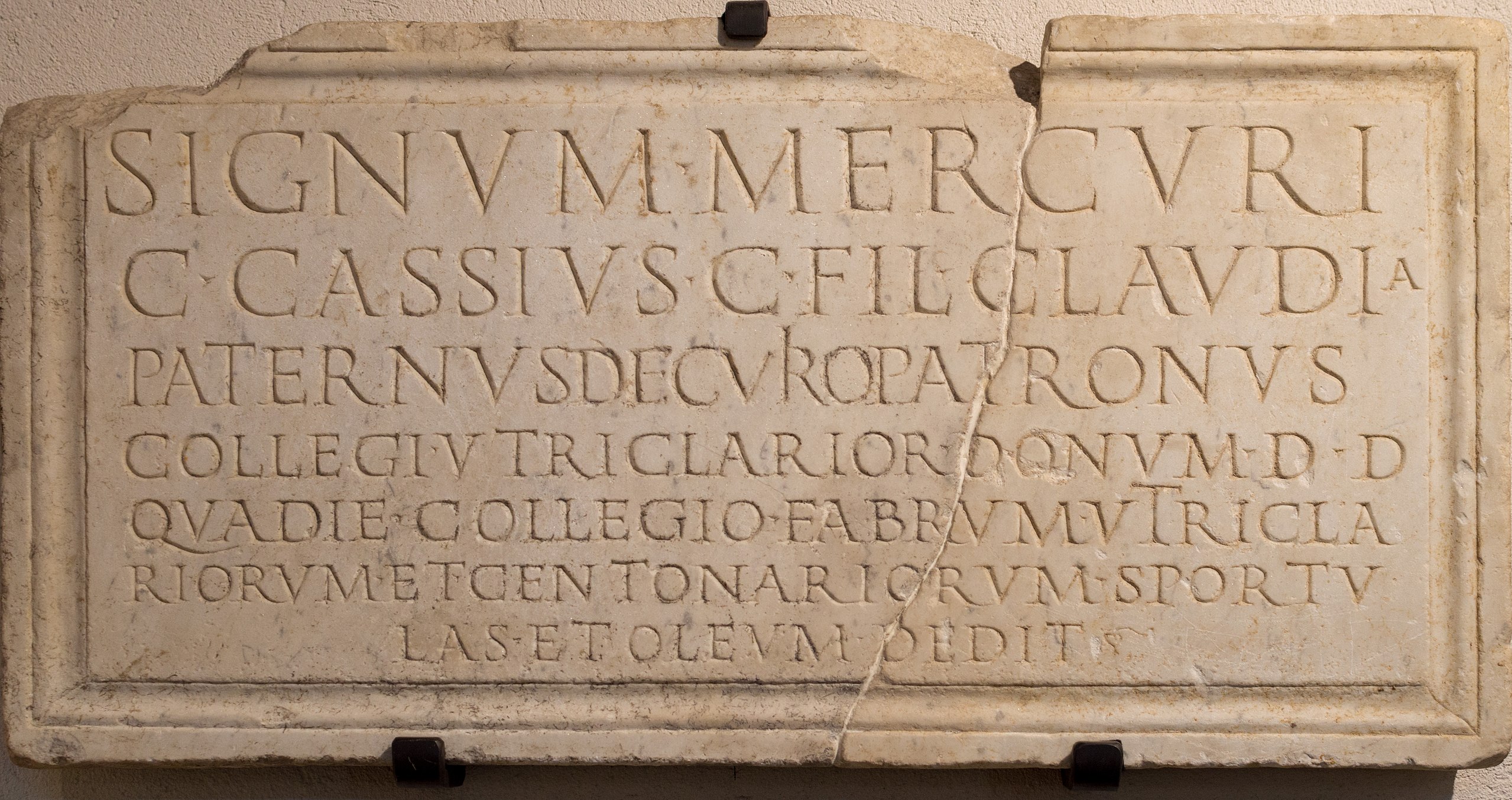
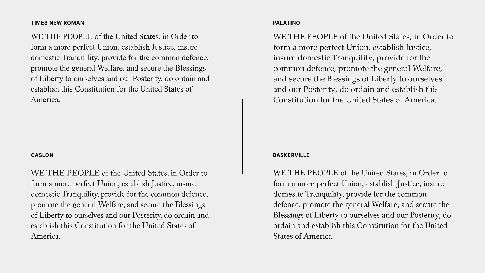
To recap, a serif typeface is one with extra decorative strokes, or “serifs,” at the ends of main strokes. A popular narrative links serifs to stone inscriptions: Roman craftsmen would sketch letter outlines on stone and carve along them; at stroke endings and corners, the chisel work flared outward, leaving the small protrusions we now call serifs. That lineage likely underwrites the memo’s association of serifs with “tradition,” “formality,” and “ceremony.”
However, most people don’t actually know this history, and many cannot reliably distinguish serif from sans-serif in the first place. The general public doesn’t perceive serif typefaces as professional and authoritative, a priori, before prioritizing their use in formal settings. Instead, people first observe that government, academia, and corporate workplaces disproportionately use serif faces — or are trained to use them — and only then infer that serifs must mean professionalism and authority.
Even if we limit ourselves to design and historical considerations, Times New Roman, despite being a serif typeface, possesses little of the “professional, solemn, and authoritative” aura. The typeface was designed in 1931 for The Times of London, and newspaper typefaces are typically engineered to print cleanly on cheap paper, conserve space, and support rapid scanning.
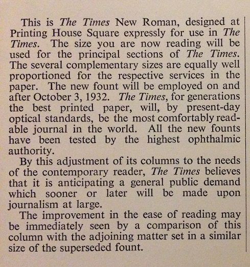
Those goals are visible in the details. The strokes of Times New Roman are relatively thin (leaving tolerance for ink spread on newsprint), the letterforms are narrow, and the x-height (the height of the lowercase “x”) is comparatively large. There is nothing inherently wrong with such functional design; it simply doesn’t map neatly onto the “traditional” look of older serifs. On a modern, high-resolution display, the typeface can appear spindly, more utilitarian than ceremonial.
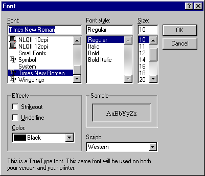
Indeed, the stronger explanation for Times New Roman’s long reign isn’t aesthetic excellence, but practicality and inertia. Times New Roman was among the small set of typefaces bundled with early versions of Windows. It was also promoted as “web-safe,” meaning webmasters could reasonably assume it would render properly across platforms. In the early era of digitalization, choosing Times New Roman was often less a deliberate endorsement than a default imposed by limited options. Over time, the habit hardened into a standard, and institutions began to require it without much reflection, effectively borrowing their own authority to confer authority upon the typeface.
Professionals who genuinely focus on typography have advised against Times New Roman. For example, type designer Matthew Butterick eloquently comments:
When Times New Roman appears in a book, document, or advertisement, it connotes apathy. It says, “I submitted to the typeface of least resistance.” Times New Roman isn’t a typeface choice so much as the absence of a typeface choice, like the blackness of deep space isn’t a color. To look at Times New Roman is to gaze into the void.
Similarly, the U.S. Court of Appeals for the Eighth Circuit, in its formatting advice for lawyers, specifically cautions:
Typographic decisions should be made for a purpose. The Times of London chose the typeface Times New Roman to serve an audience looking for a quick read. Lawyers don’t want their audience to read fast and throw the document away; they want to maximize retention. Achieving that goal requires a different approach — different typefaces, different column widths, different writing conventions. Briefs are like books rather than newspapers. The most important piece of advice we can offer is this: read some good books and try to make your briefs more like them.
As for the other U.S. official bodies Rubio cites in the memo, many don’t actually use Times New Roman either. The Supreme Court’s rules require booklet-format filings to be set in the Century family, and its own opinions are typeset in Century Schoolbook from that family. Originating in the 19th century, the typeface features more expansive proportions, balanced stroke contrast, and an elegant form, exuding a far more assertive presence than Times New Roman. As the name suggests, it also began life as a textbook face, optimized for legibility. With proper typesetting, it reads far better than a haphazardly produced Word document set in Times New Roman.
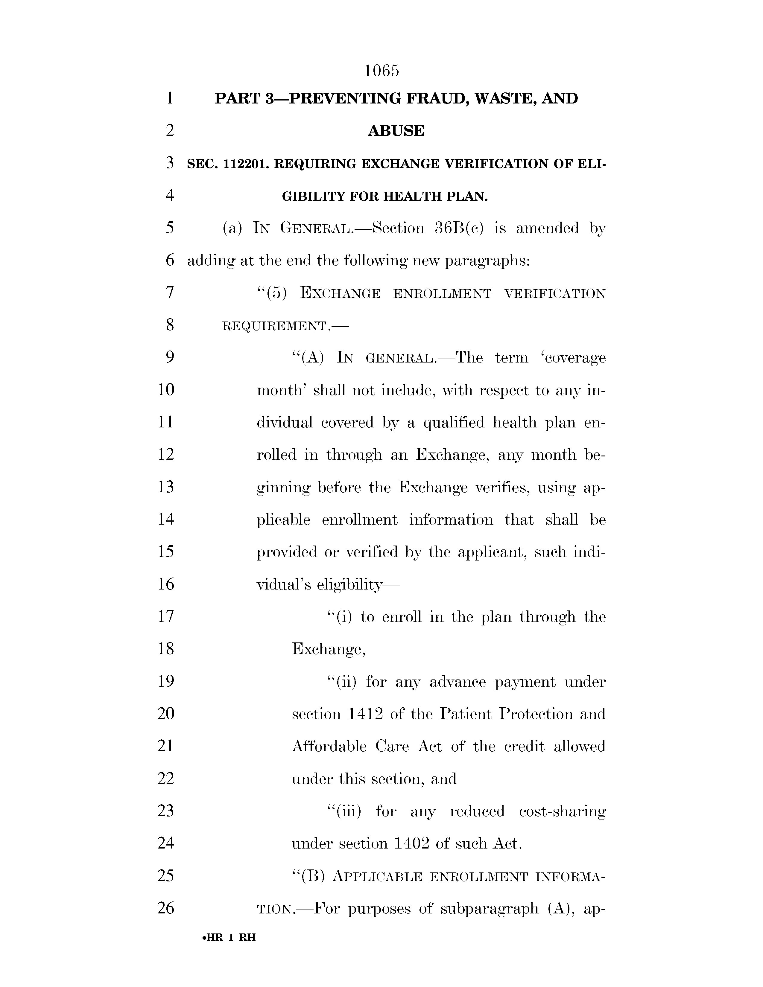
Looking at the legislature, the official PDFs of U.S. Congressional bills use Cheltenham for titles and De Vinne for body text. De Vinne, first released in 1902, shares similarities in style with Century Schoolbook but features stronger stroke contrast and more decorative serifs, giving it an “engraved” quality. Objectively speaking, this design borders on being a display typeface — imagine the logotype of Harper’s Bazaar, Didot — and is somewhat tiring to read in body text. But when it comes to conveying ceremony and solemnity, it’s far more qualified than Times New Roman. (After a bill is enacted into law, it will be typeset in New Century Schoolbook.)
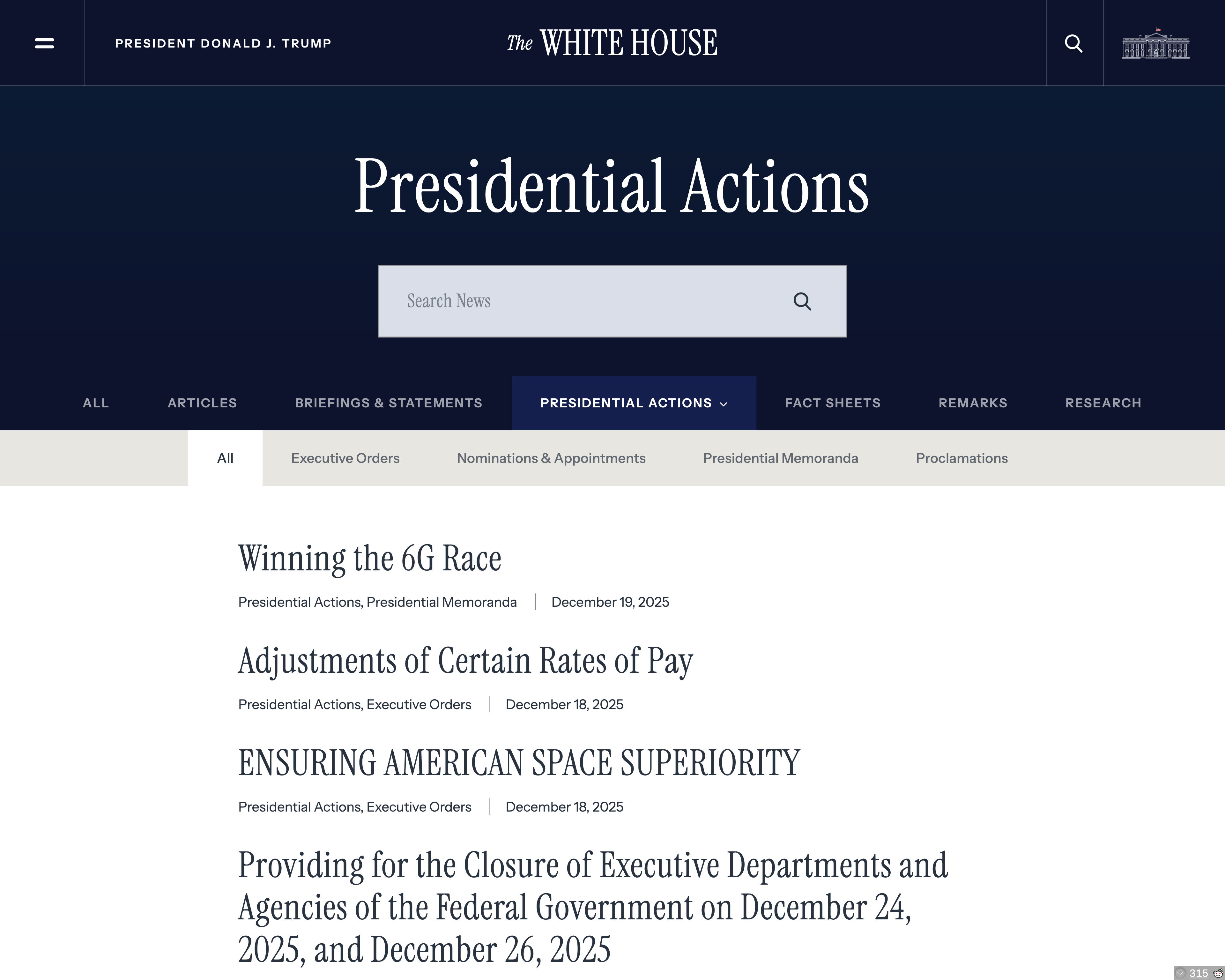
Even the Trump administration, to which Rubio pledges allegiance, contradicts the “serif tradition” by using a fashionable tall, high-contrast serif (Instrument Serif) on the White House website. It may look a bit mannered by government standards — an impression no less bolstered by its bombastic rhetoric — but it does manage to appear assertive and emphatic. Swap in Times New Roman and “AMERICA IS BACK” would read more like a mutter.
Thus, the design and historical reasons cited in Rubio’s memo don’t hold up. The formality and authority of serif typefaces are largely socially constructed, and Times New Roman’s origin story and design constraints don’t express these qualities. If Times New Roman carries authority at all, it’s primarily borrowed from the authority of institutions that have adhered to it. If the sincere goal were to “return to tradition” by returning to a serif, there are many choices with deeper pedigree and more fitting gravitas.
At this point, it might sound as though the argument is trending toward a defense of the Department’s earlier choice: Calibri. Unfortunately, Calibri is also a poor fit for formal contexts. While seriousness and authority aren’t the exclusive province of serifs, Calibri does little to convey those traits.
Typographically, Calibri is a humanist sans-serif. Such typefaces tend to have open, rounded forms and generous apertures (look at the wide openings in letters like a, c, e, and s). Calibri takes that softness especially far: terminals are visibly rounded, and many letters appear almost handwritten, to the extent that its designer described its quality as “warm and soft.”
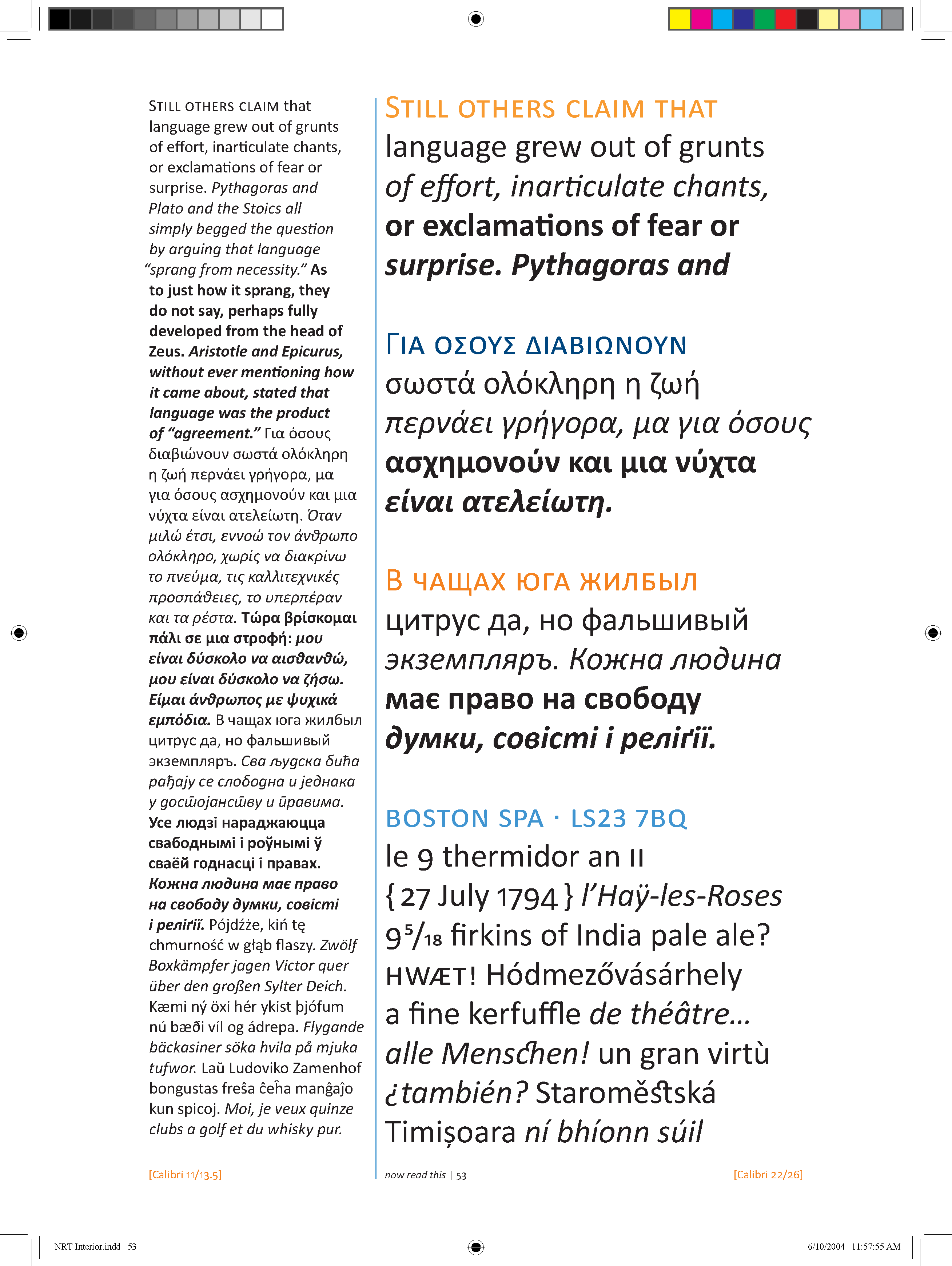
There’s nothing inherently wrong with this style, but one would hardly want an official document or legal contract to appear “warm and soft.” That is why I have long disliked Microsoft’s decision to make Calibri the default Office typeface starting with Office 2007. A default body typeface should be neutral and versatile, not exude a temperature. (Microsoft replaced Calibri with Aptos as the default in 2023, but inertia being what it is, Aptos still appears relatively rarely in the wild.)
To be fair, the State Department’s 2023 change was justified less as a matter of taste than as an accessibility and inclusion initiative. That is, to make documents easier to read for individuals with various physical and cognitive conditions. This goal is commendable in itself, but the means were, at best, loosely connected to the end, much like many inclusive measures that were once fashionable in U.S. politics and business in recent years.
First, Calibri was not designed with accessibility in mind. It was commissioned by Microsoft to promote its ClearType technology, with the design objective of appearing clear on the low-resolution displays of its time. This means it prioritizes smoothness under specific sub-pixel rendering techniques, rather than ensuring the glyphs are easy to tell apart. If accessibility were truly the goal, one might select a typeface created for that purpose. For example, Atkinson Hyperlegible addresses character differentiation by adding serifs, exaggerating shapes, and slanting strokes, making it legible even under low-vision conditions. In contrast, Calibri has no anti-ambiguity design: the uppercase I and lowercase l are nearly identical. So much for “accessibility.”
Furthermore, accessibility doesn’t depend solely on a document’s appearance but more on its internal structure and presentation mechanisms. For instance, the W3C’s Web Content Accessibility Guidelines (WCAG) state that accessible content should be perceivable, operable, understandable, and robust. This means that documents should have proper semantic structure (so tools like screen readers can interpret content correctly), support customizable layouts and fonts, and be compatible with various applications and devices. If these principles were met, the specific font used would matter little, as users can access the content with their preferred tools in their preferred manner. Conversely, if a document is technically crude, like a scanned PDF — as many official documents are — the use of an “inclusive” font is merely self-congratulatory.
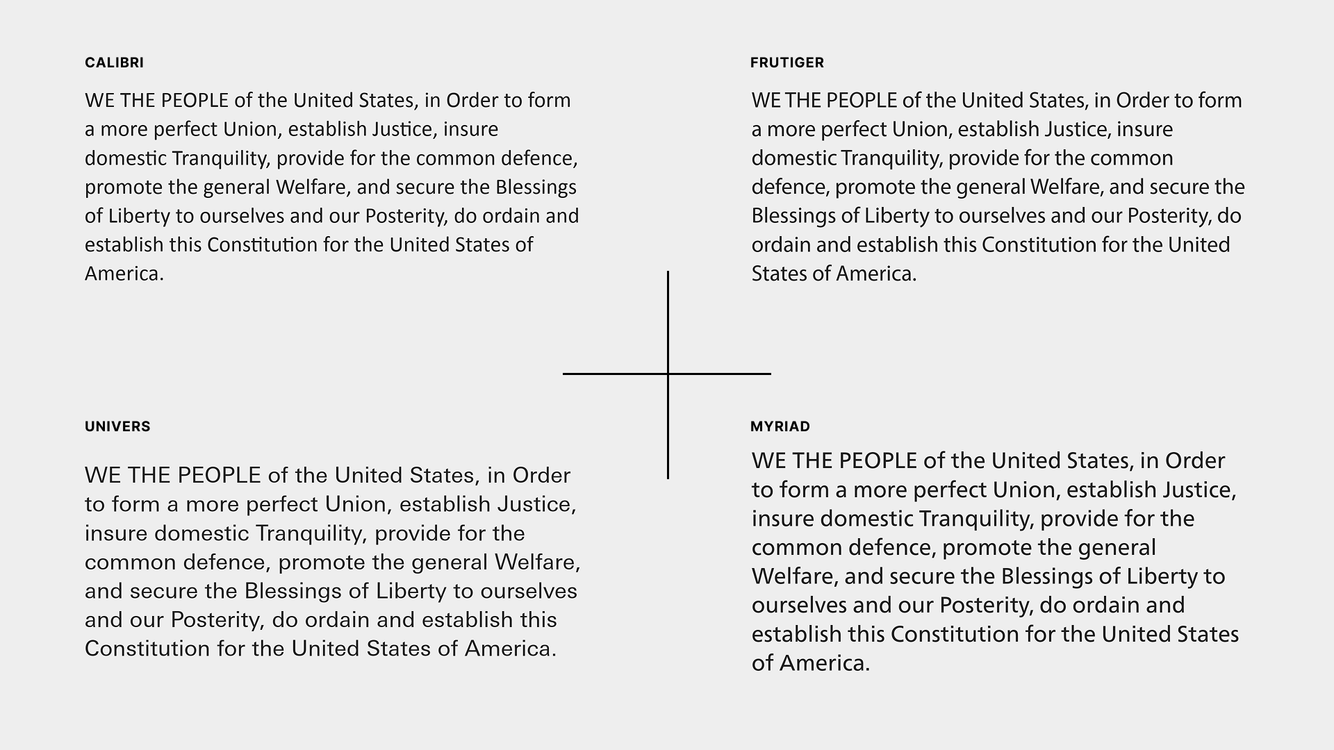
If one insisted on a sans-serif for official writing, there are many better candidates than Calibri: Frutiger (common in airport wayfinding), Myriad (used by Apple for years), the cool and serious Univers (or a well-set Helvetica Neue), or contemporary neutral workhorses like Inter. If a “made in America” signal mattered, Public Sans (funded under the 21st Century Integrated Digital Experience Act passed during Trump’s first term) and used by many U.S. government websites is also a good option.
Therefore, Rubio’s criticism that the previous move was “cosmetic,” while being politically charged, isn’t entirely unfounded.
Taken together, the Department had previously pursued a defensible goal with a poorly matched design intervention and landed on an ill-fitting typeface. Now, for political motives, it has reversed that decision and returned to a bland, unremarkable default. Between the two, Times New Roman may be the lesser evil: it is more widely recognized, and it doesn’t clash with the official context as overtly as Calibri does. Still, Rubio, or whoever drafted the memo for him, could have been more candid. There was no need to dress up a political gesture with faux-erudite claims or to lavish praise on a mediocre typeface.
Because Times New Roman just will not make America great again.