
Appreciating typography is a study in paradox. The primary goal of well-designed typography is to help you read the words, not appreciate how the words are composed of letters and how each of those individual letters has been designed to convey a small bit of meaning. If you see the typography rather than read the words, the typography has failed in its job, right? You should be reading, not staring at the shape of that uppercase A.
The goal with typography is functional, right? To convey the meaning, not the feeling?
Wrong.
Feeling is always conveyed. The question is, depending on the project, “How much feeling is required?”
Fixed Width
I’ve created a full-time job for myself talking to Claude Code. This is Claude running from the command line of macOS, which gives me unhindered access to my data. I’m using Ghostty. I’m staring at a fixed-width typeface all day. Apple provides a functional and gorgeous fixed-width variant of their San Francisco typeface called SF Mono, which I’ve been using for months, but, well, I have a short attention span — typographically speaking.
In the past month, I’ve evaluated many additional fixed-width typefaces favored by the nerdcore. Here are the six that have made my cut:
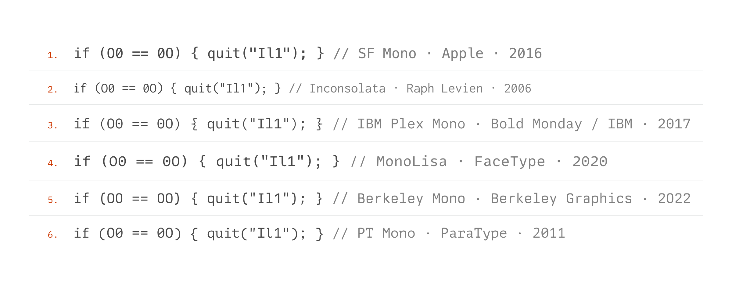
The question is: how do they make you feel? For a typeface designed for coding, you first want fixed-width. Every letter and symbol is the same width, giving you a predictable and readable grid. But how wide? And how tall? Also, how much information do you want to be able to see on a screen?
Your brain builds a very personal and emotional impression of the collection of letters that make words that convey meaning. In the case of terminal or coding typefaces, the design goal is certainly to provide structural function and not feeling, but here’s the deal:
They do.
Isn’t this about the Blade Runner Title Sequence?
Flight to New York. My boarding procedure for moderate to long flights is: sit down, find a movie I’ve seen a dozen times, and hit play. No sound. This is visual background noise while I sort wifi, prepare for a meal, and find a project. On this flight, I picked Blade Runner. Fun fact: I can recite 50% of the dialogue from this movie from memory.
As I’ve been researching typography for Ghostty, novel typography tends to jump out at me. Like when you buy a car, and all you see is your new car on the road. Except it’s typography.
Here are clips from the title sequence for Blade Runner:
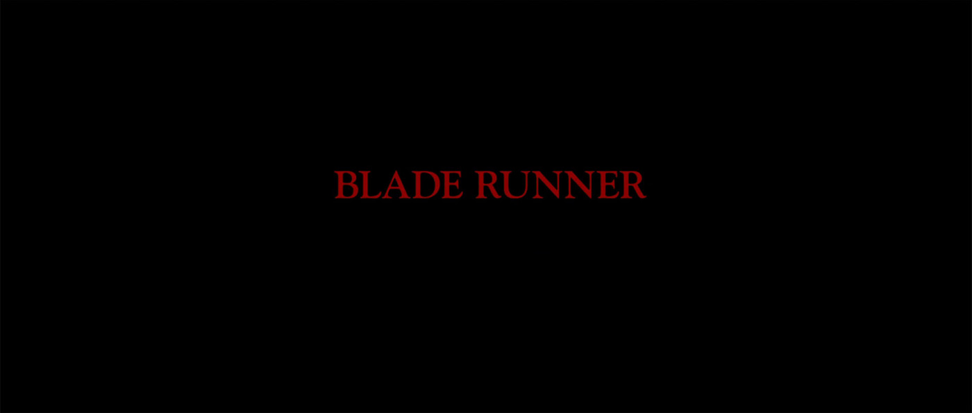
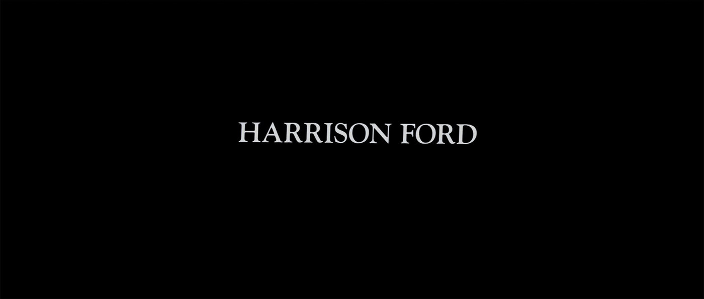
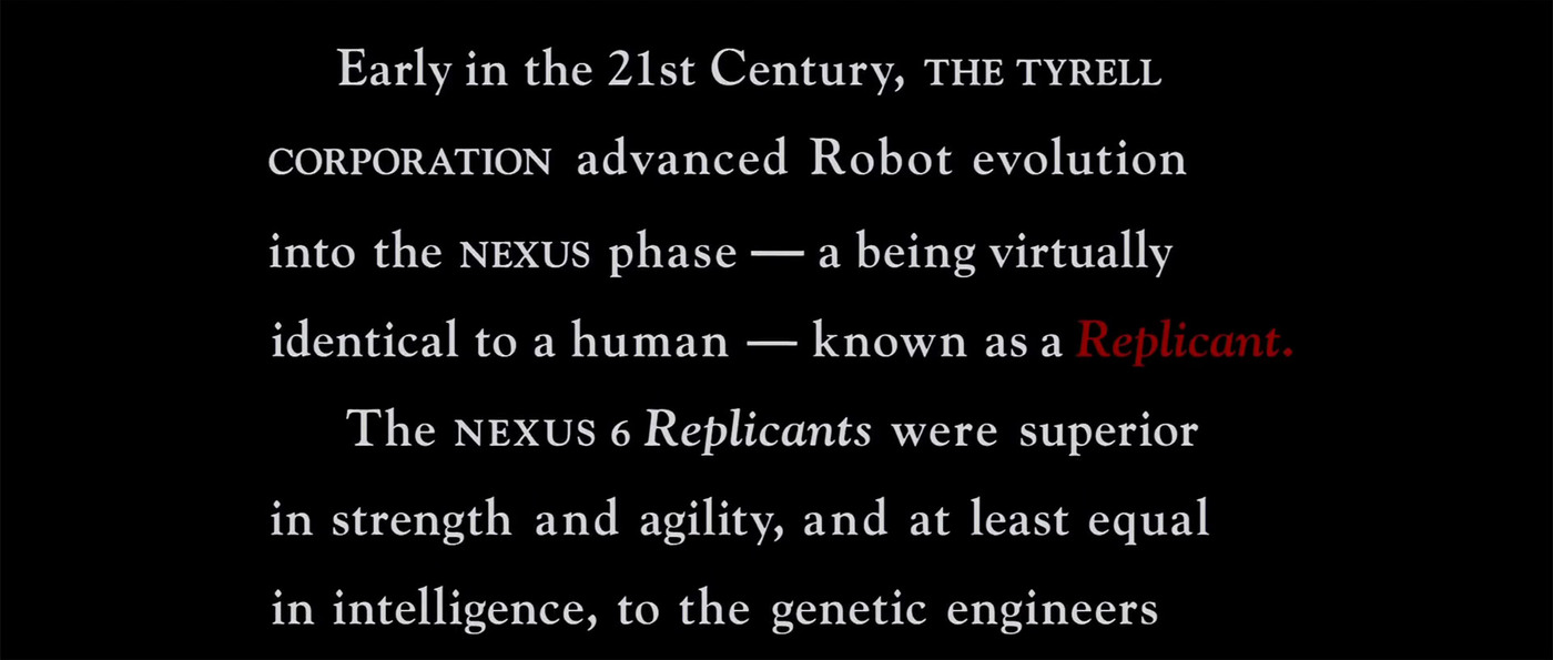
There’s a lot to dissect in this sequence, but let’s start with the punchline. This is a single typeface. It’s Goudy Oldstyle — that’s it. However, this is how they used typography:
- ALL CAPS for names, proper names, the title, and a slightly larger version for the introduction of Los Angeles, November, 2019
- A smaller ALL CAPS for intros and other small important words
- For the exposition crawl, they use standard capitalization except for two variants: small caps for proper names (like The Tyrell Corporation) or (spoiler alert) a red version of the text for the word Replicant — which is italicized every time it appears, but only the debut gets the red — and (spoiler alert) it’s the same red as the title of the movie
Keep looking. The crawl is set like a book, not a movie — first-line indents, generous word spacing — and Frederic Goudy would approve: they letterspace the caps, never the lowercase, obeying his famous dictum that “anyone who would letterspace lowercase would steal sheep.” Also, what’s up with that chonky em dash? It’s probably been years since you’ve seen this, so here it is again:
Unlike our functional fixed-width typefaces, the role of typography in this title sequence is partly functional — to set the story — but the primary purpose is establishing mood. Director Ridley Scott expertly drops us into the middle of a dystopian future where we’ve enslaved the robots and, duh, they are rebelling.
How Much Feeling is Required?
Chances are, you never think about typography. You happily scribe your Messages (SF Pro), Mails (Helvetica), and Slacks (Lato), thinking nothing of serifs, ligatures, or kerning. You are content trusting that a someone else has chosen a proper typeface for your current task. Maybe you bold, you underline, and you italicize to slightly adjust meaning. No issue. Respect.
However, we now live in a world where everyone is capable of building whatever they want thanks to the robots. They’re doing it — right now. They find immense joy in typing in a couple of sentences and watching the robots merrily build whatever they ask. See? I don’t need to be an engineer to build an app. And they are correct. Sorta.
With optimism in my heart and a firm belief that the robots can legitimately help many humans, I can confirm that the majority of consumer-facing things being built by humans who’ve never built a thing… are garbage. Building a tool for yourself? A quick script to read your feeds and generate a pleasant-to-read output? A+. Robots crush that… for you. Building a feed reader anyone on the planet can easily use to read any number of feeds? No. No, you aren’t; you can say you are, but until you’ve built a thing for everyone, you will not appreciate that the last 10% of the work:
- Takes most of the time.
- Contains an endless list of small decisions that feel unimportant, but collectively make the difference between acceptable and fucking amazing.
Don’t believe me? Here’s the first version of the title sequence for Blade Runner’s work print, the close-to-complete cut before the theatrical release:
That title typeface? Impact. A fine typeface, but a clumsy path-of-least-resistance slap-to-the-face choice to set the tone of a future science fiction masterpiece. Garbage.
I’ve never filmed a movie, but I have built quite a few products that you are using right now. In all the design debates, we never explicitly debate feeling: we obsess over the details. That obsession is what you feel when you use our products. It’s the collective voice of every single human who contributed small and large decisions to the product.
A good product sounds like the humans who created it, and that’s what you will feel.