What’s a software engineer supposed to do while on vacation? Observe how different cultures use and design software, of course!
Coming from South America, visiting Asia is like stepping into a different world. I remember the first time I boarded a train in Japan, minutes after my flight, and people-watching became my first tourist activity.
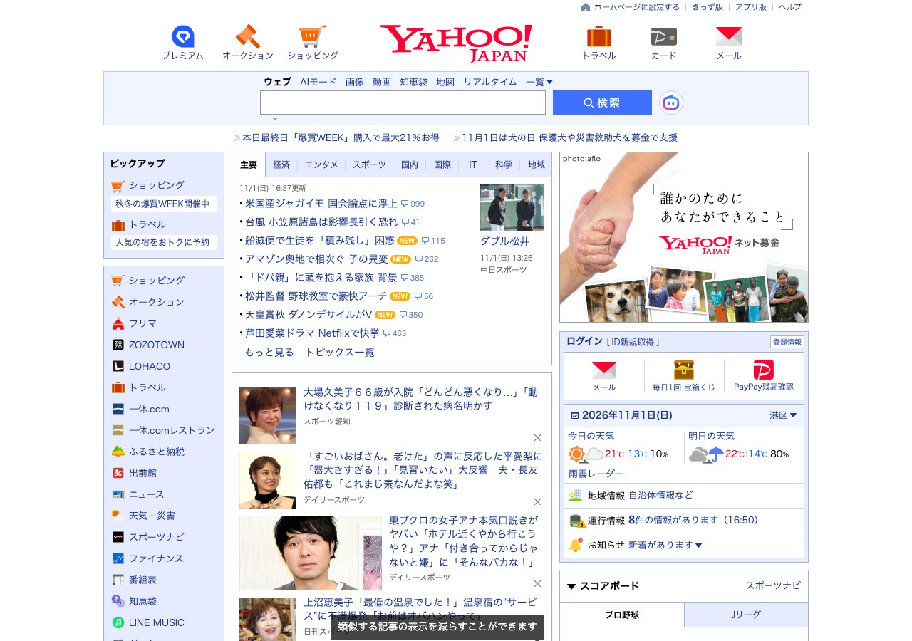
Interestingly, Japanese software also feels like stepping into a different world. Open yahoo.co.jp and you’ll be transported back to the 90s. Or rakuten.co.jp, and you’ll be exposed to product offers with an overwhelming amount of information. Or try to book a train online…

FIG. Yahoo! Japan is just like traveling in time.
Japanese trains are certainly an engineering marvel, but booking a ticket online isn’t quite the same experience. I remember using ChatGPT to figure out all the different fields and checkboxes I had to fill out. For example: “When boarding the train, you will need basic fare ticket or IC card such as Suica in addition to Super (Limited) Express Train ticket.” I thought I was buying a train ticket online. Why would I need another fare?!
Not to mention that Japan’s JR railway network is divided into six regional passenger companies: JR Hokkaido, JR East, JR West, JR Central, JR Shikoku, and JR Kyushu. They have different booking platforms, overlapping coverage, and different rules. And guess who needs to figure out which platform to use? The user.

FIG. JR-West separates ticket booking into several paths and ticket types.
The most frustrating experience I had was booking a ticket online, only to get a message after confirmation: “You’ll need the physical credit card to retrieve your ticket at the station.” But of course, I had used a virtual credit card. So I had to cancel the booking, pay a fee of ¥560 per person, and rebook with a physical credit card.
So are Japanese user interfaces simply bad? I wouldn’t say so. Some of these differences might be explained by cultural preferences: familiarity over novelty, avoiding mistakes, preference for certainty, attention to detail, and resistance to change. What’s wrong with the 90s Yahoo look? “If it ain’t broke, don’t fix it.”
But there’s something else I noticed: the internal organization of a company tends to shape the software it builds. This is known as Conway’s Law. It’s usually discussed in the context of software architecture, where systems tend to mirror the communication structures of the teams building them. But apparently, the effect doesn’t stop at the backend.
Going back to my train booking experience, while I was asking for a ticket to go from A to B, the system was asking me which railway company operated that route. A clear example of organizational structure leaking into the user experience.
I understand why organizational structures influence software architecture. After all, software is built by people, and architectural decisions are as much about communication as they are about technology.
But should users have to understand how a company is organized just to use its software?
I don’t think so.