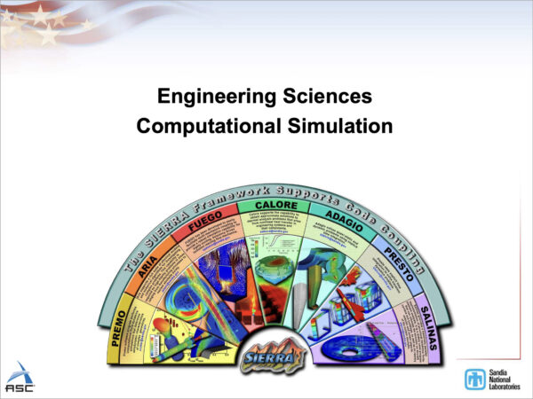
I happened to look at a slide deck from Sandia National Laboratories from 2007 that someone had posted on Reddit late last night (you know, as one does, instead of sleeping), and one particular slide jumped out at me:
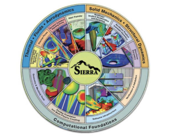
It’s a little graphic advertising the different kinds of modeling software that are part of something called the SIERRA framework, as part of a pretty standard “overview” presentation on computer modeling at Sandia that was given at a meeting in Luxembourg.
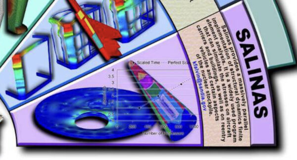
Did you catch the part that made me stop and audibly say, “uhhhhh“? Look at the lower right:
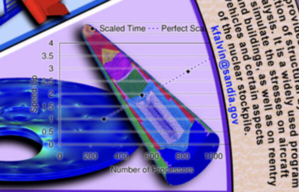
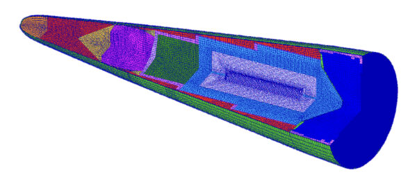
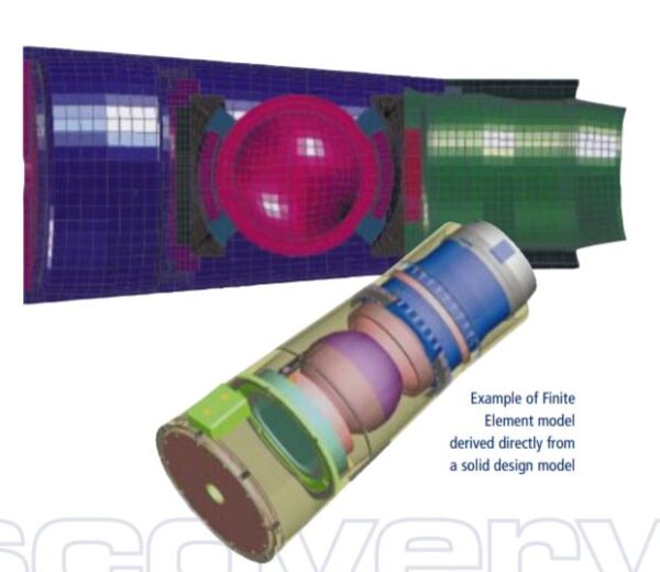
So, that looks an awful lot like the cutaway of a compact thermonuclear weapon design. I immediately wondered if I couldn’t find a better resolution version of the same graphic, so I went onto OSTI.gov and starting plugging in terms that seemed relevant. Searching for “Sierra” and “Salinas” and restricting to “Conference presentations” turned up a bunch of other instances of it from the 2007-2011 or so timeframe. The one with the highest resolution came from another presentation, from 2008:
So this is awfully strange. We’ve got something here that looks like a plausible reentry vehicle for a nuclear warhead. The bits in red, yellow, perhaps fuscia at the “tip” are in the position (and about the right size) to be the arming, fuzing, and firing system. The bits below that — the green, the blue, etc. — look like a thermonuclear warhead. The green part looks like it is meant to represent the location of the “primary,” while the the cylinders-within-cylinders are a classic representation of a thermonuclear “secondary.” One could debate about the exact identity of each color, but it looks a lot like it is meant to represent a radiation case, an interstage medium, a tamper, fusion fuel, and a “sparkplug.” You’ve even got an interesting little “dip” into the central cylinder which looks like a channel to get neutrons into the “sparkplug.”
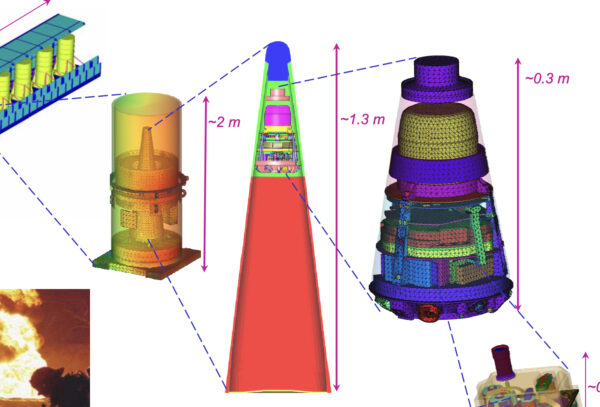
By comparison, this image from later in the presentation looks a lot more like what one would expect them to release about a reentry vehicle in a public document — just the arming, fuzing, and firing system (the top part, with the detail at right), and then the “warhead” section depicted as a featureless blank:
Even that is a little more revealing than usual, as it gives pretty precise dimensions. So seeing something that looks like it is meant to represent the warhead itself is… pretty surprising!
This isn’t some one-off slip up kind of thing. This particular graphic is present in at least half-a-dozen conference presentations on OSTI.gov, and even some on a few other government websites (like this presentation given to NASA). It’s literally the logo they use for this particular software package. And it’s not some kind of redaction error, like the ones I wrote about previously, in which things not dissimilar from the above were very clearly intended to be redacted, but were done so poorly that you could in fact see some aspects of them. This is literally the logo for this particular software framework, and it has been used in lots of presentations (including those done overseas), and is posted all over unclassified, public-facing databases hosted by the federal government.
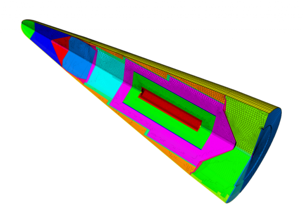
It took me a little more searching, but I eventually tracked down an isolated version of the image from yet another Sandia presentation:
The slide doesn’t give any clarification as to what we’re looking at, here, other than indicating that it part of modeling work for the purposes of structural dynamics, and is clearly part of a nuclear weapons context.
The SIERRA software framework, I gather, is a simulation/modeling toolkit that allowed scientists to basically simulate a relatively “full spectrum” of weapons safety issues. This is Sandia’s bread and butter: making sure that your weapon won’t go off if, say, you drop it, or set it on fire, or let it get hit by lightning. Things which have happened a number of times over the years. The “Salinas” package in particular seems to be about modeling mechanical aspects of materials. Which is to say, this demonstration of its “capabilities” is not about showing you that it is modeling how a nuclear weapon would detonate. It is showing you, “look, we can model a lot of different materials — steel, uranium, lithium, etc. — and could probably tell you whether they would crack or strain or shatter or whatever if you, say, dropped this weapon.” That’s my quick gloss on the various presentations, anyway.
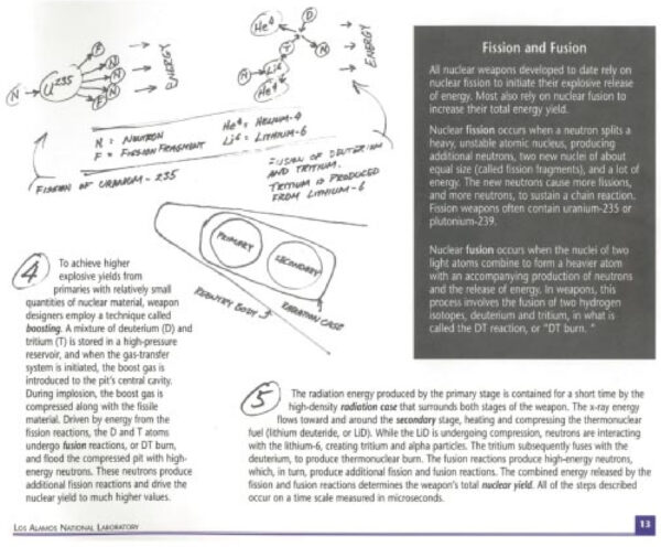
To give a sense of how strange this is, here is the only “officially sanctioned” way to represent a multistage thermonuclear weapon, according to US Department of Energy guidance since the 1990s:
Two circles in a box, maybe inside of a reentry vehicle. That’s it. Nothing that gives any actual sense of size, location, materials, physicality. One can compare this with the images of more speculative thermonuclear weapon designs in the public domain for a sense of how limited the official release is compared with what is “believed to be known” about such things:
Incidentally, I submitted a FOIA request on that particular guidance document (TCG-NAS-2) some time back, and the document that I got back was hilariously redacted to the point that even terms like “gun-type” and “implosion” were redacted, much less any and all images, despite that document apparently containing examples of what actually could be said publicly about these things. Which is just to emphasize, it’s not like the DOE is particularly loose about even as vaguely representational an image as is that one — if anything, the err in the other direction.
Why are they so uptight about thermonuclear weapon design “shapes”? The official reason, of course, is because of proliferation concerns. But there’s another reason: even the appearance of giving away “secrets” can generate unwanted publicity and political scandal.
In 1999, the Cox Committee’s report on Chinese nuclear espionage made some hay out of publicly-available depictions of H-bombs, and featured an entire spread dedicated to the fact that “visitors to Los Alamos National Laboratory are provided a 72-page publication that provides, among other things, a primer on the design of thermonuclear weapons.” It sensationalized that very two-circles-in-a-box image that I showed above, and weaponized it. How dare Los Alamos give that away! Despite it being unclassified. But that’s what I mean by unwanted political scandal — lots of scandals about the release of “secrets” involve non-secrets. (There’s a lot on this sort of thing in my book, of course.)
Which leads us to an interesting puzzle: why would the censors repeatedly allow Sandia to use what appears to be a thermonuclear weapon cutaway as part of a promotional diagram for a software package? There are a few possibilities that come to my mind.

I gave a talk at Sandia this summer, and they made me wear this badge (and another one with my face on it, which I wasn’t allowed to photograph or keep) everywhere I went. Presumably so nobody would tell me secrets, but also, perhaps, to indicate my willingness to play Checkers.
One is the idea that this is an accident, a leak, an oopsie. I find this unlikely to the point of near impossibility. Not because the classification officers are perfect. But this is so obviously not something you would authorize for release if you thought it was representing something classified. To have approved many presentations with this graphic in it to go out into the world, to be posted on the websites of multiple government agencies… they’re not perfect, but they’re not fools. Again, if anything, they tend to err on the side not releasing enough. So I find it hard to believe that they’d have messed this up, again and again, when it is the most blatant thing in the world. This isn’t some subtle technical thing. Anyone who thinks about weapons information and secrecy is going to know what a cylindrical secondary looks like. I mean, this thing jumps off the page if you are that kind of person. Which I am, of course, but so are redactors. If this were the case, it would be an incredible and repeat failure of the classification system at many points, in the same way, over several years. One can’t say such a thing is impossible but I find that extremely unlikely.
Another easily dismissible possibility is that this is some kind of deliberate release of classified information. Again, there is an entire infrastructure devoted to not letting this happen. With peoples’ jobs, security clearances, and personal freedoms on the line. Plus the fact that the people who tend to work in these jobs take for granted that secrecy translates to security. Even actual spies wouldn’t do it this way — they’re not about releasing secrets to the public, they’re about channeling them to the people they are spying to, quiet-like.
So we’re left with much more plausible conclusion that they consider this to be unclassifiable and benign. But why would they think that, given what we know about how sensitive they are to anything that comes even remotely close to representing internal weapon components?
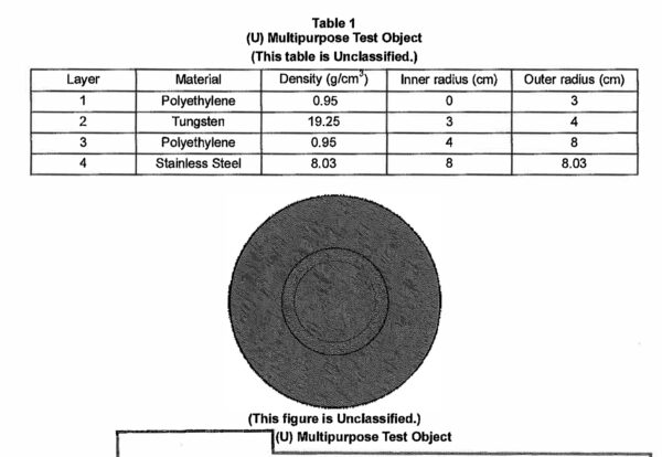
This “multipurpose test object” (taken from the aforementioned TGC-NAS-2 report from 1997) is an example of what I mean by a deliberately “unclassified shape”: something specified by the DOE as being evocative of the kinds of physical shapes and materials that are involved in nuclear weapons designs, but are explicitly indicated as being not actually relevant to weapons design. So this kind of “shape” is something you could use to validate simulation codes on which would probably work with actual weapons materials/designs, but would not actually reveal any weapons materials/designs information other than what has already been declassified.
The “obvious” answer, if my above assertions are true, is that it must not actually represent a thermonuclear secondary. What else could it be? It could be some kind of pre-approved “unclassified shape” which is used for diagnostics and model verification, for example. There are other examples of this kind of thing that the labs have used over time. That is entirely a possibility. What would be bizarre about this being the answer is that a) “unclassified shapes” generally don’t look like actual, plausible weapon designs, and this thing looks “close-enough”; b) it still gives off the appearance of a classified shape, which as noted, is dangerous in and of itself from a political standpoint; and c) if the goal is just to show off modeling capabilities in a very superficial way (this is essentially an advertising logo) they surely could have picked a million less provocative (from a classification standpoint) examples.
It’s also possible that it isn’t even meant to be a nuclear weapon at all. Sure, it looks like a reentry vehicle. Yeah… it seems awfully nuke-shaped. But there are other things that can look like nukes but at really meant to be something else. Maybe I’m seeing a “secondary” because I’m primed to see one, by the context? It’s… possible. Neither spheres-within-sphere nor cylinders-within-cylinders are inherently related to nuclear weapons components. But when you place them like that, in a reentry vehicle, in that order… it looks very much like a fusing system, a primary, a secondary… It would be quite surprising to me if it was not meant to be representative of those things, but something totally different. And, again, the original context of that model appears to be very firmly rooted in nuclear weapons development.
Another possibility is that it is some kind of “deliberate disinformation” or “misinformation.” This is the kind of thing that I think people assume the government labs might do, but in my experience, is pretty unusual and pretty unlikely. In general, you have to remember that the national laboratories are pretty, well, boring, when it comes to classified information. They want to be boring in this respect. They are not doing cloak-and-dagger stuff on the regular. They’re scientists and engineers for the most part. These are not James Bond-wannabes. They don’t parachute behind enemy lines to set up palace coups. They are extremely rule-abiding for the most part. There are lots of social and historical reasons for this (again, my book goes into the historical ones — the anxiety about “nuclear secrets” always made the Atomic Energy Commission and its successor organizations very anxious about being accused of being lax about them).
And beyond the institutional culture aspects, the idea that a bunch of engineers at Sandia are going to be using a software package logo to deliberate leak out misinformation, just waiting for someone to notice it, seems a little unlikely to me on the face of it. I mean, really. What is the “operation” here? Who is meant to be “fooled”? Me? You? The North Koreans? It doesn’t feel very realistic.
And one can add to the above the fact that, at least historically, the Atomic Energy Commission and its successor organizations have frowned on disinformation and misinformation for other very practical reasons. If you release a lie, you run the risk of someone noticing it is a lie, which can draw more attention to the reality. And even misinformation/inaccuracy can put “brackets” around the possibilities of truth. The goal of these organizations is to leave a total blank in the areas that they don’t want people to know about, and misinformation/disinformation/inaccuracy is something other than a total blank.
That’s where I’ve ended up, in thinking about what this “means” and what possibly accounts for it. But it’s still bizarre that anyone would allow something that looks so suggestive, even if it is not accurate, to be released as an official product of a national laboratory. It seems like a bad idea, anyway. And yet — I can’t come up with an explanation for this that isn’t one kind of bad idea or another. But I think this is the “most plausible bad idea” of the set.
One last thing. In more recent presentations on the SIERRA Mechanics framework, they changed the diagram somewhat:
The resolution isn’t great, but you can see that the potentially problematic part is much more obscured. But it’s still there, so I don’t think that is really an attempt to draw attention from it, so much as it is an artifact of somewhat careless graphic design. In general, it’s not a great logo by any means — too busy, too complicated, too much information, does not reproduce well at small sizes or low resolutions, etc. — but, as discussed, that is not even close to the most potentially problematic aspect of it!
I saw this and couldn’t resist quickly writing something up about it. That’s all I’ve got. If you’ve got thoughts on it, let me know. And if you haven’t already signed up for it, I am much more active on my other blog, Doomsday Machines, as of late!
I’ve updated this post a few times since I first put it up this afternoon, but just stumbled across something even more helpful. Here’s an image from a 2014 article about computational science at Sandia that looks awfully similar to the one above:
Unlike the others, it comes with a caption: “The multiple components of a nuclear weapon body are highlighted in this intentionally simplified mesh. Each part is comprised of numerous subcomponents, fastened together with screws, nuts, bolts, jar-lid-like fittings and more.” Which is just to say, it is pretty clearly saying that this “thing” is meant to be some kind of representation of a nuclear weapon, albeit “intentionally simplified.” Which doesn’t really solve the mystery — if anything, it just highlights why I still find it so odd that this thing got approved for released at all! Not in the sense that it contains “secrets” — but in the sense that it is just not the kind of image the national labs tend to release.
Someone reminded me of something I had seen years ago: the British nuclear program at Aldermaston, when it has published on its own computer modeling in the past, used a sort of “bomb mockup” that looks far more deliberately “fake” than this Sandia one. I offer this up as what I would think is a more “safe” approach than something that looks, even superficially, like a “real” secondary design:
This is called the MACE (Modal Analysis Correlation Exercise) assembly, and was created by the UK Atomic Weapons Research Establishment in the 1990s to serve as a sort of a Utah Teapot of weapons structural modeling: a benign shape that could be used to test aspects of the code that would nonetheless tell you if the code would work for real weapons assemblies.
Anyway, I’m just surprised the DOE would release any image that gave really any implied graphical structure of a thermonuclear secondary, even if it is clearly schematic and meant to be only somewhat representative. It’s more than they usually allow!
Citation: Alex Wellerstein, "Did Sandia use a thermonuclear secondary in a product logo?," Restricted Data: A Nuclear History Blog, September 4, 2024, accessed September 7, 2024, https://blog.nuclearsecrecy.com/2024/09/04/did-sandia-use-a-thermonuclear-secondary-in-a-product-logo/.
