by Aaron T. Grogg published on
For many years now, JavaScript has been the workhorse of the web. If you wanted to do something that couldn't be done with just HTML and CSS, you could usually find a way to do it with JS.
And that is great! JS has helped push user experiences forward, and honestly helped push HTML and CSS forward!
But as time marches on, and the HTML and CSS methods gain traction, we need to start replacing the old JS methods that feel so comfy with new methods that require less JS.
Nothing against JS, but it has better things to do than setup and manage your accordions or offscreen navigation menus... Plus, JS needs to be downloaded, decompressed, evaluated, processed, and then often consumes memory to monitor and maintain features. If we can hand-off any JS functionality to native HTML or CSS, then users can download less stuff, and the remaining JS can pay attention to more important tasks that HTML and CSS can't handle (yet).
Below are a few examples; any you care to add?
Table of Contents:
Accordions / Expanding Content Panels
Description:
The details and summary HTML elements provide an HTML-only replacement to the typical JS accordion:
CopePen: Accordion / Expanding Content
Use cases:
- Hiding/showing content
- Expanding content sections
Basic implementation:
<details>
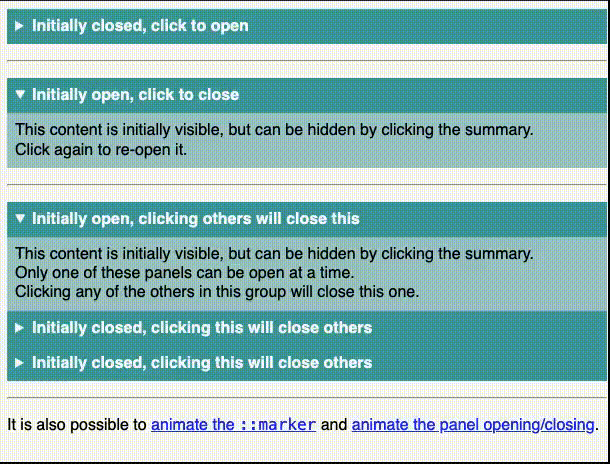
<summary>Initially closed, click to open</summary>
Content is initially hidden, but can be revealed by clicking the summary.
</details>Add an open attribute to set the default appearance as "open":
<details open>
  <summary>Initially open, click to close</summary>
  Content is initially visible, but can be hidden by clicking the summary.
</details>
Use the same name attribute on all related details (like radio buttons) to restrict only one open panel at a time:
<details name="foo" open>
  <summary>Initially open, clicking others will close this</summary>
  Content is initially visible, but can be hidden by clicking the summary; only one panel can be open at a time.
</details>
<details name="foo">
  <summary>Initially closed, clicking will open this, and close others</summary>
  Content is initially hidden, but can be revealed by clicking the summary; only one panel can be open at a time.
</details>
<details name="foo">
  <summary>Initially closed, clicking will open this, and close others</summary>
  Content is initially hidden, but can be revealed by clicking the summary; only one panel can be open at a time.
</details>
You can also customize the appearance with CSS and trigger the open/close via JS.
Learn more about the details element in the previously-published “For the Love of <details>".
Resources:
Browser compatibility:
Input with Autofilter Suggestions Dropdown
Description:
Combining the HTML input and datalist elements can create a dropdown of options that autofilters as you type:
CodePen: Input with Autofilter Suggestions Dropdown
Use cases:
- Site search
- Product search or filter
- Filter any list of data
Basic implementation:
<label for="browser">Browser</label>
<input type="text"
       list="browsers"
       id="browser" name="browser"
       size="50"
autocomplete="off" />
<datalist id="browsers">
  <option value="Arc"></option>
  <option value="Brave"></option>
  <option value="Chrome"></option>
  <option value="DuckDuckGo"></option>
  <option value="Firefox"></option>
  <option value="Microsoft Edge"></option>
  <option value="Opera"></option>
  <option value="Safari"></option>
  <option value="Tor"></option>
  <option value="Vivaldi"></option></option>
</datalist>
You can also use other input types:
<label for="quantity">Quantity</label>
<input type="number"
       list="quantity-options"
id="quantity" name="quantity" />
<datalist id="quantity-options">
  <option value="1"></option>
  <option value="2"></option>
  <option value="5"></option>
  <option value="10"></option>
  <option value="20"></option>
  <option value="50"></option>
</datalist>

<label for="appointment">Appointment</label>
<input type="time"
       list="appointments"
id="appointment" name="appointment" />
<datalist id="appointments">
  <option value="12:00"></option>
  <option value="13:00"></option>
  <option value="14:00"></option>
</datalist>
Note that, at the time of this writing, Firefox was limited to only textual-based input types, so no date, time, range or color for now... :-(
Also note that, at the time of this writing, there are limitations on mobile, and accessibility concerns.
Resources:
Browser compatibility:
Modals / Popovers
Description:
The popover and popovertarget attributes can replace the traditional JS-driven modal/popover/overlay:
CodePen: Modal / Popover
Use cases:
- Hiding/showing side panels / additional information
Basic implementation
An auto popover (default) can be "light dismissed" (clicking outside of it or hitting the esc key). Opening an auto automatically closes any other auto popovers that were open. Clicking the button a second time will close the one it opened.
<button popovertarget="pop-auto">
   Toggle Popover
</button>
<dialog popover id="pop-auto">
   I'm an "auto" Popover!
</dialog>
A hint popover can also be "light dismissed". It does not close other hint popovers when opened. Clicking the button a second time will close the one it opened.
<button popovertarget="pop-hint">
   Toggle Popover
</button>
<dialog popover="hint" id="pop-hint">
   I'm a "hint" Popover!
</dialog>
Note that, at the time of this writing, Firefox and all iOS varieties do not support hint popovers.
A manual popover can not be "light dismissed". It does not close other manual popovers when opened. Clicking the button a second time will close the one it opened.
<button popovertarget="pop-manual">
   Toggle Popover
</button>
<dialog popover="manual" id="pop-manual">
   I'm a "manual" Popover!
</dialog>
Learn more about the opening and closing dialogs and popovers in the previously-published “Controlling dialogs and popovers with the Invoker Commands API".
Resources:
Browser compatibility:
Offscreen Nav / Content
Description:
The above Modal / Popover functionality can also be used to create an offscreen navigation that requires no JS:
CodePen: Offscreen Content
Use cases:
- Hiding/showing navigation menus
Basic implementation:
<button popovertarget="menu">
   Toggle Menu
</button>
<nav popover id="menu">
   Nav Content
</nav>
#menu {
margin: 0;
height: 100vh;
translate: -100vw;
}
#menu:popover-open {
translate: 0;
}I use a nav element to give it semantic value, but you can use any HTML element (div, section, aside, etc.).
A popover defaults to position: fixed per the User Agent Stylesheet, and is simply pushed off screen when closed, and pulled back onscreen when it is open. Note that margin: 0 is required if you want to override the User Agent center-alignment.
Clicking outside of the above menu closes it. You can force the panel to stay open, requiring a manual/explicit close, by using popover="manual".
You can also add a backdrop pseudo element and style it as you wish:
#menu::backdrop {
  background: rgb(190 190 190 / 75%);
}
Resources:
Browser compatibility:
Conclusion
While we all love the power and flexibility JS provides, we should also respect it, and our users, by limiting its use to what it needs to do.
There is so much more that has changed in recent years, including a ton of options that CSS now covers. If you are now hungry for more, have a look at [my longer article that covers those as well](https://aarontgrogg.com/blog/2023/05/31/replace-js-with-no-js-or-lo-js-options/.
Happy reducing!
Atg
About Aaron T. Grogg
Web Developer / Performance Optimization Specialist
Blog: aarontgrogg.com
BlueSky: aarontgrogg.bsky.social
Mastodon: mastodon.social/@aarontgrogg
LinkedIn: linkedin.com/in/aarontgrogg