If someone had told me 12 months ago what was going to happen this past year, I wouldn’t have believed them. Skipping swiftly past all the political, economic and social turmoil, I come to the interface changes brought in macOS Tahoe with Liquid Glass. After three months of strong feedback during beta-testing, I was disappointed when Tahoe was released on 15 September to see how little had been addressed. When 26.1 followed on 3 November it had only regressed, and 26.2 has done nothing. Here I summarise my opinions on where Tahoe’s overhaul has gone wrong.
What goes round
Almost all the content displayed in windows is best suited to rectangular views. Images, video, webpages and other text crave areas bounded by right angles. Gentle rounding on the corners, as in Sequoia, is fine, but the significantly increased radius enforced in Tahoe is a misfit. This either leads to cropping of contents, or reduction in size of the view and wasted space.

Cropping is misleading, as seen in this enlarged view of a thumbnail image in the Finder’s Gallery view, compared to the larger version shown below. The thumbnail misrepresents what’s in the original.

Among Apple’s claims for this new look is greater consistency. But two windows in the same app, both created using SwiftUI, can’t even share a common radius, as shown below in Providable running in macOS 26.2.
Out of control
Tahoe has also increased the size of its controls, without using that to improve their clarity. The best way to see that is in my Mallyshag demo app.

This looks good in Sequoia above, but becomes a mess in Tahoe (below) because of its changed control dimensions.

Those three buttons are significantly wider, so now overlap one another and are wider than the text box below. The user sees no benefit to this, though, as the text within the controls is identical.
Iconoclasm
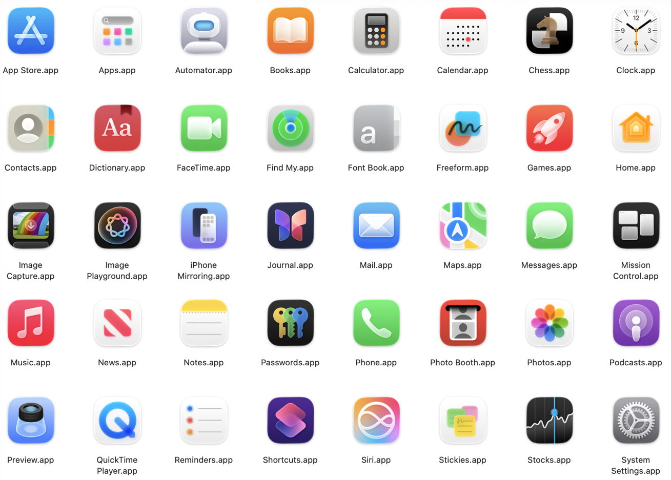
App icons need to be both distinguishable and readily recalled. The first ensures that we can tell one from another, and relies on all the visual cues we can muster, including colours, form and content. Tahoe enforces a rule that everything in the icon must be fitted inside its uniform square with rounded corners, so restricting cues to colours and contents. As a result, the icons of many bundled and other Apple apps have become harder to distinguish in a crowded Dock. Some, including Apple’s Developer app and the App Store, are indistinguishable, while others have degenerated into vague blotches.
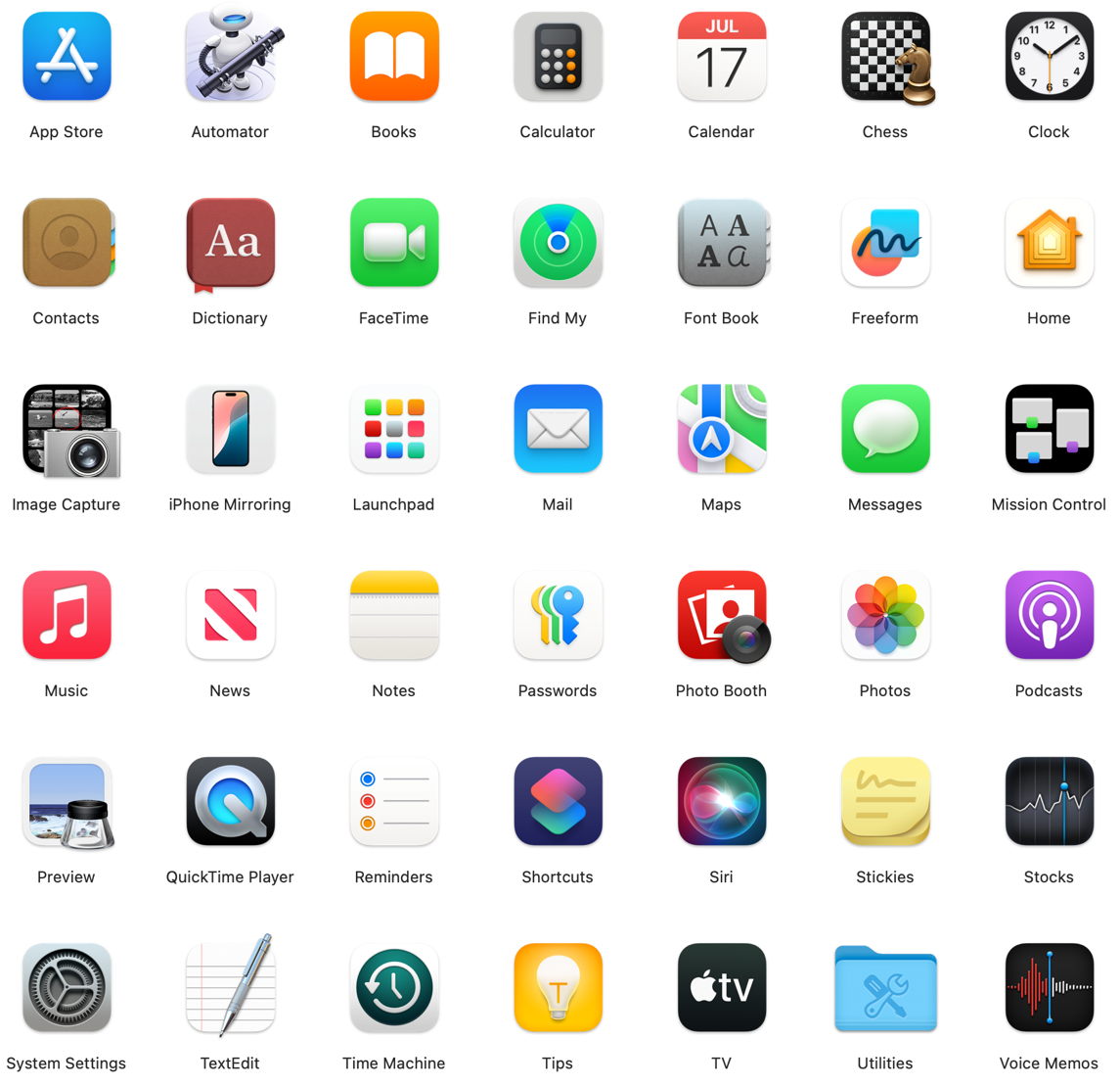
Above are most of the apps bundled in Sequoia, and below are those in Tahoe.
Whiteout
In real life, whiteouts are dangerous because they’re so disorienting. There’s no horizon, no features in the landscape, and no clues to navigation. We see and work best in visual environments that are rich in colour and tonal contrasts. Tahoe has continued a trend for Light Mode to be bleached-out white, and Dark Mode to be a moonless night. Seeing where controls, views and contents start and end is difficult, and leaves them suspended in the whiteout.

In light mode, with default transparency, tool icons and text are clearly distinguished tonally, as are some controls including buttons and checkboxes. However, text entry fields are indistinguishable from the background, and there’s a general lack of demarcation, particularly between controls and the list view below.

Wet-on-wet
This technique is used in watercolours to merge layers of colour diffusely, and the best description of some of the results of transparency in Liquid Glass. My examples speak for themselves, and are drawn first from Apple’s own design for System Settings.
Transparency of the Search box at the top of the sidebar on the left renders it incomprehensible when it’s underlaid by scrolled navigational content.
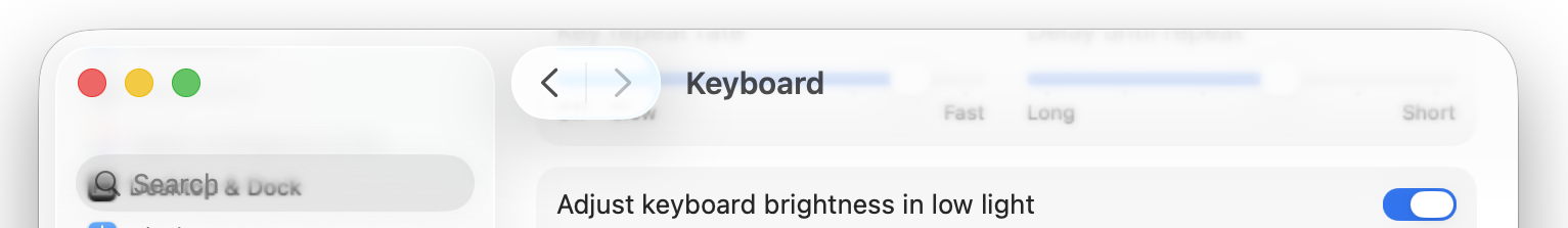
Although the view title Keyboard remains readable, bleed-through of underlying colours is confusing, distracting and aesthetically upsetting.
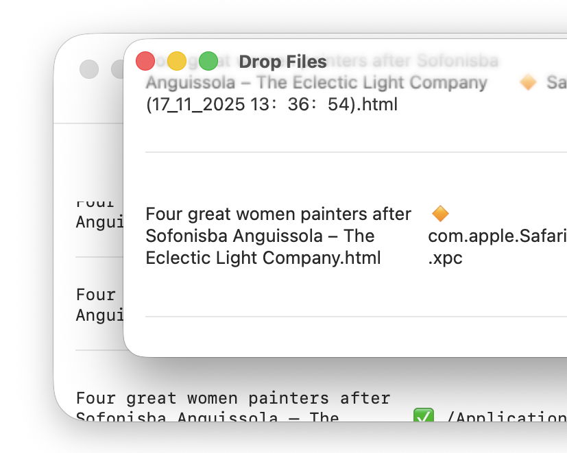
My next examples show the same window in Providable with a selected list row being scrolled up behind what used to be a window title bar.
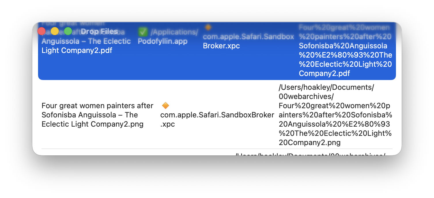
With the window in focus, the selection colour overwhelms the traffic light controls and window title, which should read Drop Files. This also draws attention to the limited width necessary to accommodate rectangular content in a window with excessively rounded corners.
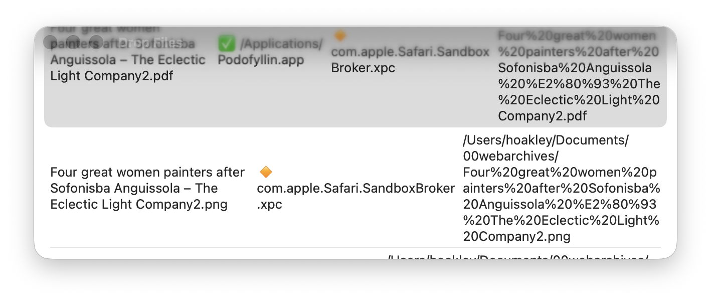
Out of focus the selected row is less overwhelming, but traffic lights and title have dissipated in grey blur.
I’m sure that, in the right place and time, transparency effects of Liquid Glass can be visually pleasing. Not only is this the wrong time and place, but those with visual impairment can no longer remove or even reduce these effects, as the Reduce Transparency control in Accessibility settings no longer reduces transparency in any useful way. That was one of the regressions in 26.1 that hasn’t been addressed in 26.2.
Summary
macOS Tahoe’s visual interface:
- Fits largely rectangular contents into windows with excessively rounded corners.
- Enlarges controls without any functional benefit.
- Results in app icons being more uniform, thus less distinguishable and memorable.
- Fails to distinguish tools, controls and other interface elements using differences in tone, so making them harder to use.
- Makes a mess where transparent layers are superimposed, and won’t reduce transparency when that’s needed to render its interface more accessible.
Maybe this is because I’m getting older, but that gives me the benefit of having experienced Apple’s older interfaces, with their exceptional quality and functionality.
That was little more than a decade ago, in 2014. Not that I want to turn the clock back, but it would be really helpful if I could read clearly what’s on my display once again.