(评论)
(comments)

原始链接: https://news.ycombinator.com/item?id=43673761

这篇 Hacker News 帖子讨论了一篇文章,该文章调查红橙色袋子是否会使橙子看起来更橙。几位评论者指出了该方法的缺陷,包括使用 sRGB 色彩空间平均像素颜色(非线性且可能歪曲结果)、不受控的照明条件以及相机的自动白平衡可能会补偿红色袋子的影响。一些人建议转换为线性色彩空间,如 HSL 或 CieLAB,或使用 PNG 图片以避免色度子采样。 许多人认为实验存在缺陷,因为人类的色彩感知很复杂,受环境影响,而不仅仅是平均像素值。他们引用了 identical-colors-big.jpg 错觉作为这种效应的例子。其他人批评照片中橙子的颜色看起来较暗,认为显示器的颜色设置不准确。一些人指出所使用的橙子(德科蓬/清见柑橘)是杂交品种,可能不具有典型性。橙子的高价也受到了讨论。总的基调是批评性的但建设性的,提出了改进实验的建议,并强调了在与颜色相关的研究中考虑人类感知的重要性。

相关文章
  • 红橙色的袋子能让橙子看起来有多橙? 2025-04-14
  • (评论) 2024-07-28
  • (评论) 2024-08-10
  • (评论) 2024-03-11
  • (评论) 2024-09-12

  • 原文
    Hacker News new | past | comments | ask | show | jobs | submit login
    How much oranger do red orange bags make oranges look? (alexanderell.is)
    74 points by otras 10 hours ago | hide | past | favorite | 47 comments


    Warning, always convert your colors to from sRGB to Linear RGB before doing any math on them, then convert them back to sRGB afterwards for displaying them.

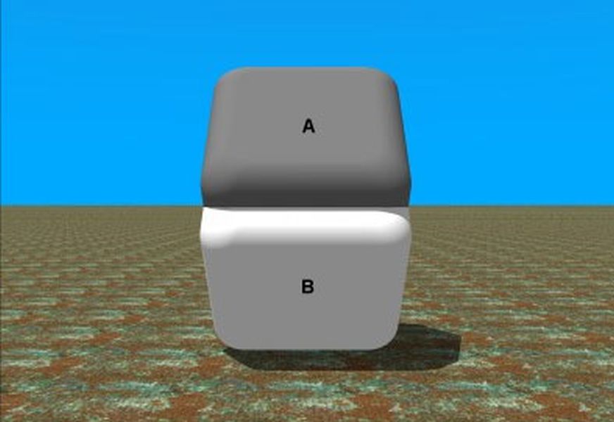
    sRGB is the familiar color space you all know and love, it's what your display uses, and it's what has those RGB numbers between 0 and 255. But it's not a linear color space.

    First think of values as being between 0 and 1 instead of 0 and 255. To change sRGB to Linear, do X^2.2 (close to squaring the value). To change Linear back to sRGB, do X^(1/2.2) (close to a square root).

    In Linear RGB, a value of 0.5 is halfway between black and white. You can put a stripe or checkerboard pattern next to the color value, and it will appear to be the same brightness. But in sRGB, a value of 0.5 is much darker. Linear RGB of 0.5 is roughly equivalent to sRGB of 0.73.

    The actual method of conversion involves a complicated curve that isn't continuous, using X^2.2 is still an approximation.


    Even better, convert to HSL or CieLAB. RGB is not at all how our eyes see things.


    >First, the average pixel is not what I would expect it to be at all

    It looks like the averaging was done in default sRGB color space, with:

    magick "$f" -resize 1x1 txt:-

    Downscaling should instead be done in a linear colorspace. Human vision is non-linear, but the filtering required for downscaling is equivalent to blurring, which is linear because it's done optically not within the retina or brain. Using ImageMagick:

    magick "$f" -colorspace RGB -resize 1x1 -colorspace sRGB txt:-

    Additionally, JPEG supports chroma subsampling, which is usually enabled by default. I don't know what sips does, but with these small files you might as well use PNG and avoid the risk of losing color information this way.

    This should produce results closer to human perception.


    >The average pixel was not what I expected.

    The average pixel doesn't look correct because human vision does not interepret shadowed colors as different colors. We first guess at the shadows, and then do some kind of inverse mapping from the shaded color space to the illuminated one before we "perceive a color". This is why the black,blue/white,gold dress illusion exists.


    They really don’t look all that different to my untrained eye - in fact I think it looks “better” without the bag. Maybe I’m loco.


    I'm in the same camp. It definitely doesn't look more orange to me. If anything, it looks more brown.

    The unbagged oranges are more appealing.


    Taking another look, I think you're right! Particularly since the first orange is pretty orange already. I think the first example would have been better served with a yellower, less ripe orange to highlight the difference and the pull in the redder, riper direction from the bag.


    It makes sense that adding red adds red (in addition to the avocado sacks you mention, I think of lemons’ yellow bags, limes’ green bags, and the red packaging/shelf lining and pink-tinged light in the butcher’s case)—but those images really do look strangely exposed to me.

    Did you do exercise any specific control over the phone’s camera?

    I wonder if the ring light might use the sort of general-market LEDs that underperform specifically at illuminating saturated reds and oranges in this range… see for example

    https://www.canada.ca/en/conservation-institute/services/con...

    and

    https://indiecinemaacademy.com/are-leds-ruining-your-project...


    That's a good question, and I could easily see the camera settings (and the light) being a source of error here. Naively, I used the default iPhone camera with the same exposure for each one, then ended up manually removing some of the HDR settings from each one when they were showing up as way overexposed on my computer. Not exactly an advanced, scientific technique, and there was also a bright source of soft white light from the window next to the setup, which could have thrown off the automatic exposure.

    Another comment mentioned it, but I wonder if the overall effect would be more visible with yellower baseline oranges (or, as you mention, pale lemons and limes). Really interesting about the LEDs underperforming as well!


    Along those lines, one big thing I worried about when reading your article was whether the camera's auto-white-balancing might be throwing everything off. I'm not sure how it works on an iPhone, but I'd suspect that presence of the red bag might cause it to reduce the redness of the rest of the image. One easy solution might be to always have two oranges in each photo---one inside the bag, and one sitting on top.


    This was my immediate thought when I saw the ring light. Very very likely a CRI of 90 or below, which doesn’t even weight much in red shades. Not uncommon to see 92 CRI with a R9 (red) score below 50% of sunlight or tungsten illumination.


    The best oranges [0] I've had were half green. Fresh from the tree, but still plenty ripe.

    It's my understanding that oranges for transport to colder countries are picked unripe and ripened in the holds of cargo ships. This ripening process is great at making the skin more orange, and OK at improving the flavour, but nowhere near as good for that as ripening on the tree.

    So if I saw green patches on my supermarket oranges, far from the tropics, I'd be conditioned to expect them to be really good. They wouldn't be, of course.

    [0] Satsumas? Clementines? I don't want to get into a debate about what taxonomically is an orange, but these were citrus fruit that turn orange in colour when ripe.


    How green an orange is when ripe has to do with the climate they are grown in. In warm climates with little variation in temperature between day or night, oranges will remain green on the tree even when ripe. If nights get cold enough (~55 F), they will turn orange.

    That said, in the US, oranges destined for markets de-greened for aesthetic purposes since customers won't generally buy them otherwise.


    Oranges and other citrus are examples of non-climacteric fruits, meaning they do not continue to ripen after being picked. So, they have to be picked at the desired level of ripeness.


    Am i mossing something or is this really a blog post saying that if you put something red in a picture and compare it to the same thing without red, then the picture with more red, looks, well, more red?


    If you put an object of color X of intensityn N in a net with color X of intensity N+M, then the object will get some spill over from the net similar to M, which the brain/person doesn't necessarily realise and simply assigns it to the object ad well.

    It is also a consumer advice about not comparing an orange inside a bag (of any color) with one outside of one as we have a hard time truly comparing them.


    I think the author is on the right track just needs to refine the assumptions a bit. Not sure if the method actually tests whether we perceive the oranges as more orange with red bags. Things like too small of a sample size, lack of any statistical analysis, uncontrolled lighting conditions, not controlling for phone camera, and simplistic color analysis (human eye is much more complex). Also lack of applicability to color science principles


    In response to the observation the average pixel color is surprisingly brown, I'll take today's opportunity to induct some of my fellow HNers into today's lucky 10,000 by linking Technology Connections's "Color is weird" video (https://www.youtube.com/watch?v=wh4aWZRtTwU).


    > Maybe the secret is to never buy bagged fruit, since it’s harder to evaluate the quality of each orange.

    There's already so much food waste due to safe but blemished produce though!


    Oranges in Orange Bags == Rotten Oranges, in my experience. Do Not Buy.


    I like the energy of the post a lot! Nice job.


    I think the lighting/camera work doesn't help here. The first photo of the orange...doesn't look orange. It's really dark. In the photo from the shop they look orange.


    Same here, most of the pictures look really dark and not orange at all.


    My first thought as well. The author probably has a monitor with not very accurate color, those look almost red.


    those are some weird oranges


    Dekupon oranges (branded Sumo in the US)! They’re my favorite. Just the right amount of sweet, and the easiest to peel I’ve ever had.

    https://en.m.wikipedia.org/wiki/Dekopon


    /jk

    They are just excited to see you, too.


    That's because it's not: it's a mandarin-orange hybrid.

    Fun fact: "dekopon" means basically "outie" (as in protruding navel, not Severance).


    I’ve a few time now had to explain to older people that “no, it’s not the same things you had when you were a kid” about a few different foods.

    Oranges, avocados, Brussels sprouts, and more I am forgetting. I’m receive basically the same “oh it’s the same thing!”.


    Wait, is that "local grocery store" selling those oranges for $2.49 _each_?!


    Not a typical orange. “Sumo Citrus” / dekopon / shiranui is a hybrid tangor/tangerine cross. Very fragile, specialty fruit, only recently available at scale in the eastern US. This is on the high end per-fruit but I’ve seen higher. I usually buy in cases at ~$1.25 per fruit.


    Wow indeed. Though I think the 4.99 ones are by weight, for 2 lbs? Seems weird though so I'm not sure.


    This is interesting because it shows us how a programmer thinks of a problem vs. how a psychologist or neuroscientist would think of this problem and highlights the lack of "human-ness" in programmer thinking.

    I'm no fan of schools forcing STEM students to study boring electives but this is a prime example of why that might be useful.

    The entire premise of the post is wrong - average pixel value has nothing to do with how orange the oranges look - it's all about perception.

    Here's an example where the same exact color (pixel value) can be perceived as either light or dark depending on the context: http://brainden.com/images/identical-colors-big.jpg

    That's what the bag adds - context - but the author hasn't made this connection.


    You saw someone making a bunch of observations, setting up an experiment and trying to use maths/programming to prove an hypothesis they believed to be a sign of "lack of human-ness"?

    To me it showed curiosity and ingenuity, sure they might not have studied a certain subject but it is a totally valid approach to an unknown problem. It might actually get people who have similar "silly questions" to run a similar set of experiment and perhaps stumble upon something novel.

    You comment showed less human-ness than OP, ironically.


    I read the lack of human-ness as locking at the wrong place.

    It’s not reality that changed because of red net but our perception of it.

    The solution isn’t in the oranges but our brain


    Agreed.


    While you are correct about color perception, I don't see the link to a 'lack of humanness in programmer thinking'. It's not an inherent trait to software engineers. The entire field of HCI, interaction design and everything around how we deal with digital colors are fully focused on the human experience.

    Maybe a reminder that computer science != programming.


    Context absolutely affects how we see things.

    But so does its colour.

    So observing how a red mesh affects that colour is absolutely worth investigating.


    You clearly have some interesting and substantive points to make! but on HN, can you please do this without putting down others or their work?

    It's all too easy to come across as supercilious and I'm afraid you crossed the line, no doubt inadvertently.

    https://news.ycombinator.com/newsguidelines.html


    It's not a "programmer" problem. Any competent program I know would never thing of averaging the color of the orange with the color of the non-orabge bag, and expect that to be orange, or representative of how we percieve the orange.


    See also this popular “optical illusion”: https://en.wikipedia.org/wiki/Checker_shadow_illusion


    I mean… the first orange basically looks red on my monitor.


    Brown is dark orange, cmv.


    Well that's pretty much a fact, so why exactly do you want someone to change your view?


    That’s like saying green is a yellower blue. It’s all arbitrary.


    The names are arbitrary but the underlying color theory is not. Colors are different wavelengths of light and our eyes have sensors that are sensitive to specific wavelengths.


    Most colors are mixtures of wavelengths of light. Our eyes have sensors that are sensitive to specific ranges of wavelengths, with relatively broad overlapping response curves. Orange can refer to a spectral color, but (as you say) the arbitrary nature of the names means it also refers to several mixtures of spectral colors of varying wavelength and intensity. "Brown" doesn't refer to any spectral color, it's always a mixture which could be referred to as a "dark orange".


    Join us for AI Startup School this June 16-17 in San Francisco!


    Guidelines | FAQ | Lists | API | Security | Legal | Apply to YC | Contact


    Search:
    联系我们 contact @ memedata.com